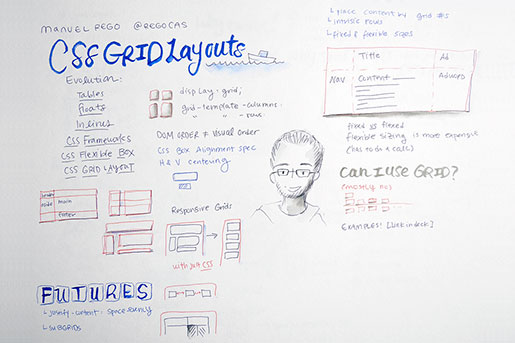
CSSConf is a conference dedicated to the designers, developers and engineers who build the world’s most engaging user interfaces. The presenters push the boundaries of what is possible — talking about the latest technologies, cutting edge
techniques, and tools.
For the third CSSConf, we're taking the show to the big city after
twoyears at the beach, and we're adding an encore by extending, for the first time, to a two-day format. We look forward to seeing you this summer in New York!
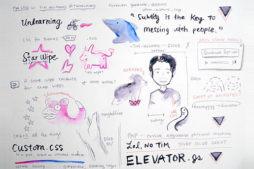
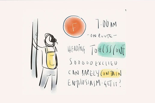
I was really excited about this transcript. Because I wanted to say fart and then take a picture. I'm Tim. Jeez. I really like it here. This is a great crowd. I think we're going to have a lot of fun today. Coming up to Midtown, I remembered
why I never come up here in the first place. So stressful, the whole time. I am the first speaker, which means I get to be the technical guinea pig of the whole thing. Whatever you're downloading, I rely heavily on the internet on this.
So you do that to me, and I'll do that to you. The benefit of being first is I get to take the first survey of everybody. So raise your hands if... You brushed your teeth last night? Oh yeah, that's good. And raise them again if
you used toothpaste. That's a good showing. I'm glad. This is going to be great. So I'm generally like... Pretty unserious. Not serious. However you say that. About most things. This is my Twitter. This is my email. So you
can email and tweet any cynicisms towards me. I will totally reply, probably. And yeah. CSSConf. It's great. I actually applied to CSSConf Australia, and there's just too many Australians in Australia, so I had to come here for
this. But it was a great lineup, so I'm very happy to be a part of it. There's a lot of different talks, I think. There's a lot of educational things. And this isn't really that kind of talk. There's a lot of talks
that would tell you it's a dumb idea to put white on a yellow background. I didn't really listen to those ones. So this is really like the unlearning of talks. You probably don't want to take notes. Or if you do take notes,
you can burn them afterwards. And all the ghostly spirit things will fly out. I want to talk about fun. I want to talk about creativity and fun with CSS and a little bit of JavaScript, and a little bit of everything together. The way that
I kind of think about it is... When we learn to read, you also learn to write. And this is the same for all of us with the web. We calm it, and we take everything in, and we also create for it, and when you write, you don't just write
for a newspaper and do your job every day. In and out. You also have, like, that creativity to do whatever you like, and for me, that's like having fun with all the technology. So this is where I got most of my knowledge from. The CSS
for Babies book. $8.99. And this is pretty much what you're going to experience right now. So the first thing I want to talk about is all these fantastic starwipes that have been going on. I went down this treacherous path where I wanted
to starwipe between two slides. The first thing. CSSConf -- what am I going to do? I need starwipes. I looked at all the different frameworks and there was none that could do starwipes. So I flipped the board over -- zero frameworks since
today, because I created starwipe as a framework. This is a little bit epileptic, but I was so happy about it, I wanted to include it. There's a lot of these. Oh, there we go. This is the CSS for the starwipe. It's using the mask
image, and passing in svg. I couldn't get it to work with clippath. This was working. And I traveled on. And then the mask size goes from 0 to 100%. The cool thing is I can change. So I can do heartwipes, which is a ton of love. I can
do these thumbs up. Subliminal like... This guy is all right. After that, I actually did this one. Which is a donkey, which is technically an asswipe. I was pretty thrilled by that. I was pretty happy with myself. And that's by changing
the... It's a little bit cut off at the top. But yeah. That's by changing... Anyway, I'm going to change back. Because those are my favorite. This was the main inspiration, is this video that I found, which is a starwipe tribute
to starwipe tributes. So this is a tribute for bacon. You should put that on your notes as a must-watch. Because it is hugely informative. And this is what I talk about when I say fun. I really like playing around and doing these quirky
things. I get distracted a lot, and I kind of go down these weird paths. And I kind of found that I'm happier if I just embrace that and keep going, when I'm enjoying something. I was never... I was never really a particularly
good student at school. I didn't really enjoy much. I'm not really good like... A book learner. And that's come out of this as well. By experimenting and doing things, one after the other and figuring things out and making
my own mistakes and making my own recoveries, it's like -- how I've got to be where I am. And I'm also incredibly lazy. That's just a fact. And this kind of came from school as well. The minimum required effort to pass
kind of passing. If you had to get 70, I would get 70. If you had to get 50 points, I would get like 51 points or something like that. And that's worked out pretty well for me so far, so I'm not necessarily going to change that.
So this is me in CSS. Before you go crazy about this naming convention, it felt weird not to have my name in capitals. And this is the estimated number of Tim Holmans. I actually researched my name. Like, this is going to be some cool kingly
thing. And Holman is literally man who has come out of a hole. Evolution has taken me a long way. This is my height in pixels, approximately, depending on your resolution, and this is the width in pixels. This is the padding I put on for
summer. All the drinking I've been doing. So I'm really lazy. This is my assignment technique at school. Basically the first thing -- it's border-box, a piece of paper. First thing I can do is increase the padding. I submitted
three pages. The top padding and side padding is how a pro does it. Then I increase the word spacing, so I can fit maybe 50 words on a page. It's really good. And subtly increation the letter spacing, and that was my lazy assignment.
There's actually line spacing in there as well. And that kind of got me through school. I kind of wanted to build this... That's me. I kind of wanted to build this into starwipe. Once I started coming along with this, I'm
like... I'm going to put into this as much of my personality as I can. So if I press S a lot of times, that's probably enough, I can really slow down the starwipes. And this is mostly so I make my whole presentation time. I've
got a clock here, which is really daunting. So if I just go really slow, I'm going to get there in the end. Change it halfway. All right. And I can press FFFFFFFFF and speed it back up. That's not fast enough. Speed it back up
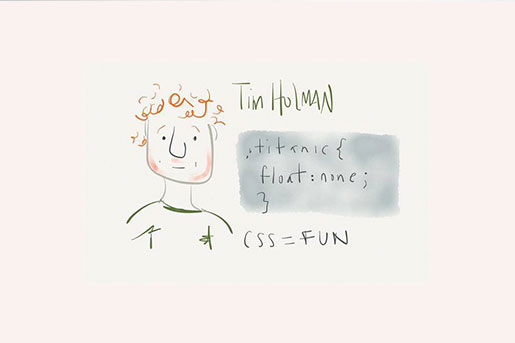
again. Oh, there we go. The Fast and the Furious. I really like those CSS jokes. I found a bunch of these online in a big thread and I was really excited by them. Like lego, display block. That's so clever. And Titanic, float none.
Periodic display table. I was pretty happy about that. Muffins ready, overflow-y visible. Unless you make them wrong. Chuck norris's color is bad ass. This is really great. And of course Australia is upside down. This is me when I found
these. I was really excited, because I thought I would be a natural at making these CSS jokes. And it turns out everything I made was really... Depressing. So here's me. Here's the subclass of me with my abs. Display:none. That
probably needs an important tag as well. Here's me. Here's my beard. Here's the patchy mask that I wear around... Here's me. This is my regular transition speed. Right now. This is my transition speed when seamless arrives
at the door. Way faster. And again, this is me, and this is my transition speed when preparing for this conference, which is way slow. These are great. This is what I mean when I say I get distracted. Just like -- oh, I'm going to do
this. I'm going to add these things. I'm going to go all over. A little over this. And like... Yeah. It got really crazy. I'm an obsessive saver as well. I save, save, save. If I make one change to one file, I'm going
to press save like ten times. I needed to build that into starwipe. So every slide I can press control C and pop in the URL, just in case this whole thing crashes to bits. It's just really enjoyable. So this whole framework is super
legitimate by this point. Like King Joffrey. So this is my list of fears, when speaking. The first one was like... Oh, I'm not going to fill up the whole time. So I kind of fixed that, by slowing down. Speeding up the transitions. Eating
up seconds. Seconds at a time. The second thing was like... Everything is going to break down. You can't really see this. That's tough. Everything is going to break down. And the third thing was that I'm going to forget everything
that I wanted to say. So obviously I needed to build in my own speaker notes. And I was kind of looking around. I do some interactive demos later, where I need screen mirroring. So if I can see the notes, everyone else can see the notes.
So if I press H, here comes up my hands with a napkin. You're talking about speaker notes. I thought that was really exciting. Most of the time, I kind of... I'll bring it up again. I've got an appreciation for hand models.
When you actually look at your hands... Mine are really ugly. So obviously CSS to the rescue. This was my filtering to fix those ugly hands of mine. A little bit of blur, a little bit of greyscale, a little bit of brightness. Maybe I'm
born with it. Maybe it's maybelline. But this is the best way to fix it. Just blur them completely out. So again... I'm really, really lazy, and I built in this nice way to get help. So when I'm practicing this, and walking
through it, I kind of found that I kept relying on these speaker notes. I kept on going like... What is it? I've got to stop cheating. I keep cheating with these speaker notes, keep going through it, and so I had to code in this way
for it to... Like, if I keep going, it starts messing with me and screwing up the text. Fluh-fluh. Just getting more and more disoriented, and the end -- you've used up all your lifelines now and as much speaker notes as you possibly
can. It worked really, really well. I like this. I always thought this was a good transition. Bilbo. I always liken this to Bilbo from Lord of the Rings when he goes crazy, when he loses the ring. This isn't really an uncommon thing,
I felt, when computers get kind of weird and angry at you. Passwords are definitely my biggest pet peeve. The barrier for a strong password just goes up and up and up. The smarter a computer gets and the more processing they can do... So
I kind of see something like this, a lot like the password. Your password is too simple. And that's the same with the help thing. Like saying... No notes. You're screwed. And the next obvious step for me was to build my own password
strength algorithm. So as you're typing, this was like the passive-aggressive password machine. Just like... The idea was like you're (inaudible). I had to imagine based on movies. You call that a password you don't know what
a password is. That's a big one my mom used on me. I'm not angry. I'm just disappointed. Try harder! And I almost use this. Not too shabby. Got to get some numbers in there. Like you're going to remember this. Game over
in the password world. That's what it feels like to me. I just get totally maimed by that system. So sometimes I get really sad from this. It's stressing me out. The things saying I have a weak password, my speaker notes are telling
me I don't have anything, so I needed to build in motivational words into this framework as well. So whenever I press M, it's like... CSS. You can do it! Amazing, Tim! You're doing great! I love you! And I feel great. Turns
that smile upside down. But I don't want to get too much... So I've got some demotivational ones as well. Just to balance things out. These are all important components of this starwipe framework. That's most of it. I went
a little overboard, building some really weird things. I can beach ball myself. Just in case I need to think of an excuse to get out of here. Everything is broken. What else do I add? I added like an x-ray. X-ray feature. Which inverts everything.
If you try to get the speaker notes, you get skeleton hands. I don't really know. But these are important things. And that's the bulk of the starwipe functionality. I was pretty proud of that. I went down that rabbit hole and came
out in China or Mongolia or somewhere completely strange. But this is again... This is what I'm talking about when I say fun. I really like traveling these weird roads, and making strange things out of things. Adding x-ray mode to stuff.
What website doesn't need an x-ray mode. Probably browsers should have that. I was also like... Also a little bit of a prankster at school. I like to just play around and have a little bit of fun at other people's expense, especially
this guy with the cheese. Has anyone ever found this file in Chrome? Custom.CSS? It's phenomenal. Any style that you add to that will be applied to every single web page that you visit on that browser. Custom.CSS is like the Holy Grail
of screwing with people. I have a little bash script that I keep in a gist and if somebody leaves that computer open, open the terminal, paste the command, bang it through, and you start having weird things on the website. It's actually
a lot of fun. And I put a lot of thought into the right way to ruin people's lives. Through Chrome. So this is, like, a few of my tips and advice. This is a good one. It just, like, slowly rotates the hue on the whole website. Usually
for really good effect, you do it over 100 seconds, so it's really, really subtle. You're on Google something, and later you're like... Oh, the colors have kind of changed. You can't really tell. And a little bit later,
you come back and it's... I have a... Let's see if the internet is going to be... Pleased. Ugh. Ugh. Come on, image. We can wait. So you can kind of see it. This is a 10-second loop. And this is a really powerful image. It's
really, really obvious. Subtlety is definitely the key to messing with people. This was another one. This is kind of taking advantage of patterns that everybody uses. So .logo, the class, and idlogo. That's everywhere. In Google. You
can add this so it starts rotating, and it's a broad spectrum of sites. So eventually you're sitting next to them, like -- have you noticed that all the sites have spinning logos today? If you've ever tried to browse Netflix
with a spinning logo, it's really confusing. And Google is exactly the same. A true pleasure. And this is a nice subtlety as well. They can live with that. You can go for a week with this spinning logo and you don't have to immediately
solve the problem and fix it. Which is truly fantastic. This is a simple one. Just putting a greyscale on every page. This is the same. They know the laptop has color. Because you can see your desktop. But just nothing online has color.
And it gets kind of confusing when they try to watch a TV show and they're like... Yeah, that black and white episode! It really got me. This is the first thing I tried to do. I just want to animate fonts. And it doesn't let you
do it. It's a travesty. Yeah. I especially liked that the font highlight refuses to acknowledge papyrus. Just like... No, it's not real. This is another good one. Just really subtle. Just every anchor is hot pink, from now until
the rest of time. I definitely still have people with this on. That's just what the internet is for them. That's the power of the custom.CSS. I'll definitely post this script. You can access the directory everywhere. It's
truly thrilling. I really like this idea of ruining experiences and making things worse for people. It's a really, like, funny way to think about things, when you're thinking about... How could this be more destructive, as opposed
to how this could be better. You kind of get a little bit of perspective that the thing that you're building isn't actually really that bad. I worked in ads, so I had a lot of opportunity to think about this. Pop-ups are a really
good one. Everybody has seen these social media engineering pop-ups. This one I have to include in every single talk, because it's like Satan's spawn of pop-ups. You've got a sound thing right here, it's got some audio
going on, and you say quadruple my sign-ups. I really feel some people kind of like... Purists... You never have to do these things. And being realistic and working like in an agency or an ad world, you'll come across this at some point.
And I kind of like to think to myself that things could definitely be really, really worse. This was something that I built. Might take a little bit to load as well. Stop downloading everything, guys. Maybe not. Maybe it's just not
going to work. I'm going to refresh. Nope. I think it's lost. We can move on. This is something where you move the mouse around, and the tweet button is actually completely attached to it. So you can't do anything without
clicking it. It's got like 40,000 tweets or something now. It's actually legitimately insane. And I think some people like... I don't know if Twitter has a thing which automatically does tweet if you just press that button,
and you don't do a confirmation dialogue. But some people, they're really angry at me. It's a really good one. I play around with interaction a lot. We're going to be in big trouble now. None of these hosts want to resolve.
It's a sad, sad problem. Let's try this. Nice. Bad. That makes no sense, because you didn't see that website before. This is another thing that's totally not going to work. We'll just kick all these off and see if
they ever decide to resolve. Nope. This is not going to make any sense. This one is thinking about it. Nope. This is a nice loading animation. That's built in SVG. And it's got nice CSS raindrops. I was happy about that. Now that's
all I've got. This one is not going to load. I don't know why I was talking about borders. I really needed that other one to carry onto it. But this is a border coly. That was good. This isn't... Hey, this one loaded. This
was something I was playing around with. I can't plug this in. I don't have the technology. This was something I was playing around with to bring animations into the DOM. Tim, you can do nice animation stuff. I want you to push
the borders. That's why borders was there. I want you to push the borders and go really weird. This animated monkey... It's getting really big. In there. And they're like -- Tim, what have you done? It's really great.
Here's your monkey. Here's your animations. Isn't this thrilling? I don't know what this stuff class is right here. I don't know what I was thinking. I'm going to start them up again. Oh, cool, let's go
back to this one. Yeah. So this is like... That one kind of travels onto this one. This was where I was thinking how hover animations could get really, really bad. What is the worst that they could possibly be? And this is like the kind
of library that I built for Giflinks. Since the dawn of the internet, accurate representation of the internet, the world has been asking -- why are hover interactions so boring? Only recently, a new paradigm has emerged to solve this problem.
Designers call them Giflinks. This is an accurate representation of me at work on any given day in the Tumblr code base. It's a little known fact that 9 out of 10UX specialists agree that Giflinks provide a richer User Experience. This
is something I wish I could inject into everyone's script. Every link you hover over, you get Heman. That would be fantastic. So again, thinking of the bad way... We looked at this one. Oh, this is something that will only work in Safari,
which I totally... Don't have open. Oh, gross. Terrible code. If this doesn't load, I opened Safari for nothing. Which is a very painful failing. I just keep doing this, maybe we'll... This was like a weird quirk that I found
in Chrome, and in Safari, on iOS devices and Macs. In this area where you scroll to the bottom of the page and push a little bit further... This is not going to do it. Oh... because I included fonts separate. No. Forget about it. Let's
not go there. When you scroll, actually, you get a little bit of numbers kind of coming back. You get a negative number when you scroll too far. So it's kind of possible to inject a Grumpy Cat into the top and the bottom of the screen.
Which was really, really fun. So is there any reason for making this? I don't really think so. I kind of like to not think about that, because it scares me a little bit. So when you're building these things, don't be like
so crazy about it. This is going to be... This is a website that I built, the useless web, a couple years ago, and there's legitimately no reason in the world that this should exist. And you press this button, and it takes you to random
websites. This is called eelslap.com. Why would that exist? It doesn't even matter. We had the technology to make these crazy things, and you can build an eelslap.com. We should be doing that every single day. That's such a pain.
This one is hey.com and it redirects to ho.com, which redirects to hey.com. Just an endless loop, over and over and over again. It's a shame that it doesn't happen, but you kind of get the point. I don't know if there's
any point in pressing that. Nope. No luck. Again, there's no reason for this. This is by far the most popular thing I've ever built, I think. Every month, people spend a total of two years consuming it, which is ridiculously insane.
It's probably put some economies in a pretty sad state of affairs. This is another one that I built. If the audio doesn't load, it's not going to be great. This is elevator.JS. I know it's not CSS. But it's like...
When I press this... Oh! (elevator music) (ding!) Some projects don't deserve to be on Hacker News, and this is one, because it drills out the people that are way smart. People sound off. Everybody is raving about this library that
scrolls to the top of the page really, really, really slow. And the people who had the music up really loud and were deafened by that... I think one of the first pull requests was somebody who downloaded and edited the audio to lower the
volume of it. I didn't accept it. I liked it loud. It was fine. So... Yeah. This is kind of like a collation of my thoughts on these things. This kind of way of thinking that isn't, like, too stressed out, and it's a little
bit explorative and a little bit experimental. This is actually a function that I found in the Tumblr code base, which I think best highlighted what I was trying to say. Sometimes things just don't have to make sense. I stumbled upon
generate_dolphins() in the code, and was completely confused and baffled out of my head and kind of secretly really, really excited. And it took me three hours to find the dolphins in Tumblr. They're in the audio player. When you're
not using it. The equalizer has these dolphins swimming around. Somebody was very quick to say they're actually sharks, based on their dorsal fin. Ruin the fun. And the teardown function for generate_dolphins() was when_dolphins_cry().
That's a special things. So I'm sorry some of these demos didn't really go as planned. But I'm definitely up for a beer or hit me up with an email, share these slides, and I Open Sourced starwipe, so you can start starwiping
yourselves into the future. Thank you.
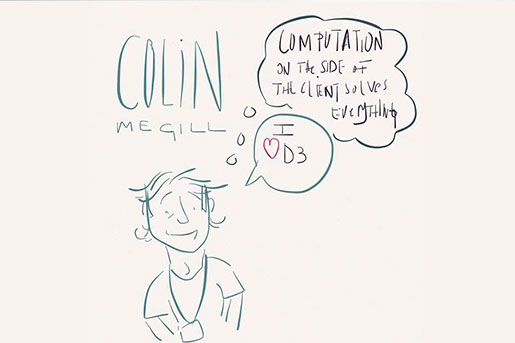
Hello! My name is Andrey Sitnik. I'm from Russia. From St. Petersburg. I work at (inaudible) team. Unfortunately right know we have only Ruby on Rails and React. But we're working on (inaudible). But you may know me better from my Open Source.
(inaudible). So today we'll talk about (inaudible) so how many people (inaudible) Sass? Stylus? (inaudible)? Okay. If you have used auto prefixer, (inaudible) other recent libraries -- with the prefixer, you just roll properties, selectors,
and (inaudible) CSS. This has happened because after prefixer it's not a pre-processor. It's just a plugin for PostCSS. A new way to process CSS. And you do to an extent (inaudible) pre-processor. So what is PostCSS? What is the
idea behind PostCSS? An idea is evolution. I really believe in evolution. I believe that every process is based in evolution. We have a great example of evolution right here. This is biological evolution. But also we use artificial evolution
in our computer science. And I would suggest that human ideas, human culture is also a result of the same evolutionary process. So what is evolution? These three steps are the evolution process. So every evolution process is based on random
mutation, natural selection in the wild, and inheritance. And my intuition is -- do we have these steps in our web? Do we develop (inaudible)? Of course, we have a lot of inheritance. We have a lot of specification. Like stuff we don't
want to support, legacy stuff, but do we have natural selection in our web? The blink tag was a good example. Think about it. Do we have a way to dismiss certification for some problems? For example, we create certification for a very big
problem? Can we dismiss certification? I would say no. The blink tag was never a part of any specification. It was just a tag for (inaudible) only. It was supported only by Mozilla, Netscape, and (inaudible). But in this case, Mozilla was
forced to support it for 9 years. And this problem, the problem that we can dismiss specifications -- this problem created other problems. We knew -- a crazy idea -- if you understand that you must support your mistakes for years, because
we have very strange ideas, but if we use them, we see -- because we have no way to dismiss specifications, and it's why random mutation is a very important part of any evolution. Because there is no way to find with an idea without
mistakes. Every idea looks like way crazy to begin. Remember what people thought about (inaudible). Remember what people thought about Javascript development just five or seven years ago. So development is about making mistakes. And this
is why pre-processors are so big deal. Pre-processors are where we can test some ideas before we can understand it. Of course, CoffeeScript is a good example. How many people here hate CoffeeScript? Of course you hate it, because it's
not so cool. It's very strange. Especially if you don't use Python. But without CoffeeScript, we would have no (inaudible). Because 30% of the ideas in ES6 was tested in CoffeeScript. I have new ideas in ES7 -- was also tested
in CoffeeScript. And so for Javascript pre-processors -- it's still a good playground. For example, you have a processor for Javascript, with (inaudible) debugger. It's a really crazy but awesome idea. I think it will change the
idea we will develop Javascript. But CSS pre-processors... This playground... Do we have some new ideas in pre-processors? I think no. I'll show you why. So what is a CSS pre-processor? It's like in PHP -- when you mix your code
with your styles. Questions: Is it a really good idea to mix your code and styles? But okay. But in PHP, we're going to put our code any place. But in CSS, the processor... There is only a few places to put. For example, (inaudible)
or any other (inaudible) -- variables, mixins, and core functions. But what about the units? The this rem, it's not supported by the old browsers, but can we create polyfill with the pre-processors? It's not easy, because we have
no units in pre-processors. And the first problem is -- because of the second one -- it is very difficult to change something inside pre-processors. They have a lot of files. And they merge into C++. How many people here know C++? So you
have less developers to change (inaudible) for pre-processors. And last but not least, the problem with pre-processors -- I'm not a big fan of Javascript, because I'm a previous Ruby developer. But let's be clear. Sass programming
language is ever worse. Can you read this? Me neither. But it's not some important, some big stuff. It is just the transition, transition mixin in Compass. We need so many lines for just transitions. And this is why we have PostCSS.
But the original idea was by TJ Holowaychuk. And it was Stylus development. Three years ago. And he understand that the processors have a big problem inside. And there is no way to fix it. Because the pre-processors' problems are inside.
So he created a new way to process CSS. He created a model of CSS processor to rework. And after (inaudible) was based on pre-work. But quickly, after it became too big for pre-work, created PostCSS. Just proof of concept. Just first duration
of modeler. With PostCSS, we have better support. So what is PostCSS? How PostCSS works? PostCSS code is very small. It contains only two parts. Parser, (inaudible). And CSS stringifier, which receives the stream, and generates a new CSS
string. So by default, PostCSS do nothing. By default, PostCSS parser CSS, and send back to the CSS. Without any changes. Byte to byte. Because the PostCSS stores always all the information above with your CSS string. All CSS images happens
in plugins. Just a simple Javascript function that receives the string, and changes something. It's just object -- the Javascript function can travel through the string -- change some and find some and add some nodes, delete some nodes,
and then we send this to this part, to the next part -- like a chain. And in that, we will send this -- to the stringifier. And the stringifier generates changes, the new CSS. Let's look at the code. PostCSS is a package, so we load
it. Next we create a PostCSS instance, and we set an array of the plugins. And now we can process CSS through this PostCSS instance, and get our result. Plugin code is more interesting. So... Remember I talked about (inaudible) polyfill.
Let's do it in PostCSS. So every PostCSS is just a function. This object -- (inaudible) methods. So we can run (inaudible) decoration. Decoration is a property, column... So in every decoration, we try to find rem, and replace it by
a simple Javascript. We need only four lines to create a polyfill, which is impossible to do with the same API in pre-processors. So what is the difference between PostCSS and pre-processors like Sass, LESS, and Stylus? In pre-processors,
you mix your code with your styles. It's written together, like PHP. In PostCSS, it's Javascript function. You split your code to the styles and to the Javascript section. And the second is that all the pre-processors features
are inside the pre-processors. Pre-processors are monolithic tool. PostCSS is not a monolithic tool. So why is it important? Why does it work? Because it can bring evolution back. It can allow us to use evolution in our web development process.
So how this works? You have some idea. For example, a new way to create the size optimization tool. You create the plugin, just a Javascript function, and people hate your plugin. Because haters are going to hate. But the emotions don't
matter, because if your plugin really works, really does some interesting stuff, many developers start to use it. And so your plugin becomes popular. And if it goes popular, you can receive specification. And you can have the time to write
a second plugin and go around again. So with the plugins, with PostCSS, we can have evolution back in our web. We can use evolution steps to develop the new specifications. To test some ideas before you have specifications. But... This is
only theory. Our current science says that theory means nothing without a really practical result. So if PostCSS really works, we will have some practical results. Of course, PostCSS has plugins for variables. For mixins. Because it's
really simple. But the important thing... That plugins for variables, for mixins, are very small. PostCSS plugins are just 68 lines of code. So it's very easy to change it, to fork it. If you agree with me, with my API, you can fork
this plugin and create your own. It's no problem. But with PostCSS, it's not about doing the pre-processor stuff. No. The main goal of PostCSS is to do some new stuff. To create some new stuff. To solve this. To change something
amazing that was impossible in pre-processors. So I will show you some things that are impossible with Sass. This is impossible to do with Sass. (inaudible) you write some CSS. Just simple CSS. Just properties, selectors, very simple. And
autoprefixer takes browsers that you support, and the prefixer automatically adds on the necessary... Only necessary prefixes, that are really for your projects, for your browsers, for your CSS. But I think... Everybody knows about autoprefixer,
yes? How many people here use (inaudible)? It's a CSS conference, yes? You have a new standard for Javascript. Called ES6. It is a future standard. There is no browser with ES6 support right now. So you have some compilers -- which
compile our future CSS... Future Javascript with ES6 future, to our current ES5 Javascript. But it will be good to have something like this in CSS. It will be good to right CSS for right now. Don't wait until all browsers will support
it. For example, CSS 4 contains custom selectors. You can define your own custom selector and use it. Or, for example, you can have new variables. A lot of new things in CSS 4. And with PostCSS, you can use CSS 4 right now. By CSS next plugin,
it was by a (inaudible). So you add PostCSS, you have PostCSS plugins, and you can do CSS 4 if you compile it. Next -- there (inaudible). But unfortunately, in the Chinese market... Chinese users still use internet explorer. Not just 9 or
10. Chinese users use Internet Explorer 8, 7, sometimes even 6. And so it's very difficult to develop for the Chinese market. And this is why. The market is one of the biggest in China. It is like CSS next, but in a different way. It
takes your CSS 3 and converts it to CSS 2. Next. Have you read the end of the global CSS? It was posted a few weeks ago. It was an idea to isolate your selectors by adding this render with a totally unique (inaudible). So you have some Javascript
that will process your CSS, and (inaudible) will isolate your selectors. It's like rem, but more sure. You create some widgets for a different sites, and you have no idea which selectors will be on different sites, so you want to be
100% sure unique selectors. And you can do it with PostCSS plugin, CSS models. Next. We have about 5% of colorblind users on our sites. I think for most of you, it's more than Internet Explorer users. So if you test your site for Internet
Explorer, you should definitely test it for colorblind users. So there is a PostCSS plugin called colorblind. It takes your colors and replaces the color. You look at the results. You can see this button is able to be visible. With people
who see all colors. But for some colorblindness, it will be less visible. And next... We can use PostCSS not only to transform our CSS, but also to tweak it. For example, (inaudible) but PostCSS has a much smarter way. For example... doiuse.
It can work with some properties that are not supported by all of your browsers that you need to support. Or another example -- (inaudible). It contains (inaudible) browser issues. So you can PostCSS bug fixes that will work with you. If
you have some CSS that doesn't work in all those browsers. But this is my favorite example. This is the Hebrew Wikipedia. You see it is different. In Hebrew language and Arabic language, we write from right to the left. But our writing
system has very big effect on our minds. So for Hebrew and Arabic users, future is not on the left. It's on the right side. So text boxes must go from the right to the left. So we need to mirror all the designs of our sites. Like Hebrew
Wikipedia. But of course, it's very difficult to support two different versions of CSS. And so there is a rtlcss plugin. This will automatically mirror your site for Hebrew and Arabic users. This was used in WordPress to create styles
for Hebrew and Arabic users of WordPress. It's simple. Left to right, right to left, but I show you only the plugins that are totally impossible on Sass. But you have much more plugins. We have more than 100 plugins. Language extensions,
shortcuts. Please check out the extensions, all the plugins. But now a very difficult question. I show you that PostCSS is much smarter than Sass. PostCSS can do much more than Sass. But if it can be faster... Because it is very difficult
to have a faster tool that can do more things. Especially when you have Sass written on C++. Can we compare it with the -- the performance with Sass? And PostCSS, written on Javascript, is three times faster than Libsass. Not because Javascript
is some good language. No. It is only because... It is a good example of benefits of modularity. It is very easy to find some (inaudible). It is very easy to optimize it. Because you can just test your plugins one by one and find the slowest
one. This is why PostCSS is faster. You can click on this link. We have bootstrap PostCSS. (inaudible) and this is the result of PostCSS. So what are the benefits of PostCSS? Why it really works? What is the immediate result for PostCSS?
Of course you have modular design and performance. But it's not really important. The main idea, the main benefits of PostCSS is that PostCSS can do much more. With PostCSS, you will have completely different development process. Because
we open completely new tasks for you. But I like you. The title is that PostCSS is the future. But PostCSS is the present. We have more than one half million downloads per month, by NPM statistics. We have many great users. For example,
Google uses PostCSS with autoprefixer, WordPress uses autoprefixer and PostCSS plugins. Taobao is a big company in China. They don't just use PostCSS. They write many new plugins. And my favorite example is Twitter. Twitter has no pre-processors
at all. Twitter uses only post-processors. They are in the middle of migration to PostCSS. And for example, A List Apart wrote an example on how PostCSS will save us from the dark side of pre-processors. Ben Frain wrote an article about
PostCSS. So what you need to do at this weekend -- if you have some idea, if you have some idea of CSS tool, you need to think about writing it in PostCSS. For example, (inaudible) a lot of utilization for Sass, for LESS, for Stylus, he
migrated to PostCSS, and he was excited, because if you want to write a mixin (inaudible), you need to write it to Stylus users, to LESS users. But if you write PostCSS, you can use it with any prefixers. Like autoprefixer. If you have a
project without any post-CSS plugins, you must go and add autoprefixer plugin. There are many reasons why you need to use autoprefixer, but one reason is -- (inaudible) as a tool to handle your prefixes. It's the really only good way
to work with prefixes right now. If you have a project already, with some processors, like autoprefixer, I urge you to look at the autoprefixer plugin. We have really new ideas. Really nice solutions. cssnext is a good plugin to start. And
if you start a new project, and only if you start a new project, try to think about PostCSS-only solution. Because they are very, very good. Not because PostCSS... Not because pre-processors are bad. Pre-processors are good still. But...
Our idea is not about code. Our idea is about keeping things simple. It's about simplicity. And one tool is always simpler than two tools. So if you start a new project, PostCSS can handle the nested, mixin, and simple-variables too.
Think about a PostCSS-only solution. This is our URL. Our projects. On Github. This is the URL for Twitter, for PostCSS. That's all! (applause) We have time for questions? No. Come and ask me questions. I will give you Russian candy
for every question that you ask.
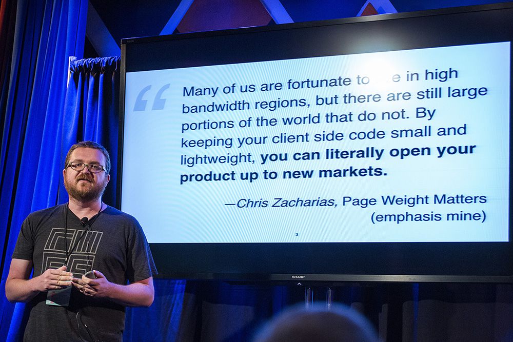
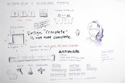
So... I'm Rachael. And I'm going to talk to you today about development operations and some tools. I work at OpenTable, as the user interface engineer. Which means I fall about here on the spectrum. On the other hand, this is where DevOps was
born. So what does DevOps have to do with user interface development? I'll give you a couple of examples. If you've ever, like, had a situation like this, where you expected the button to be on the next line, and not next to the
input, and something is clearly wrong, but it's really easy, and... You've just got a typo. There's tools that will help you spot that. Not just in your IDEs, but also in a pipeline. Or in a situation like this. You are using
your CSS properties. And the standard versions are running on browsers. So there's these specific data prefixes, but not only are they prefixed, but the implementations are slightly different. So writing this every time is really slow.
There's also situations like this. QA takes a look at a page that you think is finished, and they find an inconsistency between two browsers. How can you spot that earlier, verify that you fixed it, and keep anything like that from
showing up again? Those types of problems and more can benefit from culture and tooling sometimes associated with DevOps. If you've never heard of DevOps before, or the name is all you've heard, you may be wondering what exactly
it is. And that's actually a matter for a lot of debate. But there's a common image in descriptions of DevOps that reminds me of a situation we've probably all encountered. You know when you're working on a project, and
there's someone else who's doing all the design? They spend these long, intense hours laboring over a Photoshop file. And the first that you see of this is when they email it to you. You're expected to immediately code it
up. There's a lot that we can't tell from these files usually, like how to handle names that wrap when they don't in the picture, or how to fit them to smaller screens, and a big thing is like... This should definitely animate,
right? We can't tell from the static image how things should move. So... Even if we get notes that give us a hint like this should slide out, that gives us a lot of wiggle room. (laughter) All right. So it turns out that design complete
isn't nearly as complete as it sounds. In a work flow like that, it's almost like there's a wall between the design phase and the UI implementation phase. And when we try to pass our work over that wall, sometimes important
things bounce off and hit us right in the face. Aside from being figuratively uncomfortable when that happens, it delays our projects. So we've probably all heard that designers and developers barely speak the same language. It turns
out actually that developers and other developers have that problem too. There's traditionally been a similar wall between application developers and operations. And this wall has been a barrier to taking ostensibly complete code and
putting it in front of customers. I've got a hungry kitty there. DevOps is often said to be about getting rid of that wall and getting features in front of customers much faster. And DevOps does that with a culture that's focused
on improving communication, cross functionality, measuring things, and automating them, and in general bringing more dev into ops and more ops into dev. For example, one thing that's associated with DevOps is continuous process improvement.
That word process is a major keyword. Because one way to bring a little bit more ops into our dev is to recognize that operations is not just a name for a role at an IT organization. It actually refers to how we operate. The processes we
rely on to ship products. So let's take a step back and talk about what process really means in this context. When I started making web pages in the '90s, I would brainstorm stuff by drawing code on paper. Layouts. I was a real
artist. (laughter) Then I designed graphics, in PaintShopPro, I implemented it by writing code in notepad. Not notepad++. Nodepad. And then verified it by checking it in browsers like IE, Opera, and Netscape. And when I was ready to release
my work, I put it on a server. My process was very simple, my tools were few, and I personally interacted with all of them. When I started working for larger companies, more parts of that process became the responsibility of other people.
I worked with products managers, designers, back-end developers, database programmers, sysadmins, all sorts of people. The increased complexity and increased scale of the products that we were creating together required more rigorous processes
behind everything. Especially things that I guess I felt were deceptively simple, like copying a file with new code on it onto a live server. There is a huge amount that I don't know about my co-workers' specialties, and since
the technology landscape is constantly changing too, it's really easy to end up with more of those walls between us over which we try to toss our finished products and probably occasionally shout at each other. Process improvement aims
to fix that. How? We're in technology so we apply technology to the problem. We also are experts at all kinds of things. Abstractions, writing code, User Experience. We apply all the things we know about that to our process and by doing
so, improve it. So here's how I think of process. Our overall project really actually echoes that simple '90s work flow. Only now it's an organization. It starts with ideation, progresses to design, and then to implementation,
and to verification, and finally to release. DevOps is primarily concerned with the implementation, verification, and release parts of the process. Product and design concentrate more on the ideation and design parts of the project. Representing
implementation as one thing is a little bit deceptive. There's actually a lot of cooperative implementations going on in that phase, and what we really need to do is parallelize them. Otherwise we're going to make this same old
mistake over and over. Tying incompete UI development to the detriment of both. We know better than to do this. You take a UX design process -- it might involve something like brainstorming, prototyping ideas, in different fidelities, doing
usability tests, and ultimately producing something to hand off to the implementing team. This process can -- although it doesn't necessarily mean it does -- happen completely independently, and best of all, it has a clear deliverable.
Just like design, UI development can benefit from having a formal process with two major goals: To better support design needs and to make UI code easier to integrate for UI developers. There are two questions we need to answer. What are
we delivering and what is the process for it? The answer to what are we delivering is definitely more of an architecture question, but it interacts with a process question. I have found that UI components are a pretty compelling answer.
So let's talk a little bit UI components, what they are, and why they're so good. I define a UI component this way. There's ideally a single file that you import. That file already includes or is able to pull in everything
a user interface object needs to function. JavaScript, CSS, images, html, and even copy. To use the UI component, you use a custom tag. UI components get us closer to our goals of improving our process. Better supporting design needs and
increasing the reliability of UI code applications. It helps the design, because you can enhance a component over time, with all the details that make an interface engaging and have that great design everywhere, consistently across a product.
Breaking whole page comps down into smaller constituent parts allows us to start designing in the browser sooner. And we avoid that problem where we can't really change without involving designers, because if we change one part all
the other parts fall over. And as time passes, we can start to prototype different experiences for new features with our already production quality components. UI components improve the reliability of UI component applications by encapsulating
the scripts, styles, and markup that need to work in concert behind a single custom element. For example, internally controlling the template of the UI component reduces the chances that the DOM will change in a way that breaks styles. The
single element also makes a UI component easier to use, because instead of having to change something in html and in JavaScript to enable an option, a single attribute on the custom tag can transparently orchestrate things. That's perhaps
the most important thing that with UI components, we can provide a clear programmatic interface that simplifies complex UI-specific concerns for other developers. So because UI components are components, they help clarify our process too.
Giving us that clear deliverable that we need. And it can be specified, documented, and tested. They also allow us to update UI code without also having to update application code or the other way around, which is really nice. So that answers
what we're delivering. Now we have to figure out what the right process is to produce it. Because while delivering a UI component is a really good start, we have to have something to keep us honest. Something to make sure that the UI
component continues to work as advertised, every time we make a change. This is where we go to the tooling. The tools that we'll be talking about help us create an automated pipeline and support our ever-changing UI process. An automated
pipeline isn't the abstract kind of bird's eye view of our process that we've been talking about so far. At this point, we're ready to zoom in and think about when we actually sit down to write code, verify that it works,
and release it. At that point, there are a lot of specific routine tasks and enhancements that we can automate. Then if we run these tasks in a sequence automatically, the result is an automated pipeline. Having an automated pipeline is
a good thing for several reasons. If we don't automate, we have to do every granular thing in our process manually, and we have to remember to do it every single time. So the more of our process we can automate, the more we can do with
our time. We free ourselves up to pay attention to the parts of our jobs that require creativity. Automating a pipeline makes us all work faster too. Although it takes time to set up an automated pipeline, it's generally quicker and
more consistent than doing it manually, which results in a net savings of time over time. Second, automation helps prevent human error. We all make mistakes. An automated pipeline helps catch them before it becomes a problem for customers.
One of my co-workers also says -- UI tests stop me from making a mess. I don't have to understand 100% of the stacks. I can make changes and know that I'm not going to break parts of the code I don't usually work on. Automated
pipelines make it easier and safer for people with varying experiences and varying specialties to contribute code. That answers how we're going to produce it. We're going to create an automated pipeline to support our process.
From here, we'll talk about the types of tasks that we want to include in an automated UI pipeline, and why we want to use them. Then to wrap it up, we'll talk just a moment about actually setting up an automated pipeline. There
are a few loose categories to tasks that we'll set up. Build tasks, test tasks, and distribution tasks. Build tasks help during the implementation part of the process, test tests help during the testing part of the process, and distribution
test help during the distribution part of the process. So we're going to start with build tasks, specific tasks that are part of the pipeline. Building comes first, because most of the time the code you test will be the code as it runs
in the browser. You may have already used some tools that fit in the build category. If you've ever used a CSS pre-processor or even a CSS validator. There are three specific build tests we'll talk about. Linting, pre-processing,
and post-processing. So let's start with linting. What's the difference between validation and linting? Both analyze code for errors of syntax, but code that is technically valid will also violate industry best practice. So a validator
will catch all the issues on the left, and a linter will catch what's on the right. Linting typically makes validation irrelevant, though. In the introduction we looked at that typo. That broke our file. A CSS launcher will spot the
typo and warn us about it. A linter can also make sure code matches code style guidelines, which is why I think it's good to have a linting step in your pipeline instead of relying on everybody's individual editor. Generally the
code that you should lint is the processor code. So if you use a pre-processor, you should definitely lint that. CSS linter won't be able to handle the syntax issues here, and the Sass linter will have its own features. And if you're
into that sort of thing, a pre-processing step. Some people prefer pre-processors. Generally the reason is that it has functionality like logic, control structures, variables, math, mixins, all kinds of stuff. If you're comfortable
using those features, they can definitely make your code easier to write and more maintainable. But what if you don't want to deal with a different language? After all, CSS is probably going to add variables. Why not just try them out?
And for math, well... There's the calc function, and that addresses most everyday needs. Instead of using mixins for prefixes, it would be a lot simpler to just write the standard thing. Have something else do it for you. And that's
where post-processing comes in. This is the baby version of post-processing. Which is going to sound silly, right after that talk. But I'll say it anyway. The difference between pre-processing and post-processing is pretty much what
it sounds like. With pre-processing, you write Sass, and you get CSS. After you do your processing. With post-processing, it's more like you write CSS, it's not in a different language so much, and you get transformed CSS, after
processing it. At the start of the presentation, we looked at a problem that existed, because some browsers didn't get to support the standard version of the property. There are some post-processors -- auto prefixer, for example --
that solve this problem by taking stylesheet standard CSS properties and outputting other properties. These not only save time but actually help with maintenance, because they stop outputting prefixes when a supported standard is wide enough.
So the next category of tasks that will be automated are testing related. Testing should always occur before contributing code. And you should always test built code. If you have ever visited a site in multiple browsers, or if you use browsershop,
then you've done some testing that definitely could be automated. There are three types of tests we'll talk about that are useful for UI implementations. Unit testing, visual diffs, and end-to-end tests. Starting a test can be
really intimidating. Testing really is a pretty specific area, and the vast majority of testing is not just CSS and html. There's also a lot of vocabulary in testing, including lots of different words for very similar things. Most of
which ends up being in contradictory ways with people, and some of which originated and are referred to in very different kinds of software development than what we do. There are numerous reasons why you should test anyway. Writing tests
gives us an opportunity to think of better implementations from another perspective, typically leading to better code. Test that the implementation works the way it's supposed to, and it helps us keep it working. When you test, you
can fix bugs, refactor, and change the design while ensuring we haven't broken something. If we have, the test should fail and we'll know before we release it. It's pretty emotionally gratifying to see tests passing. The first
type of testing that we're going to talk about is unit testing. A unit test verifies functionality of a piece of source code. With JavaScript, this can be really straightforward. You take a function, pass in an argument, and you verify
that the value returned is correct. With CSS unit testing, it's not quite as clear. If you have a button, you can definitely check that the computed style of the button matches what you wrote. But correct is a little bit more of a complicated
proposition. The cascade and inheritance of styles means that we often don't have or even actually want a static checklist of exactly what styles should apply to the button component. There are things that we want to be different, depending
on the context link. This doesn't make unit testing in CSS impossible. It just means that what you test takes some extra thought. In our button example, we have two different structural variations of this button. One is this default
button. Set to display inline, next to any content next to it. And this obviously would have to be inline block or inline flex. But there's another structural version that's supposed to get its own line and completely fill space.
And that would obviously have to be either block or flex. We could check those properties for the CSS unit test under any circumstances, because any other values than those for those particular two structures would mean that something fundamental
is broken, in a way that is likely to affect the way the button looks or acts. So those are the kinds of rules that you could consider unit testing. However, because of the context sensitivity of the cascade and inheritance, visual diffs
are often a more effective approach to CSS testing. My perspective is that CSS unit tests are best as an addendum to visual diffs, because then they can provide useful specifics about the cause of the diff. So remember at the start when
we looked at that layout problem that only showed up in one browser? And I asked -- how do we spot this early on and make sure after we fix it that it stays fixed? Visual diffs are really useful for verifying layout in early release. It
automates the act of opening a page in a browser and taking a screenshot of it. When we first release a UI component, we take a look at the screenshots and determine that it looks the way that it should. And if so... We make that component
the baseline, and we save it. After that, the next time a process runs, the same automatic screenshot is taken. Only now the process has something to compare it to. So it'll compare it to baseline. If the two screen shots are different,
like they are here, the visual diff test fails. The process doesn't eliminate the need for manual testing, but it decreases it, because we only need to personally review the screen shots when we're creating baselines for the first
time or when problems occur. Visual diffs run a lot faster than manual testing, so you can test in more browsers and more screenshots with much less time. Another interesting thing about UI components specifically is how they interact with
visual diffs. An individual UI component actually becomes a visual unit. With a limited number of variations that you can thoroughly test and release that way. I don't know how this happened. So there's one last type of testing
to talk about. End to end tests. This is one of those pieces of testing vocabulary that can be pretty confusing. Sometimes you'll hear when people tell you what end to end tests are -- that they should run against a fully integrated
product with all real services and all real data. Other times people say no. At heart, end to end tests step through scenarios to simulate real user work flows from beginning to end. For a simple example, I go to a page, put in an input,
type in a name, click a button, and verify that the name was saved. End to end tests are good for verifying that user interfaces actually are functional, that clickable areas are clickable, and that menus will open or close. For example,
a button UI component can have an end to end test that sets up a button, tries to click the button, and verifies that an action occurred. If there's an issue with the button that made it inert like the one below due to the disable attribute
being present at the wrong time, the end to end test would catch that. So let's talk about a couple of specific testing techniques. Test pages and mock data. Before we move on to distribution. The UI components create test pages. The
test page for button contains nothing except the code required for the button component. The test pages are multipurpose. They're using for developing on, as a place to view work in progress, and the same test page can be used to run
visual diff screenshots and end to end tests on. Mock data is also really useful when testing user interfaces. Mock data is data that is specifically there to provide stable information to test with. It isn't real data coming live from
a production server. An example might be a mock guest list. Setting up mock data makes it easy to test scenarios like this one, where the label of the button is very short, versus very long. The longer text could have overflow and look bad,
or if not, it could have broken the layout of the page in the button. Setting up a test page with mock data and using visual diffs ensures that does not happen. Our code is now all built and tested. The last category of automated tasks that
we'll cover are distribution-related. Distribution starts when we take new verified code and share it with others. If you've ever used NPM to consume an Open Source library or plugin, you've benefited from formally distributed
code. Specifically we'll talk about pull requests, versioning, and making releases available to package managers. It's all well and good if we have a build process and test pass that each individual developer can run locally like
this. We do need that. But the automated pipeline really becomes important when we move away from our personal laptops. For example, we can integrate our pipeline into Github. When using the Github work flow of forking a repository and submitting
a pull request, we can use continuous integration and tools to test -- automatically test the pull request code using the pipeline that we just talked about. A continuous integration tool is a tool that specifically provides functionality
that helps achieving a practice of each individual developer, merging their code into the main code. Multiple times a day. And you can see that here that would be useful, if you automatically build and test every pull request -- it makes
it really clear which pull request can be safely merged. Since that pull request passed tests, it could be coded and then merged. At that point, the repository would create a new version of the UI component that is theoretically ready for
release. We can continually use the continuous integration tool to automatically merge a component. So let's talk about versioning. Versioning is good even just for talking about versioning. For example, one of your versions is totally
messed up, despite your best efforts, or you have a bug, you can say -- make sure you have at least version 1.2.3. And when it comes to versioning, it's good to look at a versioning document. Another useful thing about versioning is
that you can use that version number as a tag on the associated commit. And when we then use continuous integration tools to make that automatically -- tagging a UI component with a version number, as simple as it is, makes it consumable
in at least two ways that I know of. First, someone can go to Github, find the release, and download it as a zip, second, we can publish our component to bower, and they can use bower's package manager, since bower uses Github. This
is the minimum to formally release a UI component. It takes time to build up to this work flow, though. You need to have Github coverage, set up the continuous integration tool, and that doesn't happen overnight. So that covers the
basics of what an automated pipeline is and what we kind of want it to do for UI. From building to testing to distributing code. Now when we know specifically what we want our pipeline to do, let's take a peek at how to set it up. I'm
going to put some actual setup code on Github there, if anybody wants to look at it. So there are two basic things that we need. Repository, code editor, node.JavaScript, NPM... And if you're a (inaudible) addict like me, (inaudible).
Weird. All right. I've gotten to where I actually really like the command line. It takes me back to my MUDding days. However, it's not actually for fun. We can directly use what we do with these command line tools the way we can't
with GUIs. These are great for providing interfaces to individuals on machines, like Scout. Unfortunately, we can't effectively automate them. So instead, we'll use grunt to automate all of our tasks. There are other options, but
I don't really recommend one over the other. One of the nice things about grunt is that there are a lot of plugins that can be used with minimal effort. Assume that that's a component first, like one we talked about -- component
sets up styles. First we need to install grunt. (inaudible) we use NPM. Then to use grunt after installing it, we load the grunt file. In the grunt tile, you just need to load the path that you're using, configure specific tasks, and
set up any other tasks. Setting it up is really simple. This for example would set up CSS lint, as we talked about. So... You could basically do this with all the various plugins that I mentioned, and it would just be a matter of configuring
them. I'll put the rest of that online. So the whole takeaway that you have on this is maybe a little bit of context, and about bringing operations more into UI. And also the ability to have some... To work a little bit better with
operations people at your office. So that's about it. (applause)
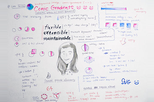
One, two, three. Is it working? Sort of. Okay. Hi, everyone. I'm Lea. If you've ever heard about me before, it's probably due to a bunch of my Open Source projects. You might have seen some of them. The rest are on Github. I'm an invited
expert on the CSS working group. I get together with other people four times a year and we spend a lot of time discussing use cases of decreasing likelihood. As my sort of day-to-day job, I've been exploring academia for the past year.
I've been doing research at MIT. And I recently published a book with O'Reilly ten days ago. After spending almost two years on it. I hope you're not too sleepy after lunch, because we're going to be doing some live coding
today. But enough about me. Let's talk about pie charts. Pie charts are everywhere. On XKCD, on Windows 95, on walls, on genitals, on food, on blackboards, and I really don't need to convince you that pie charts are everywhere
on the web. You've probably had to do some, probably had to use some weird huge JavaScript framework for it. Why can't we make pie charts with CSS? Or can we? It's surprisingly difficult to create even the simplest pie charts
with web technologies. And we're sort of going to explore this today. Take a moment, looking at this extremely simple pie chart. This is like as simple as it gets. It's two solid colors. It's only showing one percentage. Think
about how you would do this with CSS. And I'm sure you're having some ideas,and we might explore some of them during the talk. If you had some idea that we didn't explore during the talk, please tell me afterwards, because
I'll be very interested. So in certain cases, if our percentage is a multiple of 25%, it's pretty easy. We could do it with borders. As I'm sure you've tried -- something similar. We could do something like this. Let's
make it bigger. And give it a border radius of 50%. Make it circular. And then we could do border-right-color: transparent, and end up with a Pacman effect. We could even use animations to animate it like this. Get Pacman. But this is about
pie charts, not Pacman. So we could give it a background. Let's make it my favorite, magenta, and then rotation... And this would be a 25% pie chart. And you could make 50% pie charts as well, and 75% pie charts as well, like this.
But not much more. So... Yeah, this is not actually a solution. I'm kind of trolling you a bit here. Let's move on to the actual solution. Well, the first one. So when I first thought about how to create pie charts with CSS, I
thought -- oh, it's easy. I can use a pseudoelement that I'm going to skew to create all the possible variables. So let's explore this solution for a bit. We would still make it round, we would add a pseudoelement. This is
pretty easy stuff. You guys know it very well, I'm sure. Let's give it an absolute position. A background, so we can see what we're doing. We want to see it, because it has no dimensions. Let's give it some padding of
50%. Now it has the same dimensions as our main element. Let's give it some offsets. We want it to be 50% from the bottom. And 50% from the left. And there it is. We need to see what we're doing, and also, we don't want it
to bleed over, so the main element -- overflow hidden. There's our 25% pie chart again, but now we can apply transforms to it, and we can apply a skewing transform. Let's make it 5 degrees. So as I'm increasing this, you can
see I'm sort of getting there. It's not quite right, it's not quite centered, but I'm getting there. You probably figured I can apply transform origin to control which point in the elements that is fixed. I want the bottom
right... Sorry. The bottom left -- I'm terrible with directions -- I want it to stay fixed. So there we go. I'm almost having a pie chart. Usually we'll start from the middle point here, and they grow like this. So I want
to do that. So let's flip it by applying a horizontal scale transform. Now it grows in the right direction, but I still need to rotate it. Let's apply rotation as well. 90 degrees. Minus 90, sorry. Other direction. So there is
a pie chart. It goes through... If I want... Yeah. Minus 90 degrees would be zero, and then I can make it grow. The problem is... When it goes over a certain point, it kind of starts showing the thing here -- that this is actually a skewed
pseudoelement. The obvious solution would be to increase the padding. And then I can keep increasing this, and at some point, it'll break again. I make it 5,000. That's how it works, right? You kind of fiddle with numbers until
it works. But in this case, it will sort of work until 89 degrees. Now it will break. And there's nothing you can do. You can make this basically infinite, and nothing will work. Because essentially if you're skewing an element
90 degrees, what happens? You get something with infinite length and zero height. So even though I can sort of make this work, and I haven't shown you how to make percentages bigger than 50%, but as long as you get to 50%, you can sort
of imagine -- I just flip the colors. And flip the element on the other side, and I can sort of get it to work. And yeah. This is how we would do percentages over 50%. I can just... You will see how it goes. I have to override the colors
and basically flip them. It's not particularly great, though. So even though I might say that -- there, I solved it -- I made the pie charts with CSS, and there is my solution, it's kind of a horrible solution, isn't it? Maybe
something with CSS is not good enough. There are so many solutions of -- yay, I made this with pure CSS, and look at my code! And I look at this, and I look at, like, the code with 200 or 300 lines of cryptic CSS, and I'm like... This
looks like somebody vomited CSS on the screen. I don't understand what the hell is happening here. This is not straightforward. It makes no sense. I don't know how to change the most basic things about it. So just making something
with CSS, or just making something that works in general, regardless of the language, is not good enough. A good solution needs to have, I think, three things. It needs to be flexible, it needs to be extensible, and it needs to be maintainable.
So what do I mean by that? As for flexibility, I mainly mean how easy it is to change it. So is it possible to change it at first? Like, some solutions depend on specific numbers, on specific constraints, and you just can't make them
work with -- if the conditions change even a little bit. But even if you can change things, can you change them inline? If I want to write a component, and use JavaScript to display percentages -- which is common. I might not use JavaScript
to change the colors. Because that would be mixing styles -- but it's very likely I want to have a JavaScript component depending on something in my script, and I should be able to do that. I shouldn't have to modify the actual
stylesheet to change the percentage shown on the pie chart and I shouldn't need to have multiple classes, one for each percentage, or ugly things like this, which I've seen actually happen. And also, even if something is possible
to change and it's possible to change inline, how easy is it to change? How many changes do I have to make? Do I have to change code all over the place to make a simple edit? Like in ten places to get a different color on the pie chart?
All sorts of transforms and weird numbers to change the percentage? How many places do I have to change for the size? These are things that you will almost certainly need to modify, and have variations of, in a pie chart example. But that's
just an example. It applies to pretty much every component. Like how many -- I think of -- if there are big components of good code -- being possible to change it with as few edits as possible -- in software engineering, this is called DRY,
which stands for don't repeat yourself. There's the opposite, which fewer people know, called WET, which stands for two things. There are two alternative explanations for this. We enjoy typing. Or write everything twice. And I'm
sure you've all seen CSS that can be very WET. The second part is how extensible it is. Like, this doesn't quite have to do with changes, but more like -- how might... How I can... In what way will I want to make it... To make
my component do more things in the future? For example, it might work perfectly for -- if I only want to show one percentage in my pie chart. But often pie charts show multiple percentages, multiple segments. Obviously this is very specific
to pie charts, but there are questions for this for every component we might want to make. How am I going to want to extend it in the future? Even if you don't think you will want to now, chances are, the future will prove you wrong.
So in the example of pie charts, how easy it is to have multiple segments, or can I animate it. Either to show the actual percentage with a transition, or to just animate the entire pie chart from 0 to 100 continuously, to make a timer.
I'm sure you've all seen timers like this. Or perhaps can I apply effects to it? Do my segments have to be a solid color? Can they be gradients or patterns or textures or anything? Those are three things I might want to possibly
extend it in the future, but you can think of others, I'm sure. And how maintainable is my code? This is also extremely important. Part of it... And that's just a heuristic. You might have tons of code that is perfectly reasonable,
but in general, the more your code increases, the more difficult it becomes to understand. So the less code it requires, the better, generally. There are tons of exceptions. Don't take it as -- this is just a rule of thumb. Also does
it require extra elements? Then I have to look at the HTML, figure out how to change the HTML as well if I want to make changes. Not just change the CSS. It just increases the overall complexity. And mainly, how straightforward is it to
change? Can I figure out -- for example, to change the percentage -- can I figure out what I have to change, or do I have to do complex calculations? How straightforward is the code, overall? So let's look at this example. First off,
it's extremely hacky. You probably felt kind of dirty as I was increasing the padding here. This is the kind of code that makes me want to go afterwards and wash my hands. It's horribly dirty. The skewing is also kind of weird.
Like, I don't know what percentage is being shown here. Just by looking at the code, without looking at the pie chart. What does 30 degrees correspond to? I need to actually think that... Oh, it goes from minus 90 degrees to 90 degrees,
or does it go the other way? You don't want to be picky like this. To have a percentage that's more than half, you need to edit three times. And to change the color, even if we just focus on this pie chart, to change the color,
you could change the background here. Let's make this yellow-green. So that's good. Although if you want to override it on the more than 50% case, you would have to change it here too. But also, if I want to change the other segment,
and make it... I don't know... This nice blue... Also... Wow. My slides are a bit stretched, by the way. This is not an ellipse. It's an actual circle. You just have to trust me on that. I can't prove it to you without turning
my laptop. So I have to change it in the pseudoelement. So that's not good for inline styles. However, I can apply this trait. I can set color to... The color I actually want for my second segment. And then use current color here, which
always refers to the body of the color property. And if I set the body of the color property here, then it will be black. But if I set it from the parent, because it's inherited, color will refer to that. So I can set an inline style
of color on the main element, and it will... That's a weird rendering. It's not supposed to look like that. Yeah. Rendering. I went back, changed the slide, now it works. So... I can change the colors with inline styles. If I want
to change the percentage, though, I need to make an edit to the degrees of skewing. I need to change the background. I need to change the color. And flip them. Let's change this to blue as well. And wait... Background... Yellow-green.
So I would need to flip them. And I would need to make this... The blue. Yeah, it works. I don't know why it didn't update immediately. It's supposed to. Maybe it's Chrome. Maybe it's my JavaScript. But... It has
nothing to do with the CSS. So I need to flip the colors. That's two edits. I was need to change the angle here. That's one more edit. And if I want more than 50%, I would need to also remove the skew, the scaling, the flipping.
So that's another one. So actually four edits to change the percentage. If I want to go from 50% plus to less than 50% or the other way. So actually, how flexible is the solution? Well, I can change the colors easily. I can change the
size easily. The value, not so easily. And it's not possible to set the value inline as well. I need to actually modify the pseudoelement. So that's kind of bad. I can sort of have multiple values by extra children. Instead of
pseudoelements. I use the pseudoelement here for the segment I had, but I could use the child instead and have multiple children and rotate it. It's not great, but it's possible. Also it would be possible to animate. I would just
flip the colors halfway through and I would animate the... You can see how it would work. But it doesn't make me feel great. And yeah, sound effects would be possible. I could just apply a gradient on the segment here instead of a solid
color. Well, actually, if I'm using the current color solution I couldn't, but I could at least apply a gradient here, instead of the solid color. Sound effects are possible, even if they're not super easy. I don't have
an extra element, that's a plus, but it's quite a bit of code. And I'm sure you've noticed how horrible and messy and hacky it is. So overall, it's not a great solution. So how else can we make pie charts? Skewing
transforms are out of the window, but maybe I can hack rotations. Maybe I can progressively unveil something can rotations and kind of show something like this. Let's explore this solution for a bit. So here I have a circle to begin
with. And instead of giving it a solid color, I'm going to color it with a linear gradient. To make it half magenta. And half gold. And it needs to be vertical. So there it is. And it needs to be... I don't actually want a gradient.
I'm just using a gradient to... Color half of it in a different way, and half of it with a different color. So there we are. And now I'm going to cover this gold segment, this gold half of the circle, and progressively unveil it
to create my pie chart. So let's do that. Let's give this a background of... I don't know. Some random color. Let's make it blue. Just to see what I'm doing here. Margin-left. But I only want it to cover half of
my circle. Let's give it a border radius. I obviously have overflow hidden again, but I don't really need to. I can just give it a border radius that will make it a semi-circle. How? I will use the extended border radius syntax,
which means different values for every corner and different horizontal and vertical values. So my top left corner would have a horizontal radius of zero, top right corner would be 100%, because I want the entire length to be curved. Look
at the semi-circle behind it. The whole thing is curved. Same with the bottom right corner, bottom left corner also doesn't have a radius, and vertically, I want them to be 50%. So there's our semi-circle. And now let's make
it magenta. So this would be our pie chart, if it was showing 0%. Now I can start rotating this, which is the fun part. So you can see that it's already sort of getting there. I'm sure you can spot what's missing. Because
I don't want it to rotate -- right now it's rotating around its circle, which is around here. I want it to rotate around the middle of its left side, which is here. So I would give it a transform origin of left. And actually...
Here it is. We already got the pie chart up to 50%. And I just have to change this value. And I don't even need degrees. I can use turns. Which is a new unit. So 0.1 for 10%, 0.2 for 20%, and so on. So that's really straightforward
to change. Now there's a question of how do I make the other half? How do I make percentages that are over half? Because if I keep animating this and make it 0.6, it starts breaking. This is not 60%. This is 40%. And it's also
kind of wrong. So let's make this smaller again. And I'm going to use the bottom -- I'm going to style the bottom pie, which has the plus over half -- to make it display 60%. And how will I do that? This will become pretty
obvious once I show you again where our pseudoelement is, by giving it an outline. So this is our pseudoelement. And what is 60%, essentially? It would be... The pseudoelement just needs to be gold. That's all that I need to override
in the pseudoelement. So to make -- to show a percentage over half, I need to start the rotation again from zero. That's one point of it. And also I will need to change the background to gold. And then I can just keep rotating it, and
I can get all the percentages I want. This would be 70%. 80%. 90%. Wait a second. Ah, yeah. Yeah. I have to start from 0.1 again. And yeah, this is 60%. This is 70%. This is 80%. And so on. So... Well, first off, I don't want to repeat
the color here, so I will apply the same trick. I will use the color gold. I will use current color in the gradient. And also here. So to go over half, I just need to set the background to current color, and start the rotations again. So
if I want to animate it, it's not super trivial, but it's more straightforward than it was before. I need two animations. The first one is probably kind of obvious. The rotation goes from zero to 0.5 turns. Twice. Up to... From
zero to 50%, and then from 50% to 100. It animates again from zero to half a turn. And also I need another animation for the color. Which flips it halfway through. And you might be wondering how will I flip it halfway through without actually
animating it? But we'll get to that. Actually, let's make this one inherit. And this one current color. The animation will be easier that way. So if I wanted to just animate the rotation... Wait a second. Actually, you know what?
Maybe this should be the way it was, and I shouldn't fiddle with it. Because that was working. Yes. Now it's 0%. So... You can probably see how that would work. >> Transforming the tube keyword? >> Oh, no, I don't
need to. Oh, yes, yes, I see what you mean. By the way, we will have eventually a rotate property. It's been discussed in the group. Because many people tend to use... Tend to forget to use the transform. So... This would be the rotation.
We want to make it linear, because we don't want it to accelerate. And for the color, we could start with something like this. Make it infinite as well. Make it linear as well. And you can see that this is sort of smoothly going between
the two. And this is because, obviously, the linear function -- which means it linearly interpolates between gold and magenta -- but I can use step start to just make it flip halfway through, and it's halfway through because I've
used 50% here. Essentially step start means -- don't smoothly animate it. Just go from this... From the first to the second key frame. And I don't want any animation. Which is exactly what I wanted here. So how do I combine these
two? I just use two animations. And let's hope they line up. Uh... They don't. I think I need to... Yeah. Because... I was using... Yeah. So if I was using step end, which just flips it at the end, then it works. (applause) >>
It will bite us later, but let's leave it for now. So I do have an animation now, which I can use as a timer of sorts. But I didn't actually want an animation. I wanted a static pie chart that displays the percentage I want each
time, and I wanted multiple pie charts to show the percentages, but still I wanted static pie charts. So animations are kind of cool, but not what I wanted. So... How I can actually use this to display percentages without having to modify
a bunch of values every time? The browser -- given that I've written this animation -- the browser knows how to go from 0% to 100%, and I basically told the browser how to go from 0% to 100%, which is how I created this animation. So
all I need to do is tell the browser to stop it at the point I want. So how can I do this? This is what I tend to call static interpolation, which sounds kind of like a fancy academic term, but all it is really is... Interpolation is if
you have a start and an end file, how do you figure out the in between states? And static is because it's not actually moving. So let's assume I have five divs here, which have a magenta background. And if I apply an animation
to them, that makes them gold... If I apply this animation, over, let's say, one seconds, infinitely, so the browser knows how to go from magenta to gold. So I can use animation place state, paused, to pause it at any point, and now
I can increment it and increment it and pause it at any point. I can put it on hover and any point I hover over them, they stop, but how do I control at which point they pause without having to interact with them? There's a property
called animation delay which you've probably used or have heard of. So what it does is -- our animation, if it wasn't a linear progression, would look like this. Well, if it were from gold to magenta, and not the other way around.
And if I use a delay of one second, it would look like this. You know this already. The thing you might have not realized is that I can also use negative animation delays. And what they do is this. And if I use the minus, -4 seconds, and
remember, this animation is supposed to be 10 seconds, it would be like this. So if this animation is paused, and I use a negative delay, I can basically step through at any point in the animation I want to. So let's go back to our
animation, which is paused here. If I use animation delay, say... Let's make this 100, so I have nice round numbers. So 25 seconds. This is 25% through the animation. If it's 50 seconds, it's halfway through the animation.
So basically I can keep decreasing this, and step through my animation statically. So a lot of the time, this comes up when you're doing animations. You have an animation that lasts for half a second and you want to debug it. You're
like -- I can't see what's happening. So you say -- maybe I can make it slower. So you make it 10 seconds and sit through... Watching it animate... Very... Slowly... To figure out what you're doing wrong and debug it, and
every time you change something, you have to sit through the entire animation again, and wait for ten seconds, or 20, or whatever. But actually, if you use this, you could just step through at your own time, and go directly to the point
you want. Say I want to see what 75% of the animation looks like. Easy-peasey. I just look at it. And there it is. And here I have different classes. This is 25, 75 -- so I can style them differently, and have a separate animation delay
for each, and simultaneously step through my animation and give them different colors. So this would be -50. This would be -75. And yeah. Okay. And let's reapply this animation. Okay. There we are. And now for the tricky part. What
do you expect should happen if I make this -100? Will it be gold? You would want it to be gold. Actually... It's going to be magenta! Why? Because the animation starts again. We're stepping through the animation that we have, and
at 100%, it just goes to 0%, and it starts again, and our first frame is magenta. So I could do something awful like... This. And it would work, but I don't want to, because that makes me feel dirty, and not in a good way. So what I
can do is... First off, I'm just stepping through the animation statically. I don't need it to be repeated infinitely. And I can use animation fill mode, which basically... What it does is... Let's comment this out and show
you an actual animation, what it does. So if this is not paused, and I use animation fill mode forwards, and let's reapply this and make it shorter. Because I don't want to wait 100 seconds. I'm already pressed for time. So
what it does is... The animation gets stuck at the last frame. So if I apply this in my case, which was the 100 seconds, and it was paused, and I was stepping through, then... The last frame would be gold. Just like I expected. So I can
apply this to my pie chart here. I don't need it to be infinite, first off. And I can do the animation -- and pause it. And don't worry that it looks kind of weird now. I will do animation fill mode forwards. And the thing is --
I need this to repeat twice. Because I want it to line up with the color changes, and this is one second. This is two seconds. So this needs two iterations. And I can use an animation delay of... I have a bad feeling about this. Ah, yes.
Because this is... No, wait. This is step start. Hm. Okay. This is weird. I think this was the point I remembered. Damn. Ah, wait! Yes! The total duration of the animation needs to be 100 to have anything useful here. Sort of... No... No...
Um... Hm... Not quite. And I have six minutes to go. So that's not good. Anyway, I can swear that it worked. (laughter) And I will probably figure it out afterwards and be like... Damn. But it worked, and I can just step through and
change the delay and it corresponded to the percentage, and it was glorious, but now it's gone. So let's assume that it works, and please roll with me on that. Because it did! So a rotated pseudoelement, I can change the color
pretty easily, the size pretty easily, the value with just one edit -- trust me -- and I can set the value inline, because even though this is a pseudoelement, I don't have a evaluation in my main element, so I can set it here, it does
nothing, and I can just inherit it here. So yeah. And it was working! So yeah. I could set it inline. Unfortunately, it's not possible to do multiple values. These are the things I've covered. It is possible to animate. We showed
that. And we can't really do any effects. Gradients or patterns or whatever on it. Some extra elements, but less hacky than before. So it's kind of better. Yeah, this is the Chrome bug, where it disappears. But it was supposed
to be a big Emoji like this. That's a Chrome bug. If you increase an Emoji up to a certain size, and I think this has to do with my resolution as well, it disappears. Try it. So yeah, it's not great. So our next idea might be SVG.
And most people, when they think of SVG pie charts, they think of something like this. Not much styling. And the weird path with very cryptic syntax. I can tell you what it does, but it won't make it any easier to type. Yeah. It moves
to like the top midpoint. Then it grows an arc to here and I have to manually figure out the coordinates of this. This is the 40.80. It's actually the coordinates of this element, of this point. And then it goes to the center and it's
not possible to animate, it's not possible to write. It's just designed to be generated by applications. So most people... Feel kind of bad about doing this. However, we have something else that we can use. And I will just... I
will show you what in a minute. So here I have a circle. Of where I have set the view box to 0 0 64 64. It means 100% in my SVG means 64. And these units mean nothing by themselves. It doesn't mean 64 pixels. It's just so I can
refer to numbers inside my SVG and have them mean something relative to the size of the SVG. And I have the circle inside, which I can actually style with CSS. And I can give a stroke, for instance, of gold, and I can increase the width
of the stroke. And here I'm just using the units of the SVG file. And there's this interesting property called stroke-dasharray, which lets you do dash borders by default. This is what it was designed for. And you can do all sorts
of interesting dash borders for it, and you can provide multiple values and do super custom dash borders, which you usually don't need. But it's insanely useful in this case, if I increase the stroke width so much to occupy my
entire circle. Which is 32. Because remember, my SVG was 64, total. So I want to increase the size of the gap here, after its dash, as much as the circumference of the circle. How much is that? So remember... Total width -- 64. Radius is
25%. So... 25% of 64 means radius is 60. So if we want to find the circumference, we need to multiply it by two and then by pi. Which means it's 100. Which is why I chose 64, actually. It was not random. It's so the circumference
can be 100, so I can easily show percentages in what's going to become my pie chart, and they just correspond to the percentage I want to show. And obviously I need to style it a little bit more to actually resemble the pie chart. To
make this disappear, give it a magenta background here, border radius to make it round, but yeah, that's about it. And the transform... Of maybe -90 degrees? Yep. And now I can show any percentage I want, and actually, all I have to
do is set the percentage here, and it corresponds like -- this is 60%. I don't have to do any complex calculations. I just set it as the first value in the dash array. There it is. No weirdness between 50% or... Yeah. It's just...
I just set the number. I'm going to animate it. Easy-peasy. I just use key frames from 0 to stroke-dasharray: 100, and... Let's make it 2 seconds linear infinite. There it is! No weirdness! (applause) Thank you. So... And this
is how you can do multiple segments as well. And also I've used an animation here. If you notice. When I first noticed the slide -- I'm sorry. A transition. Because these are just transitional properties. Animatable properties.
Dashoffset. That I can use to offset this by this. You can see here. Strokedashoffset -5. So supposes I have this segment. Dashoffset. Let's move it. And if it's positive, it moves it this way. Which is not particularly useful.
But if it's negative, it just offsets it. Which is very useful if I want to do multiple segments, like I did here. This is actually -- the CSS is working with composition, by the way. Like browsers. So never say that W3C makes specs.
It's actually mostly browsers. But that's just an aside. So let's review the stroke-dasharray solution. Easily change the color, easily change the size, easily set the value. You can set the value inline, I set an inline value
in my circle, and SVG lets you set it in two different ways. Both by the style attribute, and also because these properties are also attributes. So here I've used attributes instead, and their main difference from inline styles is that
they have specificity of 0. So be careful with that. Any style you set -- even with the universal selector -- it will override them. It's possible to do multiple values. We saw this. It's possible to animate it. It's possible
to do gradients and patterns, but they have to be SVG gradients and SVG patterns, which is kind of messy. You do need extra elements, but you can add them with JavaScript. Only 7 declarations, and it's pretty straightforward. You change
the value and the percentage changes. So SVG-dasharray is pretty cool. Is there a better way? So there's this thing called conic gradients. Which you might know from Photoshop as angle gradients. They look like this. In CSS. I can add
multiple colors. I can make... You will see what I'm making. You're probably already seeing where this is going. Oh, and I forgot. Blue. I can set a border radius here. I have a hue wheel. If you ever need to make a color picker,
there it is. Conic gradients to the rescue. I can make all sorts of crazy things with them. Let's see if anybody can figure out what I'll be doing now. If you can, just shout it. Not that I have a prize for whoever gets it first.
So time is up. It's a checkerboard. And... Well, this is not about hue wheels or checkerboards. It's about pie charts. But you probably have already seen where this is going. If I want to make a pie chart, let's say gold,
40%, and the rest being magenta, there it is, actually. Just one declaration. I want to show... There it is. I want to show multiple segments. Well... That's pretty easy too. Yellowgreen, let's make it. There it is. I want to change
the colors in one place? I want to change the percentages in one place? How much code? Three lines. They're defined in image value level four. And they're pretty awesome. Pretty much one edit to set anything. I can set the value
inline and just override the gradient. I can have multiple values. Obviously easy to animate. Sound effects would be possible, but eh. Super straightforward. Conic gradients are pretty fucking awesome. (applause) Except one thing. (laughter)
Yeah. Yeah. They're not supported anywhere. Anywhere at all. However... You're not powerless in this. Browsers prioritize what to implement based on what you guys request from them. Few developers realize how much power they have
in this. How much say they have in this. Microsoft has set up this entire user voice forum so that developers can vote on features based on what they want them to implement next. This is not just how IE works. This is how every browser pretty
much works. Just IE has become a bit more structured about it, because they got so much shit. So... If you want something to be implemented, and that doesn't just apply to conical gradients. That applies to anything. If there's
a feature that you really like and you want it to be implemented, speak up! Don't just complain to other developers. Tweet about it. Post in bug reports. Vote in user voice. Make a thread about it, if it doesn't exist. Be vocal.
It doesn't matter where. And yes, it's obviously better if you post in a bug report, because then you reach developers directly. But it doesn't really matter. As long as there's noise, developers will notice, and the
squeaky wheel will get the feature. It's how it works. So if you like conical gradients, and I think they're awesome, you should make noise. But apart from that... I've shown you... I've shown you conical gradients here.
And this is basically just a browser-based presentation. So how did I do it? So actually... This uses prefix behind the scenes to process the CSS, and it picks up the gradient references and draws them on a canvas and injects it inside of
SVG so you don't have aspect ratios, and then it injects it in the background, which sort of looks like this. Actually. And I haven't... So since I wrote it for this talk, this is not public anywhere, but I was planning to release
it during this talk. So this is my repo. It's private. But I'm going to make it public right now. (applause) And let's hope the Wi-Fi works! Waiting. Waiting. Waiting. Come on, Github! Yay! Oh, no. Wait. Still private? That's
weird. Still private. What the hell did I do? Yes, conic gradient. Okay. Uh-huh. Uh-huh. Uh-huh. Yeah. Yeah. Yeah. So... What the hell? I can't seem to make it public! Github wants me to have private repos for some reason. >>
It's loading for me. >> It's public! (applause) >> Woo-hoo! That's the URL. These examples are actually live. You can implement repeating gradients, so you can make star bursts like this. Although it's a buggy.
It has this artifact here. I stayed up last night, but I didn't manage to fix it. And you can actually use it to create this. So there it is. And at the end... I'm already so much over time. But... Are pie charts actually a good
idea? How many of you have heard of Edward Tufte? Many. Okay. So you might know that he doesn't like pie charts very much. He's this kind of... For those of you who haven't heard of him, he's this super famous information
visualization guy. And he said a table is nearly always better than a dumb pie chart. The only worse design than a pie chart is several of them. For them the viewer is asked to compare quantities located in spatial disarray for within and
between pies. Given their low data density and failure to order numbers along a visual dimension, pie charts should never be used. So first off... He has a point. Look at this pie chart. Can you order... Can you tell me which one is bigger?
Which segment is bigger? Which one is showing the biggest percentage? Can you order them? You can probably see that they're very similar, but... It's kind of difficult to tell. Whereas with a bar chart, you can see this was a trick
question, because they're all equal. Here... What about the... This was not supposed to be like this. It was supposed to have gold as well. This is what happens when you modify things. But look at the yellow and the blue and the...
Yeah. Look at the yellow, green, and the white. It's kind of difficult to tell compared with the previous pie. But with the bar chart, it would probably be their own numbers. Yeah, that kind of broke. But you see the point. It's
difficult to compare angles with other angles. Although if you have very simple data with huge differences between them, then pie charts can be a good choice, and actually, if pie charts are an equally good choice with another visualization,
then pie charts are preferable, because there's actually research that proves that humans actually like curved things. Who would know? We're not rational animals at all. We're not rational. We just like curvy things. But also...
Even if pie charts are not always a good idea, I hope you have figured out by now, after me talking for... Way more than I should about pie charts... This talk was actually not really about pie charts, was it? Thank you very much. (applause)
Improving performance with responsive (and responsible!) images
>> Are the levels okay? Can I do anything? >> Turn your mic on! >> It's on, it's on. A little better? No? >> Nah. >> If we weren't recording, I would just shout. >> Test, test. Yeah, there's a light,
so... I mean... I'm assuming. That's good? Okay. Okay. So... Sorry for that brief delay. As was mentioned, I'm from Toronto, I've done some work with RICG. Since October 2012, the RICG is the responsive images community
group. Or used to be. Now it's the responsive issues community group, because we're expanding our horizons. But I'm going to talk about images and HTML. Even though this is a CSS conference. But I hope you get something useful
out of it. I want to talk about performance on the web and what we can do to improve performance. So the first thing I want to talk about is this thing by Chris Zacharias, who wrote this thing called Page Weight Matters. He was at YouTube
and he noticed that the page weight on the video viewer page was really high. It was about 1.2 megs, and there was a billion requests, and it was a performance issue. So he created this project that he called Feather, which was designed
to reduce the page weight to under 100K. Once you take out the video, obviously, and reduce the number of requests. So he did this and what he found was this really perplexing result, whiches with that the page load time, the average load
time of the page, went way up, instead of way down, which is super counterintuitive. And then he or somebody there realized that if you take geography into account, you can explain the difference. So what was happening was that regions with
slow internet that before previously could not load the page at all were now able to. So people who were never able to access the videos could finally do it. And even with this low page weight, it was taking them 2 minutes to load the page,
but before it would taken over 20, so they never bothered. So just by improving performance, they were able to open up their product to new markets. Which is really powerful. When you're talking about making your stuff available to
new users, it can be more useful than just looking at stats like bounce rates, even though those are using too. So Brad Frost said good performance is good design. So just keep that in mind as we go through this. So if you care about performance,
which hopefully you do now, with that super brief intro, why talk about images? What's the deal with images? They've been around for 22 years with the exact same image tag in HTML, no change. So why bother changing them now? What's
going on? This is data from HTTP archive, from June 1st, about the average web page size. I don't know if you can read that, but the total average web page size is over 2 megabytes now, and 1.3 megabytes of that comes from images. We
have a lot of images and they're very heavy. And this is getting worse, constantly. So this is also data from the HTTP archive. The blue line is the average size in kilobytes on a page, and the red line is number of requests. It's
June 2010 to this year. So you can see the number of requests has stayed pretty much the same, averaging about low 50s to mid-50s per page, which seems like a lot to me, but whatever. But the average byte size for those images is just constantly
growing. And it's what's causing this. We have this huge... These huge pages with these giant images that are performing really badly. But who cares? At the same time that we have this increasing page weight, we have this big explosion
in mobile online. People are using cell phones to access the internet. Often in places with terrible connections. So that's outside the US. If your market is inside the US, who cares? Same thing can happen here. Once you get outside
of a metropolitan city or metropolitan center, connection speeds can be bad. They can drop in and out. It can be really frustrating. Even in the city. I'm from Toronto. It's a big city. We have 4G wireless or whatever. If we're
in the subway and I have a split second to connect to a site, if it's going to load really slowly, I'm not going to get anything. Maybe a few bytes. And I don't get the content that I need. So performance really matters for
everybody. This is some data from Pew Research. It's from 2014. 64% of Americans use the phone to access the internet, and not on this slide, but from 2013, they released data that said 34% of Americans use a mobile device as their
primary way to access the web or their only way to access the web. So we really need to care about mobile and what's happened with performance on mobile. And although mobile is a convenient category, it's not a single target. Right?
This is an illustration from Open Signal about Android fragmentation, showing all the Android devices that have been released as of 2015, not taking into account iOS or Blackberry or anything. So we're serving giant images to everybody,
not taking any of the device or screen size information into account. We have a good reason to do that. Anybody here who is a designer or even isn't a designer wants their site to look good and look nice. But our problem is that in
order to do that, we have to serve these big images. Back when Ethan Marcotte first started talking about responsive design, this is the way he recommended serving images. And it makes a lot of sense. I'm sure you've all done this.
You take an image, you throw a big image at the browser, let it scale it down, keep the aspect ratio compact and it looks great. If you have a big enough source image it's going to work no matter what the screen size or layout or pixel
density is. Or DPR, device pixel resolution. I'll probably throw that term around, so I should define it. So that was one solution to this problem of wanting stuff to look good everywhere. As long as we serve an image that's big
enough and let the browser worry about it, the images will look great in any context. But then stuff like this came along. This is a Retina iMac. And this thing has... I don't know the full resolution, but the horizontal resolution
is 5120 pixels. So that's a lot of pixels. So if I'm a restaurant, say, and I'm building a restaurant website, as a restaurant, I love putting huge giant pictures of salad on my site. Because nobody knows what a salad looks
like. (laughter) >> So I'll just take a 5,120 pixel-wide photo of a salad and put it up there and it's going to look great for everybody, right? Max width, 100%. Cool. But then you get users like this. So I get this screenshot
in Paris, which is a big metropolitan center, and you might expect it to have great internet, but it didn't. I kept seeing this everywhere I went. This E, this edge connection, which is horrible. So I was in Paris with my wife for our
anniversary. We wanted to find a nice place to eat, and every single restaurant website we went to wouldn't load because of these giant pictures of salad. So this was a situation where these businesses were losing out on our business,
our money, because of a slow, non-performant website. And in addition to you as a site owner losing money, your users are going to lose money too. So this is a website that a guy named Tim Calick built. Called what does my site cost.com.
You can throw in a URL and it will calculate based on a given region, what data rates are, how much it will cost to load that page. I threw in vogue.com because I was feeling fashionable, and it came up as 8 megabytes. So in US dollars,
in Vanuatu, just to load that one web page, it cost $2.80. Just for one page. That is insane to me. So that's a cool tool to help you figure that out, if you have a heavy page. This is a real thing that many of us have real experiences
with. We might have a data cap. If every page is 2 megabytes, it's really easy to go over that data cap and start spending real money just to load web pages. So those are all file size issues with huge images, but there's other
images too I won't get to in too much detail. A bigger image means you're going to use more battery life, more time to decode the image, for the browser to decode it, you're going to use more memory, which means you have fewer
apps open at the same time. So it's a real problem. So in addition to just wanting images to look good everywhere, which is legit, we have this harder problem, that we want images to look good everywhere, but also not to just kill our
users. We want them to still have a good User Experience. So that's where responsible images comes in. So this was our solution before, for our initial problem. Serve one big image and let the browser scale it. This is a better solution
that can hopefully help us solve the other problem. Serve an appropriate image to each user. And this goes in line with this whole philosophy of responsive design as a whole. So serving an appropriate look and feel to every user. How it
we'll serve an appropriate image to every user. So let's define what appropriate means. There's going to be a bunch of use cases that I want to look at. So the first three are ones I talk about. Different screen sizes. Different
layouts. Different DER... Pixel density. Another one is image type. Or file type. So some browsers -- Chrome and Opera, for example -- support web P, which is an image format that, at the same subjective quality, can have much smaller file
sizes. So if a browser supports web P, it would make a lot of sense to serve a web P to that browser. Because you're cutting down on the number of bytes, saving memory, and all that stuff. And the last use case is called art direction.
That's basically serving a different image based on layout or some condition. So this example -- this is Obama's dog Bo, sitting in front of the White House. On the desktop we have a lot of visual space so it's okay to show
some of the background, but on these other devices, since Bo is the focus, we crop out some of that extra information and get progressively more zoomed in on Bo. That's what I'll be talking about, in terms of art direction. So
I know this is a CSS conference. And this may be a controversial statement to make, but using CSS to solve this problem is a bad idea. Why is that? It seems like a good fit. We have media queries. We can do a lot of this stuff if we throw
images into CSS background image, whatever. There's a few reasons why it's a bad idea. The first is there's this thing called the pre-loader, which has been called the single biggest improvement ever made to browser performance.
So it's not the kind of thing we want to ignore. What it does is -- it'll be, when the browser loads a page, and it gets to a blocking resource, say like on JavaScript, it'll start at the preloader and go through the rest
of the page to look for resources to find images. And it really speeds up the rendering of pages. If we put stuff in CSS, do all our images as background images in CSS, those don't get picked up by the preloader, so we have a huge performance
disadvantage out of the gate. CSS background images are also meant for styling, for decorative purposes, not for content images. And what I'm really talking about here are content images. So you can't have alt text for a CSS background
image, so if you're dealing with a user who can't see the image, they don't get that alternative information. They can't consume it in the same way. Also, I'm not going to stand by this statement, but I believe CSS
background images aren't picked up by search engines either, like Google image search. I'm not going to guarantee that's still the case, but they're at least treated differently. So if you care a lot about SEO and you
want your images to get picked up by search engines, that's another reason why CSS is a bad idea. But the first one is really the clincher why we don't want to do that. For the same reason, JavaScript is a bad idea. It negates
the benefits you get with the preloader and it also will fail in a context where JavaScript isn't available. If a user has JavaScript turned off, which is not all that common, but more commonly if something breaks on the page, a browser
plugin breaks your JavaScript, or there's a conflicting statement from an ad network, which can happen -- JavaScript is not a great idea. So a bunch of smart people decided to come up with a markup solution, build it into HTML, and
they came up with image specification. URL is here. I'm going to go through with the markup, but I recommend you take a look at it. It's fairly comprehensible, as far as standards go. It is still a standard and not written for
the average developer, but it's not bad. So let's talk about markup. So the first thing I want to talk about is resolution switching. So providing different images in the context where you just have screens of different resolutions.
So this might be something like... Delivering a different image to an iPhone 3 than an iPhone 6, which has a screen with more dense pixels. So this is an image element. You start with a source and an alt, and that's what we've
been using for 20 years. This is how you would do it as a responsive image. So you start with your basic image stuff. Same as before. Your source and your alt. But now you have this new attribute called source set. It's a comma-separated
list of different image files that the browser can choose from and assign each one -- give this X descriptor, it's called, where you say what pixel density it's targeting. So in this example, wolf600.jpg would be served to most
people. Most laptops, some older phones. A 2x display would get this wolf1200.jpg. Displayed at the same size, but less blurry. And if you want to future proof, there are 3x resolutions. You can do that. And there are some devices with sub
-1x resolutions. So you can provide 0.5x. These are suggestions you're making to the browser. You're saying -- I created these files. I think they should be used in this context. But it's up to the browser to determine which
one to pick. I'll come back to that a little bit later. So now that you have all this responsive junk in here, you could probably change your source, so you're not serving the big giant 4800 pixel version to everybody, and in older
browsers that don't support source set, they can just get this middle of the road 1x600.jpg. So you end up with this situation where browsers that support responsive images get to choose what's most appropriate, based on the user's
viewing context, and browsers that don't will just fall back to the old source attribute and display that. So let's talk about view port switching or switching which image you're delivering based on the size of the view port,
the size of the window. Again, start with a normal image element. And now we have some new things. So same source and alt. But now there's this new attribute called sizes. And what sizes is... Is it's a description to the browser
about how big the image should display on screen. So the browser is getting this information in the HTML before any of the CSS is downloaded or parsed or anything like that. So it doesn't know what the layout is, it doesn't know
if you've told -- if you've said in CSS the image should be 50 pixels wide or whatever, and it hasn't downloaded the image yet, so it doesn't know what the actual dimensions of the image are. So sizes gives it a hint.
Saying I'm going to display the image at this size. Are you guys familiar with VW units? Is everybody here okay with that? So if anybody is not sure about what that is -- it stands for view port width. And it's 100% of the view
port, the window, regardless of what it is. So this image element is going to display 100% of the width of the view port. And then we give it source set, but instead of x descriptor, it's a w descriptor. It still comes with a list of
files, but now I'm telling it how big each of these images is. So wolf 300.jpg is 300 pixels wide, wolf600.jpg is 600 pixels wide. So the browser knows how big to display and how big each of the images in the list are, so it knows which
one to choose. If I'm on a 600 wide phone, the browser might choose the 600 picture. That's a good choice. It might take pixel density and density of the screen into account too. If I'm on a 600 pixel-wide display with a 2x
resolution, it doesn't make sense to download wolf600. It makes sense to download wolf1200.jpg. So it'll do that math for you. The browser can do all of that multiplication, figure it out, choose the best element to display. So
sizes can use almost any CSS length unit. So you can say 100VW, or you can say 600pix, or you can even throw calc in there, and say -- it's 100% of the width of the view port, but it's got padding, so subtract that. The browser
will do the math and pick the best one. The only thing you can't pick is a percentage. Because it gets confused about what that percentage is referring to. The browser doesn't really have that information and layout might change
and stuff like that. So percentage is offlimits, but anything else, you can put it will. You have a question? >> I'm curious why it's called sizes. Can you have multiple values in there? >> Yes, so I will get to that
presently. So that's all well and good if you have one image and the static layout is not changing. But we have responsive layouts a lot of the time. So in this case, with the desktop, the image is going to display about 33% of the
width of the view port. On this tablet, about 50% the width of the view port, and on the phone, about 100% the width. So you can do stuff like that. You can throw media conditions in there. You can say that at a minimum width of 1,000 pixels,
I want it to display 33, minimum width 600, 50, otherwise, 100. And then as things change, the browser is going to pick the best one for you. Again, because this is source set, it's up to the browser to make the best choice. You're
just giving it recommendations. It'll make the final decision. Okay. Let's talk about file type switching. Normal image. Now we start seeing a picture element, which is this new element, that was introduced as part of the spec.
So the way picture works is you have an image, as a child of the picture. The image element has to be there. It's mandatory. If you don't have that, everything is going to break. It's doing the heavy lifting. So picture is
a parent of image. And then we have these source elements, and these will look familiar to you, if you've ever done HTML5 video or audio, where you have a parent element and sources for the browser to choose from. The way source works
here is you give it a type attribute, with the images line type, and then source set, where we can throw in a list of files. So you can still do W and X selectors within source set here. You can combine it with type, if you want. But the
important thing is the browser is going to go through the list of sources and choose the first type that it can support. So here we say -- if it's a web P display, 4800.web P. Otherwise it'll fall back to this image and display
the J peg. You can add in multiple sources and say -- if you support web P, show this. If you support jpegXR, which is supported in Internet Explorer and has better performance, display that. Otherwise fall back to the normal jpeg. So in
this way we can provide different options based on which format the browser supports. The difference with source to source set is that this is not a hint to the browser. It's an imperative. Display the first one that you support, full
stop. The browser has no say in what to do. If it supports web P, it's definitely going to display that one. And then the last use case is art direction. So all my examples so far have had the alt text around wolf. This is Party God
from Adventure Time. So if we have Party God, and we want to display this image of Party God, in this example on the left, you get a pretty good view of him, but on the tablet and the phone he's really shrunk down in the corner and
you can't really see what's going on, so we probably want to do some art direction and do something like this, where we get closer props so you can see the main focus of the image. So you do that. You start with a normal image.
And we have a picture element again. So we have the image as the child, picture as the parent, and source elements again. Now instead of the type attribute, we have this media attribute. Where you can again put in a media condition, and
a source set, with a list of files, potentially. Where the browser will again choose the very first one that matches. So because these are source elements, this is not just a recommendation. It's an imperative. Definitely show the first
one that matches. If you have a minimum width of 1,000pix, you're going to show wolf crop big, if it's 6,000 pix, you'll slow wolf crop small, and otherwise fall back to the normal jpeg. So by doing this, we can mash these
up with the queries we have in our responsive layouts and our CSS and get different art direction depending on what layout is being displayed to the user at a given point in time. So that's actually it for markup. For the basics. You
can combine all these things. It gets a little bit hairy. So you can do something like this. And this is basically the reason why responsive images got a bad rap at first. Because this is horrible. Like, nobody in their right mind wants
to do anything like this. It's terrible. This is combining art direction and file type switching and view port and resolution switching, and all of this is just to display one image on the screen. It's god awful. And I don't
recommend you do this. But the nice thing is if you ever get yourself into a situation where you need that type of fine grained control, you can do this. You're probably going to have a bad day, but you can get it done. Most of the
time, this is what your responsive images are going to look like. Most of the time you don't need to do file type switching. The differences between a web P and a jpeg are going to be fairly small. Most of the time you don't need
to do art direction. It's an unusual use case. It happens, but you don't need it. So you'll have an image. You'll have source set width at W, because then it'll handle resolution and the size and everything, and
you throw some of your media conditions and sizes. And that's going to cover you 90% of the time. So it's not too terrible, in my opinion. It's still a little heavier than a plain image, but you get very powerful performance
benefits from it. So I personally think it's worth your time. So that's the responsive images specification link again. And I will post these online, by the way. As I said, that was just sort of the basic syntax. So if you want
to get into more weird, bizarre use cases, there's a great article that just came out this week. Called when responsive images get ugly, by Taylor Hunt. And he talks about how displaying an animated GIF on an e-ink display is not a
good idea because of refresh rates. So he gets into some practical edge cases, which are very interesting. So I recommend this article a lot. So the spec is out, and you can use this now. There's actually support in browsers. Which
is exciting. Because most of the time when I give this talk that's not the case. So in Firefox, as of 38, you can use sizes and source set. In Opera, source set and sizes, and as. Chrome 34, you can use picture. Safari is lagging behind
a little bit. You can use the X descriptors but it doesn't support the W descriptors yet. And picture is in development. For Internet Explorer, or Edge, sources set and sizes are in developmented. Picture is under consideration. I think
they're going to implement it. I think it's going to happen. But they haven't officially announced yet. So for the browsers that don't support it yet, there's a polyfill called picturefill by Scott Jehl and others.
They've contributed quite a lot. And it's really great. You can use the exact markup as the final specification. And we'll handle everything for you and just make it work. I highly recommend it if you need a polyfill. But
you might not. You might decide it's not worth it for you and your users. So to help you sort of make that decision, whether the polyfill is worthwhile, Scott wrote this article, to picturefill or not to picturefill, which is a great
read and can help you make that decision. So real talk time. Responsive images are kind of a pain because of stuff like this. You have to actually export all these images. If I give the browser a choice between ten different images to download,
that means I have to create those ten different images, and that kind of stinks. So I created this tool. If any of you use grunt, you can build this into your work flow. What it does is you can pass it one large image. It'll resize
it for you to any dimensions you ask it to. It'll run through image optimizers, which again I'll talk about soon, to make the file size a lot smaller. If you have an SVG, it will rasterize the SVG to paint so you can throw it into
browsers that don't support the SVG. And I don't remember if I pushed this live yet, but I've been working on a feature that will rasterize PDFs as well. If you want thumbnails of PDFs, it will do that too. If grunt is not
your thing, I have a PHP version that you can import to CSS you're doing. It doesn't have quite as many features as the grunt one but it can still do the image resizing and optimization for you. And I didn't build this one
-- actually I didn't even try it yet -- but I heard it's good. It's called responsive image extender. And this will generate HTML for you. So if you have an image tag and tell it what you want, it'll replace your HTML.
Make your life a lot easier. If you work in WordPress at all, the people at WordPress have been producing this responsive images plugin. Which handles a lot of it for you. You don't have to change anything in your markup. You just have
an image and this will go in and replace everything and do all the resizing for you. So it's pretty nice. So that's responsive images. But in the title I said I also want to talk about responsible images. So what do I mean by that?
Responsive images are a part of that. It's a huge help for performance. But there's also some other things you can do, like image optimization, which I mentioned a second ago. So image optimization is when you basically run your
image through a program that will make it smaller without hurting the quality. It will lossless also optimize it. So things like script metadata or change the encoding -- but it can have a huge effect on the file size. It can really cut
down on the file size. There are a bunch of tools that do it. These are ones that I like. So imageOptim and image_optim are not the same, despite the similar names. Somebody has to get on the PR and figure it out. So the imageOptim is a
GUI for the Mac. It will make your fans spin up like crazy and you can heat your house with it, but it works really well. Image_optim with the underscore and no caps works on Linux and Mac and I think Windows, but don't quote me on
that, that does basically the same thing. You can call it from the command line. SVGO-GUI is a GUI that you can use to optimize SVGs. And then SVGO does the same thing. So depending on your needs, you can make one work for you. If you use
Apache -- you make sure you serve your SVGs with Cheezit, it'll make it faster. Doesn't really take a lot of effort. You can throw it into an access file. If you use something like engine X or something else, there's ways
to do that too. But a lot of people are on Apache, so I put that up. The next thing I want to mention is deferred image loading or lazy loading. So this is the eBay homepage. And this is what's above the fold when you go on my laptop.
There's a few images here. You know. Whatever. This is the whole page. Like... That's a lot of images. I'm sure you can't really tell what's going on here, because it's really, really long, with, like, a bazillion
images. But most of the time people are just going to see this. They're going to come in, do a search, click on one of these calls to action or whatever, and not need to see any of these. So what eBay does -- and that's a good
idea for a lot of people -- is to do what's called lazy loading. To wait until the user scrolls to a certain point before loading the images. So that a user that's just viewing this doesn't have to load all these, but as they
scroll, they can start filling in these gaps. And that's going to be a great way to cut down on bandwidth and wasted bytes. So there's a lot of great scripts out there. If you Google lazy loading, you'll find out a lot of
things. This is a great one called lazy sizes that works with all the responsive image types that I just talked about. It's by a guy called (inaudible), who's been doing a lot of work with the RICG, and I highly recommend this.
The other thing you can do is use CDN and use appropriate caching. CDN is a huge topic but if you have access to one, I recommend you use it. It helps things get delivered more quickly and helps with caching. And if you have control over
your own caching, you can look at what makes sense for your users. If there's an image that's not going to change for a really long time, like say your logo, you can set really long expires on the cache, for that image or some
types of images, and then users don't have to keep downloading it once a week or whatever. They can have it stored in their browser cache and have access to it. So these are all performance things, these four that I just talked about.
Because it's something I care about a lot and because you've given me a platform, I also want to talk about accessibility with images. So if you're looking at image stuff anyway, it's a good time to take a look at accessibility
and see what you're doing and if you can improve things. So one thing you can do is look at appropriate color contrasts and make sure images work well for people with colorblindness. So let's talk about contrast. This is an example
of terrible contrast. Where it's a pie chart. And it's got different shades of grey and it's really difficult to see where those distinctions are. So if somebody has low vision, or if this was being projected instead of displayed
on a nice monitor, you would lose a lot of that information, and it would basically be useless to people. Even if you can see the distinction between these different wedges, figuring out which of these greys match to which of the greys in
the legend is going to be very difficult for anybody, even with great vision. So this is an extreme example, but this kind of thing happens all the time, where low contrast will really affect how your image is interpreted, if it can be at
all. And then in terms of colorblindness, this pie chart has better contrast. It's easier to see the difference between the wedges. But somebody who is colorblind, like myself, will have a hard time maybe distinguishing the wedge colors,
and definitely mapping the wedge colors to the legend. So I'm going to do a bit of an experiment here. I have on the next slide a version that's supposed to be what colorblind people see for this. To me, this slide and the next
slide look identical. So I had to, like, trust other people that there's actually a difference here. But hopefully you can tell me, if you see a difference. So there you go. Difference? Yes? Is this harder for you to match the colors?
Do you think? Yeah? Yes? Either way... It's important to just remember that not everybody can see things the same way. And if you want to test out how your images are going to look to somebody who is colorblind, there's this great
program called Color Oracle. It runs on Windows, Mac, and Linux, and it will alter your screen to show you how people with colorblindness will perceive things on screens. So you can use it to check your images and make sure they make sense
for everybody. So instead of those other pie charts, this is a little bit better of a way to handle it. The colors are contrasting a little bit better. They may not be great, but there's better contrast. They're distinct. So somebody
with colorblindness is going to be able to distinguish them better, and instead of the legend at the top where you have to match the color values, you have the values alongside each wedge. So somebody even with no color vision would be able
to see -- okay, this wedge is associated with this value. So just by making small changes like that, you can make a huge difference in how people interpret your content. The next accessibility-related thing I want to talk about is text-based
alternatives. So we're all hopefully very used to using alt text on our images. But there's a lot of other ways you can do that too. I'm not going to go into detail on all of these. But there's various ARIA attributes,
there's the longdesc attribute, which is super controversial, but it exists. You can wrap things, descriptions, in links, or wrap an image to a link with a long description, you can do figcaption, or put them in SVG. Because that's
accessible too. So here's a bunch of information of how to provide good text-based alternatives in your images for people who can't see them or have difficulty processing them. This could be a huge help. And the last thing is to
just use fewer images, overall. If you cut an image out, that's one less image that the user doesn't have to load. Lea just gave a great example of how you can replace pie charts like the one I just showed you with CSS and maybe
a little bit of JavaScript. Use a polyfill. And it's going to have a huge performance impact. Right? Any time you done have to download that image, any time you can do the rendering with just markup, it's going to be great for
your users. So keep it in mind. If you can cut an image, try to do that. And the last thing I want to leave you with is just this quote from Brad Frost again. Good performance is good design. So as you're building your content, try
to keep your performance in mind. Try to keep users on a slow connection or older device in mind, and hopefully you can make somebody a little bit happier and earn a new customer. That's it. That was responsive images, and please come
talk to me whenever you want. (applause)
>> So my name is Aurelia Moser. I'm a map scientist at Carto DB, which is a GIS spatial platform in the cloud. You can dump data into it and style it however you want in our GUI. I'm talking about comics. So I'm using Comic Sans.
My Twitter is up there. And I come from the sciences. My background was in chemistry before this. So we are the people of Comic Sans for presentations. We make yellow on red presentations. We Ronald McDonald our way through conferences.
But it should be fun. So... The reason I have Superman in the background is I usually like to start with images. When you're dealing with maps, you're dealing with mythology, it's a projection of your 3D environment. So it's
already kind of a farce. And how you style that depends on how you represent your data to the public. And there's a reflexive way of how you approach your narrative. That's the narrative reflexivity that we want to echo when we
make maps. And also I like to use images because when you're building interactive visualizations online you're dealing with some of the most advanced compressive algorithms in the world, which is your eyes. Depending on the quality
of your vision, they fill in gaps, re-render it -- and I want to make a comment on the fact that this is Google slides. Sometimes they load scarily. I decided to do this blind sidebar here to make sure that it loads. But yeah. It's
something we strive for in engineering, to develop those processors that can deliver you images with the same kind of reflexive intuition. But again, like all maps are sort of a farcical representation, there's all kinds of arguments
in the GIS community of what you're trying to represent. The base map -- all these things come into question when you're trying to develop a representation of the 3D world. Here's Wonder Woman. So what's a slippy map?
Everybody is familiar with it. You can zoom around, pan, it creates the Borgesian map of the world the size of the world. It transforms our approach in a certain way. And I was sort of inspired by this slide that I saw at a conference, a
geoconference a couple months ago. A developer was a friend of mine, Jeff Larson, who works at Pro Publica, which does a lot of investigative journalism, and they did this retrospective of Louisiana land loss using satellite imagery. And
he was complaining that Slippy maps is (inaudible). And that was sad for me. Because this is my chosen profession. It's not fun for people to say your work is awful and not awesome. You can laugh. You're allowed. So these are the
kinds of things I make. I make a lot of maps but I also use the SQL API to make charts and graphs and things to complement those maps as well. These are maps you can make. This is a map made of CartoDB. It's an isomap. You can see the
dendrochronology of Iceland. And it's beautiful. You wouldn't necessarily take a hike based on this elevation information across Iceland. But it's important to represent things that are lovely and gorgeous and attractive as
it is to represent data with authenticity. This is torque. Which is our time series library. All this stuff is Open Source, so you can post it yourself, and you can also use our cloud and GUI interface. This gives you a time stamp for rendering
data on maps. You can play it back like an animated GIF or a video, based on that time stamp. This is an election data. Every color represents people tweeting about a different candidate. And these are the kind of animated dynamic maps you
can make now. Even in a slippy map. And this is a common pun in the geoworld. There's a lot of T-shirts and stickers made at conferences. Null island is located at 0, 0 lat-long. A lot of people have it as an Easter egg on base maps.
Google maps too. There's a GUI sitting out where null island is located. And here's the CSS. So null island has CSS and a location, it has a Twitter, it has a flag. It's a whole... It has a website. It's a bad website.
But it has a website. And this is the one we made for our maps. We have a lot of crazy SQL at work. The GUI interface helps you filter the map on the fly with SQL queries. But we also allow you to edit CartoCSS on the fly. And this is an
isomap made with SQL and buffers instead of with CSS. And of course, people were not satisfied with there being one null island because there are multiple SRSes, multiple projections, so there is actually an archipelago of null islands that
somebody plotted based on all the different projections on the same map. This is a company that makes beautiful base maps. I'll talk about some of their beautiful CSS work. And I also thought about... What do I want to talk about, in
terms of maps and how they're dynamic and exciting and not boring? This should actually be cryptography, but I changed it to cartography. It's my talk. You could talk about CSS software as decrypting things. But I love the world
and its mysteries and I looked at the last two slides. I like to think of CartoCSS -- it used to be called cascadenik. It's an implementation for CSS -- but there's a lot you can do with a lot of static maps. Even raster maps --
with CSS. So go back to the origin stories. And I'm going to carry this superhero metaphor throughout the entire talk. The magic behind onomatopoeia maps -- there's no more easy to identify with type of visualization out there.
It requires some kind of digital literacy. Bar charts, plots, but as soon as someone sees a map, they can recognize how their physical world rectifies with that digital and kind of data dense cartography. So it's a magical way to connect
with people, and that's why I love it. This is the architecture for OpenStreetMap. Which is what cascadenik came out of. It's based on map tiling called Mapnik, in the center here in orange. That's where the tile is. In a
postgres database. Some of the things you might be familiar with -- in the blue area, there's layers -- those tiles -- but it's a kind of complicated architecture. This includes some editors for OSM. OpenStreetMap is like an online
community that lets people edit maps and create more articulated areas based on their actual experience and vicinities, with editors actually living in those places. It's not calculated by satellite imagery. There's not as much
math behind it. But there's a lot of engineering on how to contribute to OpenStreetMap. But the problem with how this works is that this work flow -- this is the PowerPoint presentation online on how to contribute to OpenStreetMap,
how to start up your mapping system locally -- six slides, how to set up your environment for this, and it's a non-trivial process. These are the most relevant ones to stylesheets and styles. But it's quite a process that involves
a lot of Vim and Debian and lots of other things that maybe if you just want to make a map, you want it to be a bit faster. So these are some of the companies that are working with it. So CartoDB is my company. But Mapbox is doing a lot
of things, they released a port of OpenStreetMap, they donate a lot of developer time. Stamen does a lot of base maps in CSS, and Mapbox actually developed CartoCSS. And Cascadenik. So there's a lot of people doing really dynamic, awesome
things with maps, mostly in the browser. This is kind of what our interface looks like. Load in your data, it renders as a map, we encode it, but then you have buttons, a wizard, and you can style it with CSS and run SQL queries across your
data and filter it and create histograms so you can browse and understand the information that you're mapping. And this is what the interface looks like. When you load the data in, you get this data in the background that looks like
an Excel table, and you can filter it with macros, but it's more powerful to use the SQL component of our software, to do that. And then you can really achieve some beautiful high definition maps with the styling that we're capable
of in CartoCSS. And this is kind of the architecture for how all of that works. The things on the top are relevant to the things I work on. CartoDb.JS helps you work with our postgres database, odyssey.JS helps you create narratives, it
lets you write in markdown how you want somebody to progress through your maps. So you can set scene levels, lat-longs where you want the map to focus and people can click so they can navigate the map as you intended when you plot the data
on it. Torque is for the time series and Vecnik is for vector maps. And then we have editor for non-developers who want to do things in the browser. They can do it. It's all built in the same Mapnik stack with postgres. So these are
the kinds of things you can make in CSS. Null island was kind of an obsession for a while. This is an election map for null island. The nada party and the nix party. You can separate the polygons into the districts and apply some CSS to
color them according to the vote count in your data. So how does CartoCSS work? The anatomy of CartoCSS. It's kind of like CSS, based on LESS, but what you're styling in CartoCSS is often the data. You can also style the main map
element. But you're styling the dataset. So the name of your dataset is the ID in this case, and what you style is the data that plots to your map. You can also style base maps on base layers, and that's what Stamen does. But if
you're styling your data, it's often what people want to do -- they want to make their data pop off of the base map. So that's what you need to do. But it has some properties that you might recognize. Nested styles, named
variables, attachments are like pseudoelements, so you can add things. So the difference between the previous version, how you would work with Cascadenik and how you would work with CartoCSS when it first came out -- TileMill -- you would
render it to show the map. But CartoDB lets you create it on the fly. So you can create tile slides while you're editing the CSS and reload them in the browser to see how it works. So symbolizers are super heroes with special properties.
You can lines and polygons, as you might expect, because that's what you use when you're rendering data on a map. But you also have text as well. I'll be talking a little bit more about vector maps later. This is awesome maps
instead of awful maps. Let's talk about examples. So simple styles. This is an open dataset of bike lanes. I'm obsessed with bikes as well and bike transportation infrastructure and the lack of maps for that. So I pulled out some
public data from Madrid about bike lanes, and it was slightly offset when it came through, because the projection they manufacture their open data in is not a projection that anybody else uses, so I had to reset it with SQL. But you can
style it in many different ways. The SQL here is kind of boring. You just do a transform to reset it. So it was kind of off slightly. So I was driving my bike through buildings and such. But when I reset it -- and there's a couple ways
you can do that. Shown here. But the CartoCSS is really what gives it kind of like... Wow factor. Because you can add some character to your lines. You can even add conditional zooms so at certain zoom levels you have different visual properties
or ways of appreciating the data that you're plotting. That was a simple kind of dumb example. I had a GIF to show you this, but it was not loading. There's a couple more that I'll show you. But this is an example of an app
that was built using those kind of glows. I'm not sure if you can see it at this resolution because of bike lanes -- both protected and non-protected ones in New York -- so that's built on top of CartoDB, using CartoCSS. They made
glow lines that look like light sabers throughout the city. It's a beautiful map. You can also add data layers like Wi-Fi hot spots, that might help you strategize about what is the best navigation pattern through the city. So let's
talk about base maps. These are some beautiful base maps. Stamen makes some beautiful ones. The top is the watercolor one. But the train one is very common. People usually choose that. I'm sorry this is very long. I feel like it's
all sounding really shrill. I apologize for that. And this toner is an extremely popular one. Very simple, black and grey. I don't think I have my... (inaudible) so Toner... I thought about toner and I thought about like... Face blotch
and how I was talking about pop art and comics as well and how you zoom into different levels and the tiles and the rendering of those tiles give you weird pixellated effects or only certain things render progressively. But Toner is a pretty
common base map that Stamen was dealing with a lot of problems with that, people wanting only certain features in the base map and wanting to be able to edit them, so when they forward to CartoCSS, you can make certain parts transparent,
get a map element and sort of highlight either the features, the basic geographic features, or streets and lines, or you could highlight the labels to make them go different ways -- you could filter it now... This is a way of filtering by
building height. So this is the nested sort of zoom setup you can do. We can set different... The way the map renders when you zoom at different levels will affect kind of the topography that you see before you. So you can apply patterns
or images to buildings, and change them in CartoCSS. So labels. Labels are also a problem in maps too. People zoom in and zoom out and sometimes the text labels that you apply to a city might be very long. Very common in Germany. There's
a lot of agglutinated words that are very long. Sometimes you have to cut them down or you do tricks where you say if it's longer than a certain number of characters cut it off and don't render it. Make it an empty string. This
is... If you want to render all of the labels but you want to kind of twist certain ones of them, if they go beyond the character length, so California, Mississippi, for example, can be done in this way. And the text size can be adjusted
as well. On a case by case basis. Although that involves a lot of editing. But art is what you can get away with. Andy Warhol said that, and I like that because this is all tiles images. And this is all about tiles. Composite operations
are really rad. This is actually a map of depth data. That gives you the depth of the oceans and bodies of water. Render different polygons on top of each other. So the darker it is, the more deep the ocean is. But you can do composite operations
on layers and apply it on top of each other. So this looks boring, but this gives it away that it's on top of another layer or another base layer. This is actually eight maps, layers on top of each other, to make this super swamp map.
But they have over 20 different composite operations you can apply to your map layers to determine the kind of color and ideal opacity of what you want. So here's some example of some of my earlier attempts to be dealing with that map.
So conditional zooms. Conditional zooms are related to that feature. A lot of times we want your points or your lines to shrink or grow, depending on how close people are to the base map. As they zoom in. And you can do this in the same
way you can do other conditionals. So the column value would be the zoom level, usually. And if you change all the properties -- so this is like the cycle street network at different zoom levels. You can zoom 16 to 14, changes a certain
color, has a certain glow, and then you can also nest them, so you could add other things, like... Other data if this column is this value, then it's a protected bike lane versus an unprotected one. And you can change the property of
it. This is... We have a lot of data from Google trends. They send us some data sometimes. So these are people searching, a call on Google. And it involves some kind of conditional zooms with torque, because you want the bubbles and the
kind of -- the plume that develops the trail, as we call it, from the bubble to change, depending on zoom level. There's a couple ways you can do this. Frame offset is a way of kind of determining as the bubble grows how far it grows
and then what are the visual properties of it as it grows. Over by category. So the null island map. It's colored by category, because in a certain -- there's a party one time, and another party in another district and you have
to represent that differently so people can appreciate who won in that area. Election maps are very common. A lot of journalists use our software to make election maps and they need to move fast and they need to render live so the data pipeline
is really key and being able to render quickly is also very important. In this case the SQL is kind of boring. There's nothing on there. But the CartoCSS is kind of exciting. So again, you're applying zoom level difference to the
text size, for the labels. And then the labels, depending on if they win or lose, how the different kind of buffer area around them -- depending on the zoom -- they also have different colors and they correspond to the polygon fills, the
polygon patterns... In this case, they're not patterns. So this is what it would look like, and the GUI is how you can edit it before, and you can also export this as HTML templates and put it in your JavaScript. You can add buttons
that change how it renders. Torque and tilers. So I like talking about torque a lot. So sometimes people make bubble maps, explosion maps. If there's a density of points, it can be really interesting. There's a map that Simon Robbins
made of people tweeting about sunrise and put a sine wave of when the sun is coming up and it follows the sine wave of people tweeting across the world. It's really beautiful. And those are things like -- oh, it's lovely. It's
so nice. But sometimes it's like -- this looks like a population map. This doesn't look like anything that represents the data and that's kind of the mythology of what would otherwise be kind of a farcical representation of
the world. But we try to make that better. So this is an example of a map made by people in Amazonia. In Brazil, they wanted to track fires in the Amazon, based on data they collected over time. So this is rendering that over time. This
is a hackathon visualization of science data, so these scientists have been collecting kind of the migration routes of different sea life. But only with kind of a... A geolocation and time stamp, and then the name of the species and such,
but it was all in a table. So this makes it a little bit more understandable and visually beautiful. To have it on a map. To see it kind of animate as the animals travel. And to see where they cluster is also kind of fascinating, relative
to the world. This is a snowplow heat map. So Torque also has heat map functionality. So this is snowplows after a big snowstorm in Chicago. We had a journalist who wanted to make this, he was very excited, and he wanted to determine if
certain districts were getting snowplow preference because they had aldermen in those districts. So he wanted to see where people in Chicago lived and this was particularly promising. But it turned out this was just a snowplow car park.
Where snowplows go to bed. Not necessarily where bad things are happening. This is another map, thure bird portal, bird migration from data sent in by bird watchers. These are people viewing these bird species and you can filter by species.
This is done by Torque and some pretty fancy SQL to get it to project ideally for Europe. But you can also compare it to other information. It might be important for understanding bird migrations, like temperature in this case. There's
a temperature heat map. Birds go up when it gets hot and they stay static when it gets cold. It's interesting, too, to comment on the political nature of maps. Sometimes we get very excited about how the information renders and how
beautiful it is, but you don't really appreciate that there's a lot of skewage in the data that you're collecting or maps are often criticized for people putting data on maps that... Data that doesn't need to be mapped,
necessarily. In this case, there's not much activity in Spain, right? Nobody is really looking at birds in Spain. What's up with that? It turns out that (inaudible) had a partnership with the rest of Europe, but Spain and Catalina
don't get along, so they didn't send in their data. So there's no activity in Spain, but that's not a reflection of a lack of bird watchers. That's just a reflection of politics. So Mapnik and Vecnik. Maps that let
you do vector styling on the fly. So this is competing with raster maps. It's very exciting for a couple of different reasons. You can animate, render, download tiles, this is all on the client, so that's pretty cool. The geometries
are all in the browser, so that's pretty cool. You can do hovers and all kinds of interactivity, and you zoom, rotate, pop, all the virtues of vector are baked into it. So I'll link to it at the end. But we're trying to think
of different ways people use Torque too, because people just often populate them, and sometimes it's sorted of meaningless. Sometimes you group and cluster it. But the math behind that can be kind of complicated for some people. But
you can leverage it really effectively with CartoCSS. So this is the kind of... Consuming how the bubble clusters change, and this is some of the CSS that achieves that. So Torque has its own little properties for dealing with time series
information. So you can control the step, how fast it goes, you can apply aggregation functions, which are assigned to a variable called value that then you can style against. Which you see in the lower part there. So that's pretty
cool. And it's a different way of rendering torque. And then we have very simple things. So for, like, the earthquake in Nepal, there was a lot of activity on OpenStreetMap. They make all of their edit data available to use. So we made
a map of different roadways and the categorical classification of those roadways, and as people were editing, kind of populating those edits live. And in this case, it was kind of a cheat, because the time stamp isn't provided in the
open data, so we had to sort of hack the OSM ID to sort all of the way the edits were populating. But in this case, the type column gives you all of these different categorical values that you can then use in your CSS. To sort of control
the colors and what kind of CSS you want to apply. So this is the SQL. It's just a boring OSM ID stuff. And then the CartoCSS is a bit more exciting. Frame offset again. Going on there, because of the Torque layer, this is what gives
it that pop and that animation and that live feel. It's using a base map developed very quickly by Stamen, for humanitarian relief. They develop a lot of base maps and a lot of Open Source projects and software blend together, so we're
always working together to create collaborative projects, and it's pretty cool. So CartoCSS complements... This is not a map. It's actually not even a full GIF. I couldn't get it to load before I got on stage, but I thought
it was kind of funny how Sisyphean... Sisyphus, the guy who could never push it up the mountain. He could jump over this thing. He normally vaults over it. But this is done with Torque. Instead of loading a base map, you can put it over
an image. You can just render maps of GIFs or animations using torque. I love it. So I'll just move on. So because I was talking about onomatopoeia and comic books and all that kind of thing, I felt compelled to reference a map -- this
is an experiment in SQL -- to allow you to click on certain polygons and then have them explode out, so the geometry of that polygon is changed in SQL so it kind of fans, and then all of the JavaScript can be applied to that too. And then
the animation -- or the CartoCSS looks a little like this. Polygon pattern fills, like I said, that are tiled across those polygons, and... Then this is the SQL. So it's pretty gross, right? It's a lot of PostGIS functions in there.
It doesn't look like this normally. You would return it well formatted. But I didn't... Um... So this is how it works. You just kind of load it. You can click on different... States, if you want. This is 1840s US by the way. So
that's why there's no Wisconsin. CartoCSS puns. I'm so glad somebody mentioned CSS puns. On Twitter. CartoCSS puns. They're mostly just geopolitical puns. But there's some conditionals in there too. Some specific
CartoCSS things. And Null Island. It's not all CSS. But if you want to learn how to do a Null Island map or embed it in here, base maps -- we have a tutorial that my team works on, called Academy, like Code Academy for GIS. So you can
learn how to deal with geospatial information in general and learn how to style it. In this case, this is a lesson in styling and location like this. So I guess the sum-ups of my talk... Make pop maps, aim for awesome, not awful, and then
render with some kind of reflex. Because it should be beautiful. And you shouldn't have to wait. It's all over. Thanks! (applause)
>> Okay. Can everybody hear me all right? Hi. As Adam said, I'm Helen Hou-Sandi. I'm here to talk to you about what it's like to drive an extra legacy part of an open software project, which would be the core CSS in WordPress. You've
heard a lot today about specific tools, how to use them, how they work. I'm going to be focusing on the philosophy. The why of these tools. Why we use them. (inaudible) according to (inaudible), WordPress has been around since 1998.
And this is (inaudible). Again, I'm from the best part of this metro area, Jersey City. I used to live in Manhattan. I'm a New Yorker by birth, but I like Jersey City. That's my second shoutout to (inaudible) and their little
emoji. So I'm a director of (inaudible) experience of this web agency called 10Up. It's really awesome, and we sponsored a diversity scholarship today. So if you want to talk about that, that's cool. And again, I'm one
of the developers for WordPress. There are six of us. I'm luck I get paid to do this through the agency. I also do PHP, like queries and that kind of stuff, and a little bit of JavaScript. I just got promoted to being the lead developer
earlier this year, and it's a huge honor for me. (inaudible) so developing WordPress is an amazing experience. It's incredible to get to work on it. It powers 24% of the web. At least the top 10 million sites, so whatever that
represents to you. But 23% of that. It's a really well established 12-year-old project with a lot of contributors, and we're actively encouraging new ones. We focus on users and usability first, as well as providing developers
with all the tools they need or at least some of the tools they need by being flexible and extensible as software. Developing WordPress is also terrifying. It powers a quarter of the frigging internet! It's a 12-year-old project, which
on the internet, is pretty old at this point. We have lots of contributors, and we're always taking on new ones. We focus on users and their usability and what they think that they want and what they actually want and also developers
and the things they want from a flexible and extensible system. So the decision making that we make, when it comes to developing core and the directions that we take, they're heavily informed by some core philosophies we have. Philosophies
like design for the majority and working out of the box. It's also informed by our mission of democratizing publishing. It's easy to look at us and say -- oh my God, you're not using hip CSS. But there are people out there
who can't use the latest and greatest browser, often because they can't. And they have every bit as much of a right to publishing online as everybody else. We don't punish them for not having the latest and greatest tools
available to them. The other interesting thing about having that really large and diverse user base is that we frequently start as an entry point into the concept of web development. I messed with my AIM profile and Geocities, and even Blogger's
first redesign. Then a took a pretty long break and studied classical music instead. I became a pianist and it was fun and awesome, and made me a better person, and a programmer, even, and by the time I came back around in 2008, WordPress
was an established thing. Somebody mentioned it to me, so I said -- that sounds cool. I set up a blog using WordPress, and as anybody who sort of knows stuff about the web would do, I started messing with my theme and started wondering about
CSS, which wasn't really a thing when I stopped doing the web thing, and some PHP. So I wasn't writing great CSS or PHP. I was probably writing terrible CSS and PHP. But it didn't really matter. What matters is this ubiquitous
piece of software and at the time budding browser developer tools -- which now are pretty solid -- they showed me this was something that I could pursue. That I had options for what I can do. It can be really great to teach your users about
more dense topics like how to use all these fancy tools all the time, but there's also huge value in continuing to support being able to just jump into the basics of the open web. And encourage them to learn about what it's like
to do web development. That it's even a thing that exists. Not that it has to be a thing that they want to do, but it's a thing that exists. They might make their way into contributing Open Source software. So you might think of
us as a gateway drug to your Open Source projects. We also develop with a commitment to backwards compatibility, which is in the name of user trust. We have a complex ecosystem of extensions, plugins, and themes. It's really important
that users are not punished for updating just because we can't take a moment as developers to step out of the function instead of bringing it in completely. This affects CSS too. Where developers have decided to remove a piece of CSS.
We don't remove it completely, because it could break a user's site, at least visually. But there are times where backcompat is more than just a bit of visual breakage. For example, we had added a Z index to this mini-wrapper in
the admin to handle the overscroll thing in Safari, which had visual glitches. Surprise. So it turns out that plugins out there in the WordPress ecosystem of 30,000 plugins decided that they should apply a Z index to the items within this
menu wrapper, and sometimes that Z index was lower than the one we had defined for that wrapper, which meant all the stuff inside your admin menu, all those links, were inaccessible. Now they're covered by this wrapper background. That's
what I call a lockout. That's an actual breakage caused by CSS where the user can't navigate anywhere in their admin, can't get to their plugins from within the UI to be able to turn off the thing that caused the problem.
They can go in through FTP, but that's not for everybody. So I took the time to really dig into this. What is the Z index for, what is it really fixing, and it turns out that all Safari cares about is that you have a positive number.
We didn't have to have this really high Z index that related to other items in the admin menu. All we needed was for it to be one and it was safe. So where does WordPress even come from, anyway? It was forbidding from a project known
as B2/Cafelog in 2003. If you're wondering about B2 +, it's because we got it from B2. We inherited its CSS from a file called b2.CSS. That's their admin CSS. This was renamed wp-admin.css. And we're at almost 3,000 now.
It's still a full stylesheet for an admin. It's been around a couple of times. It's gone through a bunch of design iterations in 2.0, 2.5, 3.7, all of which were before I contributed to company, and most recently in 3.8. The
CSS has also been iterated upon, just like the design, with a lot of the selectors staying the same or being built up over time. As you can imagine, after more than 12 years, if you count inheriting B2's CSS, it's kind of a mess.
If you're squeamish about CSS, you might want to not look at the next slide. I'm not kidding, actually. So this is the kind of thing we have. I don't know how much you can really read it through the room. But they're
like... Crazy overqualified selectors. Totally unnecessary duplication up here. No explanation for why I need to set the float to none and the border to none. I don't know what is significant. Is that a button? Is it a paragraph? Is
it a box? I don't actually know what this is. I copy-pasted this. I think actually this is a screenshot. A screenshot of our current CSS. So I can actually see how all this happened. So the widgets at the top came from somebody reviewing
a diff file. The reviewer didn't see that this person had duplicated what was there and had not checked the CSS file before committing it. Or maybe it happened somewhere else along the way. Some kind of decoration maybe exists on this
submit classed thing somewhere else in the admin and we override it, without explaining why we're overriding it here. And this selector has probably just built up over time, because we really, really, really, really needed to override
a midwidth... This is weird. I have no idea what any of this is for. Now I'm going to go review it. So in the middle of all of that design iteration, during 3.3, which literally was released before I started actively contributing, all
of the CSS files that had been created over time were merged into one giant CSS file. We were having problems with dependencies and loads. So we have dependencies for different files in WordPress and it's served through this PHP concatenator.
So we were having problems with dependencies being loaded differently, so the cascade is broken sometimes, and because it's being loaded through a concatenator, it's different on every single screen. So for my first few years of
contributing to WordPress, we had one enormous CSS file for admin, a couple for color schemes, and eventually we hit about 14,000 lines in one file. Since all of you are presumably really into CSS, I think you're probably feeling about
like this right now. Which is how I feel all the time. If it were perfect, I wouldn't have a job, so... It is what it is. But how can you get out of this mess that we haven't purposefully created but that we have today? When it
comes to WordPress, we started with tools. We introduced build tools, using grunt in 3.7. We continue to use them and expand on them as we work on 4.3. In 3.8 we introduced a pre-processor to help us manage the different color schemes that
are bundled with admin. Which are really just color variables. And in 3.8, we begin generating right to left stylesheets, although now we're using (inaudible) CSS. Because Janus isn't contained anymore. But it can be used in any
number of languages, some of which are right to left. And all of these things that I just listed were solving our existing problems of scale and people time. There are only a small number of people who are hand making color schemes and right
to left. Mostly me. Leading to a lot of really last minute scrambles, as bugs were discovered. Nobody had thought about right to left for this new feature that we are just merged. And we occasionally had to do full sweeps for browser prefixes
in case something had been missed as things were added. (inaudible) so... In 3.9, I buckled down and sat down in front of my computer for two weeks, restructuring CSS files, to take further steps. So with the help of some very patient fellow
contributors of mine, we first merged the default color scheme into the giant CSS stylesheet. Up to this point a separate color scheme was always loaded for all users and it was really easy to miss things because border style and border
width would be in the wpadmin CSS file and the colors would be in the color file. And then this new color scheme generation process now did an import of the default color scheme and then defined the overrides. So they became true overrides,
and that made having a separate default color scheme file totally useless. So we merged it, and it made it significantly easier to use and patch. So from that point, we then released the wpadmin.CSS, into 13 files. If you think about 14,000
lines of CSS, it's still a lot of lines per file, but each line represents a substantial focus area of admin, comment styles, forms, we have a separate stylesheet that has rules that have been added for specific locales. So languages
that have really long strings, and we need combinations for those that we can't generalize. But unlike the 3.3 era, the (inaudible) file that's typically used by production sites -- it actually stayed the same. It's only in
development environments that the 13 separate files are loaded. And we accomplished this by taking advantage of the way a tool works. Not by using a separate tool just to deal with that, but taking advantage of something we were already
using. Which is the clean CSS part of the CSS myth. So the CSS myth includes this clean CSS. So what it does as part of it is -- it will incline any CSS files that are brought in using an app. So our wpadmin.CSS today was like this. 13 files.
That's what that looks like. So then in production environments, our build tool identified that, so people get their one large file, and this actually works out really well for people who are using CSS, because browser dev tools already
know how to handle import statements. They know. It's in this other file and it makes it a lot easier to deal with. Each of these files is flipped for right to left and combined also for right to left. So... After all of that work,
which... When I did the split of the 260,000 line changeset, with a (inaudible) inspired commit message -- it just looked the same. I did all that work, but it looked the same. So now what? We start by documenting what we have and creating
a pattern library. Our plan is to use documentation to generate a pattern library, but right now we're starting small. We need to see what our needs actually are before we settle on a tool. We don't want the tool to inform... To
define, I guess I should say... Our direction. What our needs are helps us define what it should be. So we need to settle on a documentation standard and the tool will come as we figure this out. There are a lot of really specific styles
right now, as you saw. So this documentation effort will be a moving target. It's just how it's going to be. But three further steps. Then we can take this pattern library that is the documentation of what we have, and then we
can turn the pieces of it that we see recurring into reusable UI components. Establishing these components enables us to provide developers with the resources that they need to build consistent interfaces. That's enabling users to have
this consistent experience. But it also serves as a base for testing. So we have lots of grand ideas for testing. But the most important piece for us is visual regression testing. Visual diffs. Each piece of the pattern library will have
a screenshot that comes into the test suite and each one of the test suite will see what's changed between your working copy and the library itself. So you can see if something's changed, you run it on a patch, and you can see
if you've created adverse effects. So it helps not only users, but contributors feel more confident about their patches. When I talk to people about what holds them back from contributing, besides time, the number one technical thing
-- they're afraid that the CSS that they're changing has effects that they didn't catch, because it's so weird and huge and we don't know what else it's changing in admin. And that's something that visual
regression testing would use quite a bit. Really exciting for me -- I was pushing to get this done before this talk. So in the past week, we've got it running as a proof of concept. So we're using a plugin to experiment with pattern
library approaches, and within that same plugin, we're testing now visual regression testing. We can use CSS for that right now, and that's really exciting. So after that, or alongside that, really, comes naming and cleaning. When
it comes to naming things, we want to name things in ways that communicate intent to developers. Like class-specific JavaScript use that shouldn't be used in a styling context. That kind of thing. We have often found ourselves locked
into names or not being able to use selectors or even consciously breaking some small number of plugins because they used a selector that we didn't originally intend for the purpose they used it for. And without a solid defined meaning
convention that says -- these are selectors used in this context, those are selectors used in that context -- they don't do that for X thing -- you can't be like -- it's your fault. It's actually our fault for not having
been critical about our naming in the first place. Our current state of naming conventions in CSS is basically -- we're still painting the bike shed. If you haven't heard of that reference, you should look it up. It's pretty
common, talking about... Just endless debates about small things. Painting the bike shed. Where everybody participates. So we've picked a few swatches. But there's a lot of lively conversations where we figure out what's best
for us with the project and the larger developer ecosystem. They can do whatever they want, but they like to follow a central community standard. Then we can penalize all our testing, tooling, guidelines, and clean up the CSS that we have,
file by file. So once we have the basic things in place and have that tooling in place to help with the clean-up effort, we'll look at things like automated property ordering, things like that -- even accessibility checks. Just checking
for contrast between foreground color and background color. Other types of front-end testing, acceptance testing like were talked about earlier, and even performance metric tracking. Checking out our time to render, how things are handled
and scrolled. This gets to total performance, as well as CSS itself. But also how our selectors are doing, how much we're doing with these files. I think we'll likely actually move away from using pre-processors in the form of
Sass right now to handle our color schemes, and probably move to something like CSS (inaudible) and use CSS variable specs so when we get to that feature we're ready. It's not because pre-processors are a bad thing. A lot of it
is because we're really just using it for color variables. It's a ridiculous way, to have to include a pre-processor for that. But it also doesn't align with our current state as a project and our CSS. And it doesn't
align with expectations of prospective contributors. Our more modern JavaScript -- media library uses Backbone. We use browserify to build our JavaScript for the media files, and that's because we expect contributors in that area to
have experience with those types of tools, because it's more complicated. But we don't have that for contributors to CSS. And CSS is one of the first places people can feel comfortable making small changes to. We also always have
to be evaluating those tools that we use. I mentioned CSS Janus stopped being maintained so we moved to RTL CSS. I think the most common CSS (inaudible) that was out there stopped being maintained and we have to think about what we can use
today. When you think about how they're maintained, how we relate as an Open Source project. We have to test the output of some of these libraries. So we also test (inaudible) files. We test development files and (inaudible) files.
Because sometimes things happen between them. We have to make sure that a given library, a given tool is still useful to us, and we have to reevaluate what else we might need, because the web is constantly changing. So as Run-DMC said, it's
tricky. There are many, many parts, and many unknowns for us. Our contributors, who we value so much, are people. With people things to do with their time. And the vast majority of them are volunteering that time. Our past few releases,
like including 4.0 -- they've counted nearly 300 unique contributors apiece. Some of them shared, but still. 300 unique contributors per release. And when you have a lot of volunteers, it's really important to give them specific
tasks so they can give efficient use of time. Some people are fine with having a general, vague direction. Take charge, take the reins, and go. But it's not the majority. It's a small minority of people who are comfortable with
just going with a vague direction. It can be frustrating to work on efforts like I've outlined here, because things don't visibly change to give you that gratification. This is what I worked on. This is a difference I made in WordPress.
And since a huge part of our goal is to clean up while maintaining at least some amount of backwards compatibility with what exists, little to nothing actually will probably change visibly in our production software. Except for the code
itself. So there are a lot of things that can shape the future of WordPress. Contributors, different features, things like the JSON-REST API that are in development. Helping a (inaudible) API initiative. Sort of on the PHP side, but also
JavaScript templating. And forms, how fields are used in the contexts in admin or elsewhere. Responsive images, as we've talked about today, and so on. I'm really excited about all of those things. Generally I believe in them.
But all the things I've been working on, for the past several years, and what I've been focusing on most in software -- User Experience, of both your end users and developer users -- this long and intense road map for CSS, which
can take a few years, and I'm comfortable with that -- what that road map does and what it enables is my contribution to this. Thank you. (applause)
>> Cool. So... Yeah. So this talk is called it's all functions and variables. And my perspective on what makes programming programming... So I'm a designer. It's probably what everyone who knows me knows me as. On the internet. You
can call me Michael. Because xyfer is really hard to say. I love community stuff. As part of this, I'm one of the co-organizers of CSSConf AU, and I run one of the biggest meetups in Melbourne, called Melbourne CSS, and we're a
big fan of Open Source stuff. I've been doing it for probably six or seven years now, and most relevant to this I guess is... I work on Libsass, which is the C++ implementation of Rubysass, to try to give Sass a bit of a speed boost,
and I'm now the project lead of Node Sass. So this is not a talk about Sass. I'm not going to stop here and tell you how Sass is awesome and try to convince you to try and use Sass. It's not that kind of talk. This talk is
actually a story. And it's a story about how my life got turned upside down. So take a minute, sit right there, and I'll tell you how I became a real programmer. So I want to start with a quick question. Can everyone just raise
their hands to start? All right. And how many of you would consider yourselves programmers? And how many of you have written a function or a mixin or an if statement in Sass or LESS or JavaScript? So if you haven't, put your hands down.
Who is not a programmer? Who has never written a loop or a function? Awesome. So you're all experts. Practically done here. But... This is a story, and we're going to go back to the dream scene, where we go back to when the protagonist
is a little child. And this is kind of a little story about my background in programming. In Australia, we have a thing called the Pen License. When you're in primary school, grade 6, about the age of 12, every week you sit a test.
A test of your handwriting skills, cursive, so at this point you've only written in pencil in school. You have to get the privilege to use a pen. I was the last to earn this. Purely out of obligation. And before I used a pen, it was
one of these things where... I'd gone through this journey. I had been writing code for 15 years, and (inaudible) so I started... I was really lucky. I started stupidly young, programming. And I was writing in BASIC, and then I studied
HTML, using Notepad, I was pretty excited, and then we hit the first years of high school. I started working on things like Visual Basic and Python and looking into C. They were interesting to me. Later on, I got obsessed with interactive
things. I wanted to build things that moved and animated and you could do really cool things with. Things like Macromedia Flash. Before Adobe was Flash. You could make things come to life. Then comes to university, and you have to learn
Java. But in all this time, I started on PHP. And that was my gateway to the web. It was so easy. And then I got a job and that job required me to learn JQuery. Not JavaScript. JQuery. I'll be honest about it. My first foray, front
end, was a lot of JQuery. And this involved a lot of C#. I have code up there in C#. I don't recommend anybody using it. Then I started some Ruby code. And in two or three years, I went back into the web. (inaudible) and then a really
short burst of time I was learning CSS 3 and HTML5 and JavaScript and then when you start on these things, you start using node, you're using grunt and gulp, and then front end stuff, you want to do performance, so you're looking
at engines, and then later on in the story, you say -- oh, I'm going to do some Sass. And today (inaudible). And this looks like a crazy amount of stuff to be doing. And so it takes them 10,000 hours to be fluent in a language to understand
how that language works. But there are things called C-style languages. Languages evolve over time and a lot of these evolved from C roots. 1989 is the first major one, I think. '86. So this is C++ code. So this is kind of like a simple
image function. See it in Compass, the Sass libraries, and you take a basic image -- I want to find an image -- so we've got a function, passing a string, (inaudible) and if you look to JavaScript, the difference here -- like, you say
-- this is a string. You put in var, this is a variable, function is exactly the same. Same syntax. You move to PHP. And it's almost exactly the same. Drop the var, add dollar sign. This is how people pick up new languages. Always the
first one is hard. You look at things like Sass now, and Sass is exactly the same. Kept the PHP dollar signs and in front of the function put @ signs. In JavaScript, you prototype. Decorators. PHP -- use lots of classes. And then we come
to the next level. These are all C-based languages. This is a group. Drop the superfluous stuff. No more vars or dollar signs. The function is replaced with def. Return statement optional, but call the function in the exact same way. Go
over these languages and you get them pretty quickly. How hard can all this stuff really be? All of the ideas in languages, modern languages now, are children of the C. Descendants of C languages. So it gets pretty easy. The difference is
really syntax, but you can get there pretty quickly. So over time, I gave a lot of talks for a lot of years, did a lot of Open Source work. The focus has changed from back-end to front-end stuff. And talking about this stuff at meetups --
talking about conversations, it's starting to change. Questions like -- are you a designer? Why don't you do some real programming? This was weird to me. I had written production code for 10 years. In a lot of these languages.
And we had a lot of the same problems. Same maintainability, scalability bumps. This code works. Can I maintain it in two years' time? Can someone else read this code? The same kinds of operations and performance issues. Memory. We
have layouts, we have memory consumption, CPU cycles, requests -- the thing you have in the browser, server side, is you have non-standard environments. Writing code, it's hostile environments. Push it to the server -- a bunch of machines,
writing in Ruby, and that's our environment. And we're looking at browsers all over the world. The problem sets seemed a lot harder on the back end. So it seemed weird that people thought this was easy child's play kind of
thing. It's hard to change people's minds. It came clear to me after a while that this was a side effect of the Dunning-Kruger effect. People who don't know a thing can extrapolate -- oh, I know the basics. The harder part
is not that hard. Not knowing enough to know how hard something is. A lot of us may have experienced it today with Lea's talk. Oh, it's a pie chart. We have a circle. How hard can it really be? And you start thinking about the
details -- it's really insanely complicated. But you have to give it that time and effort to get there. The flip side of this is -- the people who really know something -- everybody else says -- oh, this is easy. This has become second
nature to you over time. You should be doing these things. It's really easy. And now people don't know it's a really hard thing. If you look at the -- the day of the web design article that came out 15 years ago, every few
years we get CSS 5, responsive development, then the web extensible web management and now we have (inaudible) and then 60 frames per second thing and these are a lot of things to keep up to date with, if you have (inaudible) since IE6 or
just explored around with (inaudible) so this is a really good article from Alex Sexton called front-end ops. It talks about what it's like to be a front-end developer. A front-end ops engineer is someone who cares about external performance.
They're critical of HTTP requests and load time. They own everything past the functionality. They are the bridge between the intent and the reality. And the responsibilities are... Handle things like migration to new versions and external-internal
dependencies up to date, security, and it's not just CSS and JavaScript. You're responsible for every byte from the server side code to the user. Applications, rendering performance aspect of the browser. So we skip ahead now to
the modern era, and in 2011, I started at 99 designs. At this time we had no front-end team. The UI was ad hoc. A bunch of back-end devs hacking UI when they needed it. And we went through multiple rebrands. (inaudible) so in 2012, we had
to tackle responsive rebrand. So we decided... All right. Let's really get serious about this. We forked foundation. And started our own internal framework. And we bet big on Sass. We started building our own UI framework. And with
this kind of stuff, started bringing in asset pipelines and started doing a lot of Ruby stuff with asset pipelines, early days of grunt, and you realize things get really slow. Developer experience, UX, and we were always like... When we
request compilations. So 2014 comes around and now we're multiple teams and with multiple teams we have multiple asset pipelines because each dev has their own things forked from the previous generation. We have slower compilations.
Now like 8 minute compilation times. So it's kind of crazy. I'd had enough. I'd heard of Libsass. And I made this. It was kind of a pipe dream. That one day we'll have good sass compatibility. And I figured if we have
that, we're so close. As you can see from this card, it wasn't even the beginning of what was missing. This was all the bugs we ran into, getting the Sass worked out. So it's like... It's excitement and then disappointment.
We thought we were close. And then we weren't. I was missing so many basic features. Like polyfills weren't possible, the development of the project was really slow. One person working on it, on their 20% time, it wasn't going
anywhere, and it was in C. This was kind of a problem, I thought. Surely if somebody rewrites this thing as a node developer, rewrite everything in node... I like rewriting everything in node. But the front-end devs -- they'll start
writing more Node, make it a generic enough tool, add more features in, and we'll get there really fast. So I got really serious about this. Did a lot of studying on compilers and interpreters and how it all works. I kind of put it
aside, something I thought about but didn't have the motivation to start working on it yet. So in 2014... We ran the first CSSConf in Australia. And I worked with Chris Eppstein. I used my privilege as one of the organizers to practically
stalk this person. How can we make this? How can we get there? Why is Sass slow? How can we make it better? So later that year, there was a thing called CapSass run but the inventor behind Libsass. And at CampSass, I met (inaudible). And
I talked to these people and asked them -- why is this thing in C? And there were reasons for writing it in C. I know. And it was the right decision at the time. But I talked to Hampton Catlin about my idea. Can I write this in Node? Would
it be faster? His answer was -- you can do this in Node, but this is years of your life. There are edge cases you don't even know about. And so I asked him -- why is this slow? If we get faster, will it be ever be ready for us? He came
back with this. The intersection of people who write C++ and care about CSS at this point was exactly one person. And that was Aaron, and he had a job. So I went back to Australia. Really kind of thought about my Node Sass idea. Figured
I'd bite the bullet. I had studied a bunch of languages. I had taught C. How hard can C++ be? But I didn't know C++ and I was afraid of it. Like, to me, this was the realm of real programmers. People who write C++ write operating
systems like Windows. Really kind of stuff that I had shied away from. Legitimately scared. This was a big offputting thing to me. How can I do this and not run screaming for the hills? So we figured we should jump into it. See how it goes.
So then getting started -- a lot of things in C I vaguely remembered from my time at university and playing around with it -- things like linkers, and a compiled language -- this was different from every language I had studied earlier. They
used interpreters. You run them, and they run. You had Ruby, PHP -- it would work. But you don't have to know these things to get started on these projects. You can generally run your make file and it'll just work. The only challenge
was make files. Really foreign syntax. Like slash configure and then make and then you have a library. Few people know how to work this on the front end. It's a thing that -- you link these things back to things you know. And make was
kind of like grunt. In fact, grunt was heavily inspired by make. It was the make for the front end. And the idea of how this thing worked -- you go back to your knowledge. It's kind of a scary thing. Like, a hash, include, angle brackets,
quotes -- it's changeable, and that's kind of confusing. And they're not simple includes. You can think of them as imports. Because in this case, include is like import. The most common (inaudible) you have to worry about
-- Libsass source code (inaudible) only thing that really kind of mattered. And the difference between... Sorry... Quotes and angle brackets is you think of bower or node or browserify load costs... Having quotes means load this directly
in the directory, wherever I am, and the angle brackets says -- go through my load path. Eventually find this in my path some way. So that was pretty straightforward. Another thing is this is strictly typed. No language I used earlier outside
of C was strictly typed. I read a book on it. Probably for three months. And this was a simple example we saw before. And you're declaring what this thing is. You say base_url is a string, and that matters because you're getting
strings back, adding strings together. This is the same thing here. There's a lot of great advantages in typing. It's not the greatest thing for everyday work but great for what I have to do here. And then things like header files.
These are also like kind of scary. And in Libsass, they mixed codes that shouldn't have header files and made them more confusing. But these are like dependencies, things I'm going to use later. Assume it'll be there and if
it's not, nothing is going to happen. So I wanted to jump in and get this map. I figured if I get maps, we're there. It'll be beautiful and everything is going to work. So if you don't know what maps are, quickly... CSS
has a thing called short hand properties which in Sass are called lists. A list of free items that you implement later. And you can get an item out of a list like this, get the first item out of it. (inaudible) so you have maps. And maps
are like lists. In CSS it's like a hash map or an array in PHP. Give the key, get the value out. And I'm like -- oh, give me the key. (inaudible) which is much easier. So I wanted to get started. And I write a thing called Sass
spec. It's a Libsass test suite. You write Sass and the CSS you expect -- if it works, everything should work. So even if I can't get this sorted, I can write this PR and get this merged. This was PR44, which shows you how slow
Libsass was at the time. And it got merged and it's important to celebrate the small wins. Even if I couldn't do this code, I gave somebody help to get there at some point. But I needed more C++ to solve this problem. So... I followed
an idea of like... CPDD. Similar to TDD. And see if you can follow what this actually means. This is real code from my original PR. And it's the sort of coding that if you have a look at these things, you'll see a pattern. And
I don't know if you can spot the pattern on how my map code works. How about now? Or this one? If you'll notice, everywhere you see the word map, you see the word list above it. Because maps are essentially lists, but rather than
having, like, an integer-based index (inaudible). So I duplicated it, changed list to map, and in some cases, the logic was a bit different. Instead of strings, it's like copy-paste code, and I did it, and it compiled. And it was amazing.
Of course maps didn't work. Because I hadn't written a parser yet, but I got it compiled and that was really exciting. So then I went to the next step of my development, which was CEDD. So when you get an error, a quit error in
Sass, or this is now Libsass, you get a really descriptive idea of -- this thing is out of bounds. I know where to look in this code. It'll give me an idea. When you get errors in C++, you get something like this. Like... This is broken.
Figure it out. There was a lot of that. Eventually I figured out to use GEB, get a lot of cryptic output. A lot of like... Really scary-looking things like sys calls and symbols, and OS archive. This looks scary. With two or three commands,
I can now have the stack trace. The thing I had in the other code. It tells me that somewhere in this stack trace at eval I had an error. Once I discovered that, it was a lot of easier. But it took a lot to get there. Why is this happening?
Just screaming at the compiler. And this is what I call compiler error driven development. This is the advantage of Libsass. Once you compile it, it generally worked. Like segfaults, when you reach into memory -- if you give them the file,
because things are strictly typed, they generally work. (inaudible) and magically it works. So... Ship it. I wrote a PR with the code I had written over the last month of work. And foolishly, it got accepted. People were happy. And this
got announced as SassConf and everybody was excited. It was great. There was one kind of big problem. I write my C like I write my Sass. So a map function is native, and you give me the hash -- you get a key, and pull that key out in constant
time. But because I copied list code and lists are vectors and not hashes, it's like... Oh, here's a map, here's a key, look through all the things in the list. When you find the key that matches, pull it out. So two vectors...
One of keys... So this runs in like (inaudible). It's super slow. The bigger your map gets, the slower this gets. I knew it was slow. On the PR, I said it was slow. Publish this, merge this, but somebody who knows what they're
doing will get closer. I don't write C++. You can do better. But they shipped it anyway and they were happy to do it. And this is because of the Libsass philosophy of the moment. Performance is a feature. We wanted to... Our main goal
is to get Libsass to where Sass is, and performance comes mostly because... C++. (inaudible) once we're there, we start doing work. It took a while for this to happen. This was the bug. My code was significantly slower in Ruby Sass.
Because if you do bad engineering, it's slow. C++ isn't going to save you. And I came out and said... I was honest about this. I said this is going to be a problem, when I wrote it. And Aaron, the main developer at the time, said
-- this is fine. We'll deal with it later. Let's get this shipped. It was a great mentality. This is linear time. The longer this is, the slower it is. This should get a hash and get a value out and be the same -- and I go in and
say -- performance should be an issue because I'm a terrible programmer in C. And this is my first work. It'll get better. So I spent another month or so on this. Help from friends. And I'm sure we've all seen this thing.
More generically, it's like -- things I don't understand are hard. And I've had this in every language I've learned, and seriously in C++ and Sass. So we kept iterating over weeks and months and eventually had a new PR.
This shows before and afters. We were running 11 seconds, where Ruby Sass was running in 1.3 seconds. It was slow on heavy map stuff. This ran in under a second, which was faster than Ruby Sass. That was half our job right there. So this
was the third version. Now this number is 200 milliseconds. Crazy fast. It took more months of work and finding things I didn't understand. And... There was a party. We had maps. Everyone was really excited. Almost there. Now I thought...
Yeah. My code will run now. 30 or 40 bugs later... We finally got there. Skip to today. Now at the present day. Come towards the end of the story. And there was a series of poor decisions. I am now a core member of Libsass. C is less scary.
And also the Node Sass project lead now. Which is one of the main gateways to Libsass. The great thing about Libsass being in C is it's embeddable. We have binding for almost every language and we don't have to rewrite all the
Sass logic. And I'm up here on stage. People can talk about me to find out how I turned Sass into C++. It's great. Don't be afraid of other languages. You're a programmer. You can write Sass. So happily ever after --
what does this mean for Libsass and programmers? Libsass is almost at parity. We keep seeing this. We get close, and we will get there. We will. But I was on holiday for four weeks and I got an email -- the last project of Libsass. So we're
now 100% Libsass. And C++ is slightly less scary. There are parts of the code I don't touch. When I do, I copy and paste. And I've got to thank these people. Hampton and Chris last week, two weeks ago, at San Francisco, at Mix
In. These people made this possible. Ship the code, then clean it up. If you care enough, you'll become a contributor and start to care more. The more you use it, the more you'll care. And luckily, I'm actually running under
time. So demo time! I'm going to try live coding. And we're going to live code C++! Yeah. And I want to show you the true copy and paste driven development. So in Libsass, there's a function called compact. It's part
of the spec, and they just chucked it in there, and we eventually decided to move it. We wanted to be a (inaudible). So I said okay. Let's create a compact equivalent. You can see it here in Sass. We take a list. >> (inaudible)
>> Wow. >> So we have the compact function, create a new list, if the list is empty, we'll return a blank list. And I saw compact... Things that look false, which in Sass is null and false. So we loop through this list,
assign the value, check if the value is false. If it's not false, we add it to our list and return the list. Pretty simple. We have a test here. A bunch of items in a list. And the results -- what we would expect here is -- false and
null are removed from this list. So... Cool. We can see false and null are removed from the list. Recompile them in Sass. Cool. So this is running the Sass code. Writing these languages in the interpreter is kind of slow. So we want to write
it in the native language. If we were so inclined... Remove this function, try to run this code, and you see you spit out the compact string. The function is not defined. We assume the core (inaudible) URL so all is well. So... The obvious
place to start is part of the function of CPP. And this is how I was developing the start of Libsass. It's a legitimate way to do things. So there's a function in compact which is... Index. Kind of find the first thing in the list.
So we just kind of search for index. Yes. We have the index function. This is what we're trying to do. Take some lists, move over that list, return it... And that's pretty close to what we're trying to do. Let's copy-paste
this. This is how it's done. So... Compact. We don't need a value. We take a list, over this, and (inaudible). I don't know what this does, but I'm sure it's safe. Bear with it. What we're doing is a new list.
So it's a look... How we create new lists. This is good. Copy that. We'll call results. >> That's not compact. >> That's not compact. I do that every time. So the length is going to be different. Assume it's
going to be zero. (inaudible) separator. So we look at our Sass code. We want to assign the value... Assign the value to that value. So let's... Great things. That expression there. Expression value... I'll put the * in. Equals...
Cool. Yeah. Value is l. That's legit. So run a test to see if this is true. If this does have a value, we'll take our results. And just... Add this value, I guess? And... Return results. So if we don't have a list, writing
a list... We're creating a new list, return, loop through all the items in the list, assign the item we're currently at to a value, if that value is truthy, add that to the original list. Pretty same in this code. This is the if,
this is the append. Looks legit to me. I'll compile this. It didn't work. So... All right. We know we forked. I think index. Search for index in our code... Duplicate that. Change the next one. Keep looking. It's complicated.
(inaudible) duplicate. Compact. I think we're looking good. Yeah. Okay. Recompile this. So we still have false. We don't have null. So we've got progress. Yeah, that should have worked, so... (laughter) >> Live coding
for you. We're partway there. But I'm not going to try to reproduce that on stage. So we laugh and we giggle, but that's how a majority of Libsass development happens. Don't tell your managers. Cool. So... I'm @xzyfer.
You can find me at that on anything. Stay sassy. (applause)
>> Can you hear me in the back? >> No. >> I'm just talking normally. Now can you hear me in the back? Now can you hear me in the back? How many times is she going to write that up there? MIRABAI: As many times as it takes. >>
Okay. Now can you hear me in the back? Okay. So I'll talk really loud. Until it goes on, and then people in the back go... Wow, you're too loud. I think it is right now. We're good? Okay. Do not download this right now, because
there's no internet access. Barely. But it's always going to be up there. My name is Estelle. See? Estelle. Just remember that. And then you'll be able to find this deck on Github. Everything is listed on my Github. Estelle.Github.io.
This entire deck is CSS and HTML. There isn't a single line of JavaScript throughout the whole thing. So just think of that. Whenever you're like -- how is she doing that? Which library is she using? There's no library. Just
pure hand coded CSS and HTML. So let's get started. So we all know CSS is awesome. This is such an old joke. This is actually hard to do, to mess up this badly. Just use regular CSS, and we can make it look good. And then get rid of
stupid width. And CSS is awesome. And if you only want to be small, you just float it to the left. Right? You guys already know how to do that. Right? So stop making this joke. Because CSS actually is awesome. We can really easily center
stuff. So I put a lot of design effort into my deck. It's -- a hard time picking the color greys. So here this is centered. Two lines of CSS. Display:flex. Center. It doesn't look centered, but if I get rid of half of this text,
it's still centered. Don't tell me you can't center in CSS. Someone said yesterday -- I think his name was Chris Coyier that flex box was a simple spec. I actually just wrote a thing on it that's 122 pages long. It's
not a simple spec, but you can do cool things. This here -- it doesn't look that interesting, right? But this right here is perfectly aligned with this other H5. H1 and H5. Who cares, right? That's easy to do. If I can find here...
If I do 100 pixels... Only on the H5 is margin top. There's still a line. So this is some of the features that flex box is going to offer you. It's a line item space line. So this is kind of a WTF of CSS. That spec like the border
radius spec seems like oh, you can just make a round circle. It's I think six pages when printed out or something ridiculously long. It's 60 pages in a book. The specs are really, really deep, and they can do some amazing things.
So you can do baseline, which means that these are going to be aligned at the top of the... The bottom of the first line. Within that spec. You could do stretch, which is the default. Stretch. And they both go 100% of the height. It's
a really deep spec. But let's cover stuff that's actually more fun. Counting. Who here knows how... Who here has not implemented CSS counting? It's been around since... IE8? But it's been in the spec since forever. You
need generated content, so IE8 finally supported generated content, but it's been around since Safari 1, since Chrome came out, everything else. These little numbers right here, these 5 -- I've been counting the slides. So I told
you there's no -- that's not hard coded. It's there. Is this not working? Okay. I'll turn this off. I'm also not used to air conditioning, so the air conditioning in my hotel room gave me a really bad sore throat.
Because I live in California and this is a natural tan. Okay. So... Right here, this is the counter for the whole deck. What I did is I did a counter reset on the body, counter increment on every slide, and then after each slide, I put the
page count, and then I gave it a position of absolute, put it in the bottom, but just to show you, I added one here. Because I want to show you one other thing. When you add things to your pages, like transitions and animations, and you
have things like this, can I get behind here? Yes, I can. Oops. And I can change my deck. Pointer-events:none. I have no clue what I just did to my deck... Allows you to get behind whatever is on the... Whatever your Z index of 1,000 is,
you put a pointer-events:none on it, and you can actually click right through it. So that's why... I want to make a huge 1, and accidentally change the page I was on in my deck, and then try to find my talk again. And... Okay. So...
One other little feature in this deck -- here's all the pages in my deck. Remember I said no -- so I can just go and find out where I was, which was counting, and go directly there. No JavaScript. That was pure CSS. I'll show you
how to do that later. Okay. So counting. What else can you do with counting? Right now there's one error on this page. One invalid entry. Because this one is required and it is empty. So if I actually put something in, like 5, I now
have zero valid entries. CSS. If I make a mistake, it goes back up to 1. If I have the wrong step, because in HTML5, if you don't give it a step when you do the number input type, the step I default is 1. So 0.1 is a mistake. That's
a little bit of HTML thrown in with my CSS. So let's make another mistake. 9 is bigger than that. And we start entering here. I gave another little hint. It's pink. It says invalid. Counter increment, invalid count, background
color:pink. So I'm counting and I'm also showing the user what is invalid by changing the CSS. This is progressive enhancement, so colorblind or a completely blind person would not be able to see this, but it is an enhancement
for the sighted user. So I now have... If I actually make this valid... I'm down to three. Two. One. Zero. Oops, went the wrong way. Zero. Unfortunately with CSS I can't actually correct this to singular. We'll have to work
on that. So what did I do? I used the invalid pseudoclass and the counter. So what kind of pseudoclasses do we have? We have a lot of -- if you look at HTML5 form features, we have a lot of new things that we can add to them like patterns
and the required attribute, minimum and maximum. And with that, we have all sorts of CSS that we can use to target this. This has also been around for a really long time. Enabled, disabled. Is the check box checked or not checked? And that's
actually what I used to do this whole deck. I did... There's a check box behind that next button, and when I check it, I say the slide that comes after the last check box -- show it. We have invalid, in range, out of range, required,
optional. So do take a look at your selectors and dive deep into them, because they're super powerful. So you guys probably know a little bit about specificity, if not a lot about specificity, but it's one of those things that
seems super simple, and it confuses a lot of people. So we know that the star -- some people think that it has no specificity. But it has a little specificity of 000. It's not none, but it targets all the elements but with no weight.
Then elements have a specificity of 001, classes have a specificity of 010, but so do pseudoclasses. So if you do nth of type, that has the same weight as a class. And the ID -- it used to be use IDs for everything. I recommend using IDs
for nothing. Because they are super powerful. A thing that people don't really think about is that when you get more specific with the greater than sign, which is the child selector, or the tilde, the plus -- the plus is the adjacent
sibling. The tilde is the general sibling. They don't actually add any weight. They make things more specific, but this second line right here will override the first line, if you're using the same. Even though it's more specific,
it doesn't have any more weight. So these combinators don't actually add weight. And then there's the not. I love not. But people don't... You generally realize that the not has actually no weight, in terms of specificity.
It's whatever you put within the parentheses. What you pass as a parameter. So here we're adding 001. Here we're adding a class attribute weight, and here we're adding an ID weight. And you can put complex -- like, complicated
selectors in here. These, whenever you use the not, it has to be a simple selector, but a simple selector can be very complex to write. It just means you can't have a parent-child relationship going on in there. If you have any questions
about specificity, I created this handy little chart. You can print it out. It's at Specifishity.com. You don't need to write any links. The last slide on this deck has a link to every single resource that I use through the deck,
except for one, which I need to add. Okay. So... If I find you're using important, I usually tell people that I will fire them, if they put important in the code. There are reasons to use important. But you have to be proactive about
it. When you're setting up originally, if you want to use, like... do it proactively, but don't do it reactively. Don't add important because you can't figure out how to override something. Because you can't override
it. So instead... Let me just make this bigger so you can actually see it. So here, I did disabled cursor default important. If somebody uses disabled, it will always have a cursor of default. Instead, you can actually use the class three
times. So that element that had a single class declaration of disabled -- if you write .disabled, it checks... Does it have the class of disabled? Yes. Does it have the class of disabled? Yes. Does it have the class of disabled? Yes. So
even though you're only putting it once within the element itself, you can declare it three times and that gives it a weight of 030. If you do this, comment out in your CSS why you did that. If you use important, use important for prototyping.
Avoid it like the plague for... In production. But if you're proactive about it, like there's a legitimate reason, go for it. But what if someone... What if you're putting in a third party script and they put important? Call
that company and tell them to fire the people. But there is actually a way to override important. It's animation. This is the worst hack in the world, but I thought it was really funny, so I wanted to share it with you, because this
is a WTF. So here I have li color is white -- is important. But notice it's red. So if I change this right here to blue, you see it turned blue. Well, you probably can't see it turned blue because of my beautiful color selection.
But it's no longer red. That's maybe what you can see. Let's just make it yellow. So if people are colorblind for one color, at least they can see it did actually change. See? It changed. So what did I do? I said... Gave it
an animation of... And I called it red. Because it's now yellow, so that's why you don't name your things based on colors, because when you change the color, the animation name doesn't make sense anymore. But I said at
100%, make it yellow. And then I said animation red forwards. What that means is: Attach the animation, and when you get to the 100% mark, stay there. So the important was ignored, because for right now, though the spec is changing and it
might change back and they've been arguing about it, and who knows what they're going to do, but... Allegedly, right now, when you have a property in an animation, it's more important than important. Because that is so easy
to remember. That's a WTF. A wonderfully terrific feature. Yes, that's what WTF stands for. So red forwards -- I didn't give it a duration and I didn't give it an iteration count. By default, iteration count is 1. And
by default, duration is 0 milliseconds. So I'm just taking advantage of that. And forwards makes things stay at the 100% mark. So that's how I did that. So let's talk a little bit about animation, things you might not have
known. We covered -- important is ignored in the key frame. And in the original values, for right now. The specificity spec has changed. But all the browsers, except for Safari, support this hack right now. So don't use it, because
it's a dumb idea. But other things you should be using is -- realizing that animation name is an identifier, not a string. Why is that important? Don't quote it. Because if you quote your animation name, it won't work in Firefox
and a few other browsers. I don't know which browsers. I haven't tested them this past week. But don't quote it. Because you might break it. Animations are applied in the order they're declared. If the original values
are missing -- you saw I just did 100% -- the 0% is the default values that were on that element in the first place. Animation iteration count is 0 or greater. You can't do a negative number there, up to infinite. And no matter what...
Like, that animation I put on, that had 0 iterations, basically, it had -- it threw an animation start event, and an animation end event, but it did not throw an animation iteration. So you get one animation start for each animation, one
animation end for each animation, and then an animation iteration for each iteration, except if the animation iteration and the animation end are the exact same time -- then the animation iteration doesn't get thrown. So that's
one of those things that's kind of a gotcha. And then animate your characters with a function called -- animation timing function called steps. I'm going to cover that one. Oops, went too far. So I'm just going to make this
a little bit smaller, so you can't read the code. Okay. So here... This is how animation step works. I have this function called steps(4, end). I'm taking this little image, and I'm animating it to look like a bicycle rider.
So what is animation steps doing? I'm going to show four screens. And then what does the end mean? So what I want to show is this. But I don't want to show the 100% mark. So I'm going to break the animation into four steps.
It's going to be going up to the background position -360. So I show the 0, the 90, the 180, and the 270, but the end says skip the 360. If I had put start there, it would have skipped the 0% and I would have shown these three. But
I really don't want to show this one when the background position is -360, because I would be showing a blank screen. So the step function, which Lea used yesterday to make it jump from one side, when she was doing the pie chart and
she made it jump to the other side -- she was using step, so it just kept going like that. That's a perfectly good use for it, but that's a totally WTF use for it. This is the common use for it. I couldn't figure out why steps
was there when the spec first came out, because I don't do character animations very often, but steps is there basically for this sole purpose. But the end and the start are really confusing, which is why I wanted to cover that part
today. Did that make sense to people? Okay. So animation timing function is a WTF because it's like -- I don't understand it. And also because you can do things like this. So here it says -- width goes from 500 to 100. So I marked
the 500 mark with this line, and the 100 mark with this line. These little specks are 50 pixel increments. By the way, I hate making graphics, so there's like three graphics in this whole deck. Everything else is just CSS, because I
just don't want to open Photoshop. I don't know how to use Photoshop, actually. So here I'm saying -- go from 100 to 500, but look. We're at 40. And we're at 600, 700, almost 800. So you can actually use animation
timing functions to make things balance like crazy. By using cubic Beziers that are off the normal curve. So if I did one to one... It would stay in there. But because I went... Oh. Probably shouldn't do that. That's not the key
I want to press. There. Like, that is going completely off the page. So I like this little tool that I created, and I still have to prefix for Chrome. But it's a nice little tool to just basically, like... what do these things mean?
What does Ease mean? Lea created this awesome tool, but visually this helps me actually count whatever it's doing. So you can either go to cubic Bezier.com, great site, or play with this ugly thing that I created. But it helps me understand
things. So that's cubic Bezier. The other thing -- we're going to have a talk on SVG today. So I'm going to cover a few things on SVG that I think they're not going to cover. You can animate your backgrounds by using
animated SVGs. So in CSS, you can animate with CSS or you can animate with SVG. So don't do this, because this is just incredibly ugly. But if you look at MDN, the Mozilla Developer Network, they've actually supported a background
image called elements, and you can put any element as a background image, including, like, a canvas that you manipulate in the DOM. Unfortunately, it only works in Firefox. It's been there for over five years now, but no other browser
has started supporting it yet. So SVG. It rocks because they're just basic images. You can animate it. You can include media queries within them, so you can change it based on what the viewport is. Because the viewport... Normally when
you're doing media queries, the viewport is the browser itself. When it comes to SVG, the viewport is the container that the SVG is in. It's supported almost everywhere, IE8, and then you can do masking. So I'm going to cover
masking a little bit. So this is the one resource I didn't actually give credit to. Did someone here draw this? I found it online. So I didn't give you credit, because I couldn't get online to find out who drew it. Sorry.
So this great artist right there did that. So I'm going to show you a little bit about CSS shapes. Because shapes are awesome. So... Right here we have this beautiful picture of Adam. And it's floated to the left. That's what
you do with images, right? This is what IE8 and IE9 and IE10 will get. But shapes is now supported, and you can basically say... Hey, put your text circular. You can't really see, but the text is going this way. So... Let's clip
that image. And give it a little bit of love for Webkit, because it's been supported that long. And look. We just made our text go around. So that's CSS shapes. And this is a wonderfully terrific feature. So we can also make it
oval. But then we also should clip the path in an oval. Ovular. There we go. So we can make it look a little bit better. I'm going to get rid of the ellipse, because I prefer the circle. And... That's good enough. Margin. So now
that I'm holding this, I have to peck. So I apologize. 200 pixels. And get rid of the dash, but a parenthesis at the end, and that doesn't work, and then go back here, and go back to CSS shaped. I'm glad I added that feature.
That's cool. So let's try this again. And then... So... I just gave the margin left on the image itself... If I actually didn't use shape outside, that's what IE8 would get. Right? This is perfectly doable. This is a
nice little layout. It took like four lines of CSS, three, four lines of CSS. I could have done a border image radius too to make it round in this case, but you need to use the clip path if you're going to be using shapes. So those
are a few shapes. Let's cover a few more shapes. Here's one. It's a triangle. Because I used polygon. So I again want to clip the path. And sorry, Adam, that your face got cut off. But I can use background position, right?
Background position is one of those features that no one uses, but you can do so many powerful things with it. But I'm not covering that today. I'm covering other features. So that's one polygon. But you can do other polygonal
shapes. Here I'm just cutting the middle of it. Webkit. I'm just basically cutting out a section of that image, and I say -- oh, I just want to show this, and I want the text to go around it. So there I used a rectangle. I could
have come up with a more interesting shape, but I didn't. So here we have Super Plumber, a hero I created for a talk I gave, but it goes around with the theory that I use Photoshop as little as possible, so I just grabbed whatever image
was on my desktop. Look at this nice little curve of text. I used this polygonal... PoLIGonal? Whatever. Shape. And I gave it a margin right. Because what you want to do when you use shapes is you want to cut it as close as possible. You
don't want to have any two points being the same on the left, because then it looks like a hard edge. In this case, I could have actually put padding instead. Because it's a transparent image, and the padding would have worked
fine. But if I had actually put the clip path -- I'm going to make the background yellow, so you can see how ugly this is. Background... Color... Yellow. Okay. So that doesn't look very good, right? Eh. I have no taste. It doesn't
bother me that much. I think Comic Sans is not that horrible. Until recently. Okay. So here, had I actually had that image, that would have looked really bad, so I would have wanted to use margin-right instead. Because that actually looks
better, right? So... For the clip to work, you basically need... You shape outside with polygon, rectangle, circle, ellipse inset. I don't actually think rectangle is one of them. I just made that up. Then you can float it to the right
or to the left. You can't actually put text in this part. We're going to have a shape inside pretty soon. Or maybe not soon. It's in the spec, but it's not there yet. But you can only just do it on one side for right
now. So how did I come up with these numbers right here? Because that was not easy, right? It was so easy. I'm going to show you how I did it. Let's go over to this, because I have the extension. That doesn't show when you're
doing it... Okay. I'm not going to show you. I'm not going to do it live. There is an extension called CSS Shape Editor. It's in your... In your inspector. If I can open up my inspector. Uh... I'm going to select... No,
that's not select. Select this element. And then shapes right there. And it's not working in Chrome Canary. It does work in my Chrome. I'm not going to open Chrome just to show you. But basically you just define the shapes
and it lets you do the points. So unfortunately it's not working in this browser. Works in my other browser. So back to SVG, remember when I said SVG and media queries, and it's super powerful? I came up with -- David Newton yesterday
talked about responsive images. They're not supported in every browser yet. This responsive image method is, except for IE8, but it has a fallback, so this is cool. So if I hover over here, the SVG size gets really small, and here I
have a clown with balloons. As I get bigger, it's a different PNG. This is a PNG that's showing. It's a responsive image. Now I have a car because I got bigger and now I have this huge image, because I got bigger. There's
two methods of doing this. This was background sizes auto. Here it's background size cover. So it's pretty much the exact same thing, except for the previous one has better performance, and I'll explain why in a second. So
how did I do this, first of all? I included an SVG. And the SVG's viewport is the container. So when I changed the size of the container, the media query that got selected changed. So I had a huge image, a big image, a medium image,
and a small image. Media screen max width 300, 600, 900, and 901. Typical media query. But it's inside an SVG. It's pulling in a raster image. Right? Background repeat, no repeat, background size auto. I'm telling the image
to fill up the whole thing or basically give it background size auto. It has nothing else in there. It's basically just going to have a background image on this SVG. And the SVG is pulled into an object tag, and the object tag has a
default if the object doesn't render of the image for IE8 with the alt attribute. So it's very well supported. Since Android, after 2.3. 2.3 and IE8 using a fallback. Okay. So why was the first one more performing than the second
one? Because the second one -- the first one used background size auto, and the second one actually resized the image. When you resized image, you have to decode it twice. When you're using responsive images, whether you use this method
or picture or source set, realize when you resize images on the fly, especially if you're animating them, that it has to be decoded twice before it's repainted, so it takes two to four times as long to render. Which -- if you're
only going to render it once, really who cares? But if you're going to be rendering a lot of images, especially in animation... So there's another way to make images smaller. So this is a hokey example, but I want all this detail,
right? On this image. But I want the center to be empty. I really want to use this PNG right here. Transparent PNG. But at 551kilobytes, that's big. So I can use a JPEG instead of a mask. Somebody talked about masking yesterday. I forget
who it was. But masking is a simple way to use transparent JPEGS. There's no such thing as a transparent JPEG, but by putting a JPEG together with either a SVG or transparent PNG that's monocolor and therefore tiny, you can actually
reduce the file size. So here's an example. Oh, I need to put Webkit in front of this. That's why it's not working. Okay. So you awe it was white, right? It was a JPEG. Instead of using a transparent PNG with a center cut
out, I used a JPEG that was 20.8 kilobytes. The mask was really simple. It was just a rectangle. And that's way smaller than if I had used a transparent PNG for the iPhone 1 box. Again, I use whatever is on my computer, and I had this
on my desktop. Probably should update my phone screenshots, but hey. And then you can tell that this is live, because I already showed it to you, but let's just do two left to reiterate. So it's kind of like a frame that is 21.1
kilobytes instead of 133. So I'm saving a lot of bandwidth there. Another thing SVG is used for a lot is font icons. Just give me a second, because it's getting really warm up here under these lights. So Google came out with these
font icons that are actually amazing, because they use ligatures, and therefore they're accessible. So the word behind that 3D -- like, it doesn't just say the letter capital D, like most font icons do. There's actually a
word. So here's an example of it. Here in tiny. We have a little face. I have the word face. And that's what created this. So... Class material icons. What happens is -- with ligatures, like... Have you ever seen two Fs put together?
So they're using basically FACE put together, that comes out with this drawing. You don't actually have to use all this CSS. This is the CSS that goes behind it. Google actually provides this for you. All you have to do is give
it a class of material icons and pull in the font family. To make it accessible, because IE8 does not use this -- so this is accessible. This word says accessibility, and we have these two little guys right here. One is done with generated
content. E84E. Let's just change this to F and see what happens. Apparently the slide is not live. Okay. I thought it was. Oh. This is why. What did it say before? 3F? Okay. 4F? Oh, well... Whatever that is. Okay. So... You can do it
two ways. You can either use CSS, because this part... This one, that works in IE8. This one, accessibility, doesn't work in IE8, but it will actually read the word accessibility. So you can use just ARIA hidden for your generated content
and stick it in there for people who are actually using IE8. And that's not actually the correct way to do it. You don't want to use ARIA hidden, because it'll hide the whole thing, and you don't want to hide the whole
thing, but you can put a little span on it with ARIA hidden for that. Okay. So... One of the reasons you want to use those icons is 'cause you want to... I'm going to actually go to the next slide first. Okay. So what this slide
does is... If you notice, this is the ugliest text you've ever seen, because there's two different fonts being used. Way off the screen... Because sometimes... Come on! Let me... Okay. This is not a live... Is it live? No, it's
not live. So I'm just going to shrink this, and end up on some other page again. Come on! I thought I was being clever when I added those little things in the beginning, but now I find they're super useful. Why does it keep re-going
here? Index. Back. And... Font squirrel. Okay. So basically at the end, what you can't see -- and I'm not going to mess things up again -- it says text=AEIOUaeiou. So I pulled down 718 bytes of font, because I only downloaded 10
characters. So if you know which characters you're going to use, create a subset, and you can create these tiny, tiny file sizes. So if you're only pulling in for... If you're only pulling in for the ampersand, because sometimes
your designer wants an ampersand, go here to font squirrel. If Google Fonts just... Include=&, and you'll only get the ampersand, but you can choose expert, and from here, you can do custom subsetting, and I'm going to increase
this so you can actually see it. So this is Font Squirrel. You choose expert, and then you can just use &, and Font Squirrel will give you all the CSS you need, as well as the file that is tiny, that only contains that one character.
So that is fonts and subsetting. So who here has used modernizer in JavaScript? So I only want to use CSS, right? Because that's my thing. So we have this little modernizer thing in CSS. Called @supports. So here it's purple, because
it supports flex box, right? So it supports display flex. It supports it. But this is a Chrome browser, so you know it's not going to support Moz-appearance, right? Oh, it wouldn't do that anyway, because this is display. Oops.
moz-appearance:none. Right? That doesn't... But what if I did a display none here? Okay. So... How can you use this as modernizer? Well, you can do it for browser sniffing by just doing moz-appearance, which I just did. That's
only going to support Firefox. But you can totally exclude old versions of IE by doing display:none. Because old versions of IE don't support @supports. So you can use CSS @supports. As like a modern modernizer. Put display outside
circle, or if you want to use flex box, you have one layout for flex box and you override it in your @supports spec. So that's modernizer for CSS. So how did I do all of these slides? One, I've been changing CSS on the fly and
it's been going live, and I said I didn't use JavaScript. Well, I just did a style display block. So here it's actually legible. I just turned my style block to blue. Right? So all I did was I did a head display block, then
I hid everything in the head, and I made my last style content editable, and I'm editing it on the fly. And because it's actually the style block in the header of the page, it changes the CSS, and that's how I'm doing
this. So... I basically did style content editable. I used Webkit user modify read-write-plaintext-only, which no longer works, which is why it didn't copy and paste anything. Now I should be using user-modify: read-write, which allows
me to copy and paste directly into content editable. You have to set it. Otherwise sometimes you have read only. So here I'm using user modify. So in terms of the deck, how did I do this deck? What you don't see, because everything
is quirky today, because I'm live... Is right up here... There was the next slide. Right? The entire time, the next slide was up here. Because what I did is... I did... The next slide is... Well, first of all, the current slide is this
slide that comes immediately after the label, that comes immediately after an input that is checked. Is normal. It's sitting there in the front of the page, not transformed, scaled to default size, not rotated. The slide that comes
immediately after the label that is not checked -- of an input that is not checked -- that comes immediately after a slide that comes after a label that is checked, so that means the first slide that doesn't have a checked check mark
before it, is up in the upper right hand corner, and then I animate it in. So that's how I did this deck using CSS and using check boxes. That's kind of it for my talk, except I want to go over one more slide, and that's these
resources. So this is always going to be up at do you know CSS, and then specificity, specifishity, animation deep dive, clown car -- material designs. Remember when I did the generated content? It's hard to figure out what those numbers
are? There's a list of them right there. Font Squirrel, optimizing Google fonts, the shapes editor is right here, and I'm just going to click on these shape examples and pray that we're online. We are! Yes! Okay. So... This
is the one I wanted to show you. Please. Okay. Well, you can go to this site, and it's going to show you tons of shape examples, including using SVG to make really complex shapes. So I have... It went from three minutes to four minutes.
>> Because you're over. >> Oh. (laughter) >> No one booed me or yelled at me. I thought I had three minutes. I'm dragging it on. And then I'm like... Wait! So no time for questions, but I'm here all
day. And I do not do stand-up comedy. (applause)
Sass: The gateway drug for designers who want to code
>> Good morning, everyone! My name is Adekunle Oduye. I'm born and raised in Brooklyn, New York. So it's a pleasure. Oh yeah, cool. So it's a pleasure talking to you today. Before I start, I know my name is difficult. So I got an
outline like that. If you guys want to say it with me. It's Adekunle Oduye. It's not that hard. See? Yeah. Nice. See? Everyone got it. Cool. During my day job, I'm a product designer at NASDAQ. We work on web-based platforms
for investor relationship professionals. It sounds pretty complex, which it is, but that's that. I'm also one of the core organizers for the Gotham Sass Meetup, yeah! And also for SassConf. So before I get into my talk, I want
to talk about what I'm not going to talk about. Which is... If designers should learn how to code. This has been a debate for the past two years. I was hearing a lot about it. But for me, I think there's a place for both coding
and non-coding designers. Especially in our team. We have a 30 person team, where some people are focused on the visuals, which is pretty good, because they push the boundaries. They've got designers like me, that lives within the boundaries
and knows what it's capable of doing or not. What I also will not be speaking about is Sass basics. Hopefully... I'm assuming that everyone knows what are variables, mixins, and so forth. So hopefully... I hope what you guys will
learn is how Sass can introduce designers to programming concepts, and also how it can make a better developer and designer. I know for me, it's definitely helped me out, just learning the ways of the web and how it works. And also...
It seems kind of odd, but I think learning how to code actually made it better for me to communicate my ideas, and be able to collaborate with both designers, developers, and also stakeholders. So let me get into my story real quick. I started
out as a traditional print designer. I had no coding experience at all. I think the only class I had was, like, a Dreamweaver, and I hated it. Actually, I think I failed it. But that was it. So I came in to -- had an internship, after I
left school, and I was doing basically promotional items, and typical print stuff. So what had happened... A couple months down the line... Was I did a couple of mockups for a website, my boss was like... Hey, do you want to code this site
up? And I was like... Not really. I got promoted from intern to actual full-time, and I was like... I guess I got to do it, right? So I did it. And I was like... Okay. Challenge accepted. So... It was actually an okay experience. The good...
It was actually functional. You click on links, they actually went to the right pages. And that's about it. Because if you actually looked at it, I was very disorganized and redundant with my CSS. Like, my CSS was very WET. Kind of
like what Lea was saying yesterday. Also, it took me a long time. It took me for the first project about 6 to 8 weeks, which -- at an agency, it's a lot of time and money. It was kind of funny, because for that project, the client refused
to pay the whole amount. So we had to give a discount for that. Which now I'm losing money and I'm taking too much time. So I was like... Oh, man. I don't know if I'm up to this. But I was like... It was great seeing
my work come to life, and it was like... It gave me a good feeling. I was like... Yeah. Yeah, I was doing exactly like that. So it was great for me to see my work coming to life, and I was like... I think I might want to do this for the
long haul. So this was where my coding addiction -- my code addiction. Not coke, but code. So the first stage of addiction was experimentation. I started, after having at least four or five projects under my belt, it was... I knew the whole
process of it. So it was coming to a point where I didn't really need to go to Google or CSS (inaudible) or anything like that to actually figure out what I was doing, understand how to make layouts and all that other stuff. But the
more I was doing it, the more I was like... I'm getting kind of bored. It was like the same thing over and over again. I was like... Is there a reason why it's boring right now? Like I said, there was a lot of redundancy. Since
I was working by myself, I just did whatever I wanted to do. And when the directors actually looked at my code, they were like... What the heck are you doing? I was like... I don't know. I'm just Googling stuff and making it look
good. So my coding buzz started to wear off. And I was like... I need something else. I was like... What's next? So I was like... Kind of thinking, I was talking to some of the developers, and he was like -- yeah, you should try JavaScript.
I was like... Okay. Because HTML and CSS was conquered. I was like... I guess this is the next drug of choice, right? But... Something happened. We didn't mix! At all. I didn't understand. I was like... I was trying to figure it
out, but I couldn't figure it out at all. It was kind of like oil and water. Or Batman and Joker or New York and Boston. I know a couple people from Boston here, so yeah. So there was four main reasons why it didn't actually work.
First was understanding the syntax. It was definitely a big learning curve for me, since I was more of a traditional designer. I had no CS background, no coding background. So it was kind of harder for me to understand. Second was definitely
a different thinking process. Because if you think about it, you have to account for many situations. Whereas in the CSS -- what I was doing before -- was pretty much up front. The docs are very heavy. I would look at the docs and I would
fall asleep, and I was like... Oh, God. And also I tried, like, many educational platforms, like Lynda, Code Academy, all that stuff, and it didn't stick. Because most of the time they would teach you the syntax, but not how to think
about it. So when I tried to do my own projects, I was stuck. I didn't know where to start. So this made me very frustrated and sad. And I was like... I don't know what else I'm going to do! And it was really interesting,
because once I started going to meetups, just trying to get better and things like that, people were like... Oh yeah, you having trouble with this? You should try Sass. I was like... What is this thing called Sass? They were talking about
-- it's basically CSS with super powers. I was like -- I want some super powers! I want to be part of that! So I started, and the most interesting thing was that Sass was kind of a presentation language, with basically scripting language
capabilities. So with a Sass script, you can do many things that you can do -- the same thing in JavaScript or any other object oriented language. So the problem was solved. Now my code is kind of working. I was like... Okay. I'm kind
of feeling this. I was able to break down my CSS folders, because I used to work with a big, large style.CSS folder, where it was like -- trying to find things was a hot mess. I was finding and replacing different stuff and it would mess
up other stuff. And it made my code more scalable. So this leads you to the next stage. Which is basically... Regular use. I started using it regularly. Any project I had, I started using Sass. And I was like... I like it. And it came to
a point where I just couldn't go back to CSS. Even if I had the opportunity to do CSS, I would just go somewhere. I had to use Sass, where I could just do my Sass, compile, and everything was there for me to just copy and paste it.
And also it was so good that it just kind of made me lazy, actually. Because it was like... It has all these things that make it a lot easier. Such as pattern frameworks, like Bourbon, Compass, which is great for vendor prefixes and all
that stuff. Which you probably don't need anymore, but you had these grid systems, which... I used Susy, and I love it, because it removes -- you don't have to actually change classes within the markup to actually change the layout.
Which was good also for me. And if you want to check out more check out Sache.in for more Sassy stuff. There's a whole bunch of things out there. But like everything, with great power comes great responsibilities. That's from Spiderman,
if you don't know. Uncle Ben. My favorite quote. But the thing I was doing now -- kind of overusing it. I was doing too much with it. I didn't know how to stop. Because I was so hooked. I was like... I've got to keep on going.
So this is the next stage, which is substance abuse. Or Sass abuse. Either way. So the first one was... It's kind of funny, because for me, I thought... You want your CSS to appear just like your markup, right? That's a good idea,
right? So you end up with the nesting inception. But... This wasn't a good idea. And why wasn't it a good idea? Because your CSS is not componentized right now. And I didn't just go one, two, three, four, five, six levels
deep. I went eight levels. Yeah. So basically what I was building... I was building pages instead of actual components, and it came to a point where I had... It was like for my actual personal website. So it was like 14 big pages that was
there. So I was thinking... I was like... Oh, damn. Maybe I should refactor it. But it was just so much work. I was like... I don't have time for this. It was so much work and I was like... You know what? This gives me another reason
to actually build my website again. So that's what I did. The second overdose episode was... I call it the extend burgers. This is where your extends kind of look like this. I mean, your selectors... This is extend after extend after
extend after extend. Interestingly enough, I thought extends were actually the faster way of doing it, but it's not. There's a great article from Shea from Belly, talking about mixins versus extends -- I mean mixins won by a mile.
Because they were actually simple to use, faster to load, and then they're also creating the smallest file size. And also, it's also easier to debug with mixins than actually extends, that I found. And I was actually using a lot
of import, which is not a good thing. So don't fire me. The other thing was the overuse of Sass itself. I think sometimes when you're writing Sass, you forget that it's CSS and not JavaScript. So I don't know if you can
see that. But when it starts looking like this, and especially for someone that doesn't know Sass... You're going to look at it and it's like... Wait, am I in the right file? Even to this day, I don't know what this does.
It does whatever I want to do, so whatever. So those are the three problems. So after I kind of figured out my overdoses, I was like... All right. I know what to do now. Stage four. Full addiction now. It was a full addiction right now.
Because I was using it so much that I couldn't go back. And every time I would see a design, I was like -- hm, I wonder how to do that in Sass? Or make it in a way where it's just scalable and you don't have to write that
much code? I was like... I need to do it all the time. I was fiending for it. Yeah. I was like... So... What happens if you just have Sass in your head, in your blood, and it's like... Oh, I need something else! Sass... It brings me
to the first benefit. Which is basically how Sass introduced programming concepts to designers. Like I said before, I had trouble learning JavaScript. But once I started to get familiar with Sass, it was kind of easy. Because it has the
same concepts. Where it has variables, mine use different syntax, but it's the same idea. You have arrays, which are lists in Sass, you have objects, which is maps in Sass, you have functions, you have loops. So now I had a better understanding
of how to make my work with JavaScript now. So I started to experiment with JQuery first, and then I started getting my feet wet with actual JavaScript, which is more programming, and all that other stuff. And with these two tools, it was
very easy to design and implement your designs very quickly. At NASDAQ, that's what most of our team does. Most of our designers know how to code with HTML and JavaScript. And we do this thing called rapid prototyping. It's basically
in a gist -- when you design something in your application, you validate with a team of designers, developers, and stakeholders. The process is iterative. You basically do three steps, which is prototype, refine -- prototype, review, and
refine. See, with this -- sometimes your design is not right at the first try. You have to keep on designing and designing and testing it out with your users, to see if it works. It's like if I buy a pair of jeans, I probably want to
try it on before I actually buy them. Because if I commit to them and they don't fit, then that's a problem. So that was kind of like the story we're trying to solve. Benefit number three... Like I said, it's definitely
a great tool for today's designers. Most people believe that designers can't -- shouldn't be able to use Sass or JavaScript, but I think it's now more than ever, there are job responsibilities... It's so much that
we need to actually design the actual product, close to the product, as much as possible. And we should probably design and test our interactions. And why it makes it easier? Because now we have to test for different screen size, resolutions,
browsers, now we have, like, the iWatch and all that other stuff, so we have so many devices and situations to design for. We have to test for the user interaction, which is why most of our team uses JavaScript. Because it does quick events
and feedbacks, which you can't do just with CSS. And also comes with things called visual conditionals, which is basically a way to set conditionals for when different designs activate. Like I said before, it makes designers focus on
interaction over visual design. Especially when you work in sprints. You don't really have time to actually focus on how the type looks, what color to use. There should be something in place for that. The benefit. It improves communication
and collaboration within your team. So at NASDAQ, we have 30 people in our product design team. We have about six, seven product owners, and at least 40 developers. So if we didn't know how to code or do any prototyping, it would be
hard to actually communicate our ideas to us. So... Being that we have all these skills, the benefits to designers is that now we can set up design frameworks. Like pattern library and style guide, which basically keeps the design consistent
itself. So when you're actually designing, you don't have to actually spend your time thinking about it. You can just reference the pattern library style guide and that will help you out. And also it benefits the developers too.
Because now you speak their language, you understand their constraints. There's less deliverables. I know for me, I used to do mockups and then do annotation, which I hated. I was like... I don't want to type words. I just want
to code. And stuff like that. But this was a good thing, just to deliver some actual prototypes to them. And it also gives freedom to design, too. Because most developers won't admit, but they kind of like designing too. So you give
them the tools, the style guide, you give them a pattern library, sometimes they come back to you -- yeah, I got this. What do you think about this? I'm like... Oh, I thought you were going to say you liked the code. And they will love
you. They will give you a big kiss like that. Benefits for the stakeholders... I think it's very important to have actual working prototypes. And a prototype is different from a static mockup, because it includes both interaction --
and it tries to include real data too. Which I think is important just for testing on the market, and especially for usability testing, which is what we do at NASDAQ. And also when you come to a meeting, it's a great presentation tool.
So usually you send us out before the actual meeting. And what they will do is they will play around with it, and then they'll have a set question, when they come to the meeting. Which makes the meeting more efficient, rather than having
a two or three hour meeting. They ask the right questions too. It's not about how it looks or is the font too big or it needs more splash or whatever like that. It's more like... Is it answering the right question? It also gives
an ability to see any pit holes in the ideas. Because I know when you're designing it, you're focused on one thing, but you've got to think about it. Whatever you design is a reflection of the whole product itself. So teamwork
makes the dream work. It makes you happy. I think... I started at NASDAQ, and it's kind of funny, because even -- it took me a while just to get used to showing unfinished work, and that's one of the benefits of actual -- showing
a prototype. It gives them the ability to actually test it out. It's interesting that most -- if you include them in the process itself, people will get excited about what they're doing. And basically you're all on the same
team. Because I know in some companies where there's definitely beefs between the designers, the developers, and the product managers, but you have to understand that if the product does well, everyone wins. So I'm actually going
to stop kind of short, but the takeaways... Hopefully you'll get... Is that how Sass introduces programming languages concepts. I think now for me, I don't even consider myself a designer-developer. I consider myself a prototyper,
which I think is an interesting role. Since now I'm more focusing on if what I'm designing makes sense. So I'm able to validate my design decisions. Also, it improves collaboration and communication within the team itself,
which I think is very important. NASDAQ actually told me how -- you have to be patient with everyone. Because sometimes you can't just do whatever you want. Which is probably best. Some resources. Definitely check out Sass-Lang.com.
SassWay. It's great for advanced, beginners, and everywhere in between. SassWay is where you can write in Sass and it compiles into CSS, which is a great thing to know about. We have Sassbites, a podcast on YouTube. And there's
a lot of people in the community, like Hampton, Chris Epstein, Richard, Sarah... Follow them on Twitter. Yeah. Thanks for listening. Questions? (applause)
>> Thank you very much. So I'm Manuel Rego. I come from Spain, and I'm really excited to be here in New York, Caroline's on Broadway, talking about the grid layout, which is a new spec. Most of you will love it. But I'll show
you today. And that's also... A little bit more about me. I'm like a kind of... A weird fish in this conference, because I'm not working with it at all. I don't write websites. I don't write CSS. I'm on the
other side. I'm working on implementing the CSS spec, on Blink and Webkit, Chromium and future Safari versions. I'm in a different position than most of you. But it's good that you can know how this is working, with the CSS
working group people like Lea, in order to move the specs forward and contribute to them, because like Lea said yesterday, you have a lot of power in what things are going to happen in the browsers. So even if you don't know it, you
can ping people, and things will get modified. And I'm part of a consultancy from Spain called Igalia that was founded back in 2000. We work mostly on free software projects, and we have a pretty big web platform team with a lot of
experience in Webkit and also in Chromium and we cooperate in different free software projects. So here we are going to talk about layout on the web, and I guess most of you know how to do websites, so most of you know that most websites
are using somehow... You usually have a header, you usually have a footer, maybe a column on the left or on the right. So there are grids everywhere. This is just one example. The New York Times website. Where you have a foot, you have a
column on the left. And grids have been there forever. I mean, we go back in time to 1996, we see that the grid -- the New York Times website was already using a grid somehow. Some columns. Some footers. Some headers. So how does this evolve?
It's part of the history, but... People started to use tables, I guess. Most of you use a table the first time you create a website. (inaudible) because that's what all of us have done sometimes. And then we have floats, and floats
work really nice if you want to float an image on the left and the text on the right. But when you try to create really complicated layouts and you want to have columns and you want to have rows and you span two rows, it can become more
complex. The same happens with the inline blocks. That are good for some use cases, but not for a complete redesign. And then the CSS frameworks emerged. And they are pretty good. They are something that probably -- there are so many that
it is hard to see what is the good one. You can choose one and then you realize that you miss a feature and maybe changing the whole website to another framework is not an option anymore, and also you have to download the CSS or JavaScript
sometimes in your page, so it's not a perfect solution. But it's a solution, anyway. And then for the -- especially from the CSS working group, new specs are appearing. One of them is CSS flexible box, that I guess several of you
have already used or have already played with, which is a really great spec, but it is for one dimensional layouts. So you want to put elements in a row and use the space properly and flex -- some of them grow more than others, and then
they are displaced or wrapped to the next line. So that works particularly good in flex box, but if you want to do a complete layout of your web page, a real layout with columns and rows, you have use nested and unnested flex box, and then
you have to put things on the website, you have to review the HTML again, so it's not a good idea, and then CSS grid layout spec appears, which allows you to lay out the page in columns and rows and say -- how do you want them to grow
or to shrink, depending on the space? And you can set a lot of different sizing behaviors for the rows and the columns. And have a complete layout. So it's like the solution that will be in the browsers layout, I hope soon. So I'm
going to use this -- so you all know what I'm talking about. This is a very simple grid. We want a row here. The column, the main, and the footer. And then maybe the most important concept provided in the CSS layout grid spec are the
grid lines. Because they are called with numbers. We have three vertical lines, one, two, and three, and four horizontal lines, one, two, three, and four. And these numbers are really important, because when you are placing numbers on the
grid, they are referencing these lines. That's why they're starting with 1 and not with 0, to avoid confusion with the rows and columns. We'll see later. But if we want to put the header here, we put it between the first and
the third vertical lines. Then we have the grid tracks, three rows. And the columns we call tracks. All independent on the direction. And then we have six cells in this grid. But also we can define with areas that are like for example in
this case -- the first row completely I can say this is an area that takes two columns. The whole first row. I placed the items inside that area. You can place one or three or two or several items inside that area. Not specifically in a
cell. So we will take a look to the syntax of a grid. Not only the basic things, because there are a lot of syntax and a lot of options to do the same things. And it's pretty powerful. But we will just do a quick review of the syntax
and the main features, in order to let you know how to use grid, and you can start to play with it. And everything starts with a new value for the display property. In this case, it's display grid, so it's easy to remember. Similar
to display flex. But there are also inline grids or inline flex. And what happens when you use that is that if you put display grid on an element, that element becomes a grid container, and you are setting a new formatting context? What
does it mean? You are breaking the flow of the page, so the children of the grid, which are the items, won't follow the regular flow of the page, the regular layout, so they will have specific rules defined by the CSS grid layout spec.
So we have two main properties to set. The size, to set the structure of the grid -- to set the size of the columns and the rows. We have grid template columns and grid template rows. They are not so hard to remember, I think. And we are
actually creating boxes from CSS, which is not that common before. Usually a wrapper element in HTML, put something there, and place it here. But here for CSS we are creating the containing boxes and we are placing the things here. So it's
something a little bit new. So we are going to take a look at how these work. And actually, we have three different sizing methods, or sizing behaviors for the columns and the rows. We can use fixed sizes, like 100 pixels, 100 pixels, 100
pixels. So we have three columns of 100 pixels, and we can even set the height of the rows. The second row can be bigger or whatever. We can remove all the columns, and we have just two columns and two rows. And this is using fixed sizing.
So we have another method that is using intrinsic sizing, so the columns or the rows will depend on the size of the contents. So we can put auto, for example. So we have -- this column now is with the content. If the B has 100 pixels width,
the column is bigger now. And the other option is... Use flexible sizing, which is, for example, this new unit, which is called free space. So we do one free space. So take the free space for the second column, or we can do... Sorry. We
can do similar things to the ones in flex box. So when you say to an item in flex box... Flex row one, flex row two -- so here is more or less the same. Use the free space, but don't take all the space in the second column. So these
are the three methods, and we will see later how they actually work. So now that we know how to create the structure of the grid, we have to place the elements there. So we have the grid placement properties. There are several shorthands,
but most common are grid-column and grid-row. And the most important thing is when you are introducing a grid, you are visually breaking the order of your HTML, the DOM order, and the visual order. Because we can put the items in different
places of the page, and then we'll break that order. So you should keep good order in your HTML, in order that... For accessibility, and in order that people using screen readers can follow that properly, and not mess it up, because
you can change it later with these properties. So, for example, we have here a grid of width two columns and two rows, and we can put the grid item in the second row, so it's just grid-row:2, and in the second column, and you see that
we are really breaking the order from the HTML and the visual order. We have also the property like in flex box. It can be useful in some use cases, but not the most common thing. So... And then we can span the items. For example, span 2.
So we're taking two columns. And this is the same as saying... From line one to line three. Because we are not really referring lines here. This is the second line, this is the first vertical line, up to the third vertical line. And
we're going to span also vertically, so with the two rows and two columns or just one column. The first or the second one. So we can very easily move things inside the grid with these properties. Another interesting property, grid template
areas, that allow us to create named areas, so some places of the grid we can put a name, and this is a kind of ASCII art, as you will see. So for example, we have here... Four items. And we place the A in the head area, the main area, the
nav area and the foot area. And we are defining here the areas. So we have the head taking the first row, the nav in the main, the foot on the right, taking the last row completely. But you could say... But nav should be on the right. And
it moves to the right. And you can even say... nav here too, and here too. And it changes, as you can see. So it allows you to do a lot of things and change very easily the layout of your web page. By changing this simple property. You can
even say that I prefer to have the main to that, or have the header again, or whatever. So you have a lot of flexibility with this. Just change how the layout of your web page is. Then maybe you have noticed this in my presentation -- even
if you don't set the grid placement properties, like grid flow, the elements are already taking the different cells on the grid. So that's because there is something in the autoplacement feature that takes care of looking for empty
cells on the grid in order to place empty elements, and if you need to add more rows or more columns, that is controlled by the flow property. So if you have a very simple form with levels, input label, and you say I want this to be a grid,
so it's adding rows by default. You say grid-auto-flow:column, it will add a column. And we don't want that now. So let's stay with a row, which is the default. So we can put a label on the first column. We put the inputs...
On the second column. And okay. The form is looking better. Just putting it inside our grid. And we can say -- okay. But we give it a span 2, because we have just one border. So let's take the whole space. And we can even say... Okay.
Justify-self-:center. And it's centered now. We see the alignment just as before. So this is putting the elements, looking for the label here, the input goes here, and then there are no more space for the rest of the things, and it
adds rows on demand. So alignment -- and like we see this morning, in flex box, it was already pretty easy to center things vertically or horizontally. And the same will happen with grid. Because the same properties introduced by flex box,
like justify items or justify self or line items, they are also used in grid. And actually, the CSS working group gave a spec called CSS box alignment. This is the same thing in flex box as in grid, and grid is implementing and following
with that spec too. So it's very easy to center things here. For example, align items, center, and they are centered, or justify, so they are centered too, and by default, the important thing is that they stretch by default vertically,
like in flex box. So this is the default. If the row is bigger like 200 pixels, it will stretch, and the whole thing -- you don't say anything. You say start -- of course it doesn't stretch. But this is something quite different
from what the row looks like, that usually take the whole space horizontally but not vertically. And then thanks to the grid spec, not because you use the grid spec, you are going to do responsive designs by default, but it has some features
that are very useful for helping you to create responsive websites. So one thing is the flexible track sizing for the track, so they will take the space and they will grow or shrink depending on the needs. And also if you combine it with
media queries, you can very easily change the layout of your page. For example, just changing the grid template area properties, so here you have a grid with three rows and two columns, but if the width is smaller than 400 pixels, you go
to just one column. For example, from (inaudible) or whatever. From portrait to landscape or things like that. So we can just change this property, and you are also changing the values for the sizing of the rows and the columns. You are
changing completely the layout of your web page, and you don't have to do anything with HTML at all. You don't have to modify anything in the HTML. Just a few lines of CSS, and you will be changing the layout of your page, and
you can even do more things. And the tracks that are flexible are growing or shrinking. So that's most of the things that you can do. There is more syntax for doing the things -- you can put names to the lines. But there's a lot
of stuff for this talk. So what about the future? There was a thing that was missing in CSS grid layout spec that was the possibility to add gaps to the columns and the rows. You had to do it manually before. You had to put, for example,
if you want to have gaps of 25 pixels here, you had to put them manually on your columns, and then when you place the items, take care that you don't place them in the second column, which is actually a gap. But place it on the third
column. And there was a proposal to reuse column gap for multi-column spec and introduce a new property, row gap. And actually this week -- the spec was modified, and these two properties have been added to the spec. They are not implemented
yet, but they will be soon. But also, while we don't have that, we also have the option like a workaround, using alignment. Which is pretty similar to what you have with flex box. You have just a grid with three columns, but you are
using justify content, space between, or space around, and this is similar to what we have in flex box. We are creating gaps. We don't know the size of the gap. And in some cases, that can be nice. And another thing that will come in
the future are subgrids. Which is a bit complex to explain, but I will try it anyway. So basically you can have a grid with several items. In this case, A, B, C, D, E, and then a new item which is a grid at the same time, so it's a
nested grid. And in the nested grid, you place four items. But you are not sharing anything, regarding the track sizing with your parent. The alignment is completely different. You don't know anything about your parent, if it's
bigger or smaller. You don't know anything. So if you use subgrids, you will be sharing exactly the same lines as your parent. So the subgrid will be sharing the same track sizing information. So things will be perfectly aligned. So
just in order to get the idea -- if you have a more real form inside the UL and LI list items, with the input if it's a list item -- we can say -- okay, the UL is a grid. The list item is a grid. Labels on the first column, inputs on
the second. But this grid is independent of this grid, so they don't know anything about where to place... What's the size of the first column in this grid and this grid. So they are not aligned at all. We have the chance to use
subgrid, which is not implemented yet, and is marked right now as at risk in the specs. When we move to the next level of the spec, we will have this perfectly aligned. This is the main grid and this is just our subgrid. So we place these,
if they were children of each other, somehow. So now that we know more or less how all the syntax is and the features that we have, how does it work behind the scenes? What do we have to implement in order that we can lay out a grid? Basically
we have to do three main steps, somehow. Summarizing a lot the work we have to do. But... We have to place the items inside a grid, so when you say grid row one, grid row two, grid column three -- we have to place the items, set the properties,
run the autoplacement, and look for the cells, and you can place things outside of the grid, and we have implicit tracks on demand. Then once they are placed, you have to calculate the size of the columns and the rows, because they might
depend on the content. And then once we know all the sizes, we have to lay out the items, using the new content in boxes that we have defined by the grid. So we will use this example to see how it will work. So we have here five items. So
these two share the same class. That puts them in the third column, but it doesn't say anything about the row. And we have a grid with a width of 400 pixels. You see the calculations. And we have three columns. The first one has a fixed,
the other flexible and the third one intrinsic, just to see how all of them work. And also we have two rows. So we have an empty grid. Three columns and two rows, thanks to these properties. But we don't know anything about the size
of the rows or the columns at this point. So we'll start placing the items there. So the first item is title, and we put the first row and the second column, the nav on the second row and the first column, the main content on the second
row and the second column, and then we have the ad, that has a class aside, and it says grid column 3, the third row is empty, ad word, the third row was already taken by the ad, so it has to go to the second row. So we have the elements
placed inside the grid. And now we have to calculate the sizes of the columns and the rows. So first the first column is very easy. We have a fixed sizing method, so it's 100 pixels. We don't have anything to calculate. But then
when we have processed all the fixed columns, we have to go to the intrinsic ones, because they depend on the content and the flexible ones, they use the available spacing to know the value of the others before. So we skip to the third column,
which has auto. So this means that the item inside the column -- what is the size? Ad. Main size is 30 pixels. Adword, size is 70 pixels. So autocolumn will be 70 pixels. The biggest one of this. So they have... If you have like 100 rows,
it will have to go to other rows, all the items in that column, and calculate the sizes. And then we have the column in the middle that was a flexible column. And we know the size of the rest of the things, we can just subtract these values
and we have 230 pixels for this column. Okay. So we know the size of the columns. And now... We have to lay out the items and say -- okay. You have this width available for you. Lay out here. So title text width, and the content, maybe,
in this case, is bigger, but we don't know the sizes of the row yet, so it's not important. But we need to calculate this before going to the rows, because if the row depends on the content, we have to... We need to know these
sizes. So the first row again is easy because it's a fixed row. So we just resize the thing. But the second row, which is auto, again, it has to ask the children. What's your height? 120 pixels is the bigger one. So we will go
there. And it seems we are done. We have finished our grid. But not yet. Because as I told you before, the default option is stretch. So they have to vertically stretch. We have to lay out again the items and say -- okay, you have to take
the whole height of your containing boxes that are now these cells that we are finding in the grid. So now, yes, we are done. We have the grid layout. It was a bunch of steps. And this is the most simple case, because you have items spanning
several rows or several columns, and the columns are intrinsic sizes, or things like that... The adword is much more complicated. You have to do much more calculations. But anyway, you got the idea, more or less. And now that you know how
it works, how can we make them faster? We can avoid some things or try to use different features to make the grids faster, and this is just some numbers that I took, comparing some big grids with others and seeing what happens. So for example,
this is very easily... Very easy. Fixed sizing is faster than using intrinsic sizing. You do have to ask... And you'll remember before in the third column -- we have to ask every children what's your size, before calculating the
size of the column. The column has a fixed sizing -- that's faster. A 20 row and 10 column grid is 50% faster. In 100x20 grid, it's 100% faster. And it's even 150% faster if the grid is bigger. So the bigger your grid is,
the bigger difference you are going to have here. But not only that -- like the previous grid -- 20 rows, and 10 columns grid, all of them are auto, so they are intrinsic, or all of them are flexible sizing, so taking the free space -- auto
is faster, because the flexible sizing, you have to divide the space to calculate, and the operation is pretty expensive. So auto in this case is 70% faster. So you can use fixed sizing. Otherwise you can use intrinsic. Just one column with
flexible sizing is not a big deal, but if you are doing the whole grid with flexible sizing, it's much more complicated. And also you remember the last step was -- stretch, lay out the items again, stretch them vertically, and take
the whole space. So if you are going to stretch, you are saving time. Stretch is 20% slower than using a start option or end, for example. And that's because we need to do that stretch step. And also if you use fixed size for your items,
they're not going to stretch, so you're saving this time anyway. So that's all about this spec and how does it work, and what is the status of the things. So basically the W3C specification is here. This is the link to the
working draft. Because it's evolving. The last working draft is from March, but since then, a few syntax have changed. For example, in the grid template areas, for the gaps, you can use several dots now and not only one. If you want
to have everything aligned. And also the grid areas, the syntax that we see also changes. So the spec is evolving. And the last thing -- the last things that we have implemented are on there. And this spec was started back in the times of
Windows 8, started then by Microsoft. But since then it has altered a lot and has much more features and the syntax has changed a lot. And it's a pretty good time for this kind of talk, because you are going to be the ones using grid
in the future. So you can already start playing with it and see if you miss features, because the spec is still moving. So you are still in the time of talking with the CSS working group and saying -- okay. This is really important for us.
And then we are working on the W3C test suite, which is just a bunch of HTML, small HTML pages with some CSS, some JavaScript sometimes. So any of you can contribute there, for example, if you want. You go through the spec, you want to test
a few features, and you create several small HTML files, testing the different options, and you do a Github pull request, and I can review that and we can integrate inside the test suite. So the test suite is really interesting for us to
find bugs, but not only to find bugs. Because in order that the rest of the browsers implement the spec, if they have test for reference and check that they are following the spec properly, it's really nice, and in order for us to ensure
that we're following the spec properly. So that's maybe the bad part. Can I use grid? If you go to the page, you see that it's not really yet. But that's not exactly how things are. Because my talk is called CSS grid
layout is just around the corner, so it's not that bad, I think. Basically Internet Explorer, since version 10 you can use it. Not the same syntax, not all the features, but you can create grids. They are prefixed with MS. And actually,
in Microsoft, they will give the old implementation. So they are not updating the implementation yet, because the spec is still moving. In Chrome, you can find the implementation that is more complete and is more updated. For example, the
last changes that happened during the last month on the syntax are already implemented there. They are also on Webkit. And our primary focus for work -- we are working mostly on Blink and you can test this with the experimental web platform
features. Just enable the flag and you can test in Chrome. I'm using it for this presentation. And then on Webkit -- so when we do the test, we work mostly on Blink, but then we move mostly to Webkit, because the code is very similar
and it's very straightforward for us to have both implementations going at the same time. It's useful because sometimes we find bugs on the Webkit side and then we do it in both projects. And it's enabled, but in this case
it's prefixed with Webkit. So if you test this, you can use the nightly, but you have to use prefix. And we don't know anything about the plans of Safari, about Chromium, our plan is to ship the feature this year, but it will depend
on the spec. If the spec keeps moving a lot or not. So it's not that easy to estimate that. We hope that within this year we are sending an intend to ship, Blink, the developer, what's going on there. And I guess that one -- the
implementation in Webkit is lagging a bit behind. Like, a few months later. So I hope Safari will ship too. And then the Firefox implementation is started this year. You can enable the flag. But you have to do more work. And there is polyfill
that is under development and you can play with other browsers, if you need it. So it's not like you can use it already, but you can already start playing with it and provide feedback. Once this is shipped, it will be much more complicated
to change things. So it's better to test it before. So if you want that, you have our repository with examples. With Github. This is very simple. When we implement the features, we upload a few examples, just in case someone wants to
take a look. And Rachel Andrew is giving a lot of talks about CSS layout and explaining very well all the syntax and knows much more than us how to write websites and how to do websites, because she is not an implementor like us. So there
are more examples and more use cases, so you can take a look too. And last I would like to publicly thank Bloomberg, because we're in collaboration with them, working on that, and neither the spec neither the implementation would be
in the situation it was now without them. Because we're helping to move the spec forward and the implementation is covering almost everything that is in the spec right now. So it's almost written, and we are really happy to do
that. And that's all for my talk. Thank you very much for listening. (applause)
>> Let's hope. Welcome, everyone. We're going to talk about SVG. >> Mic! >> Mic! >> Mic? >> Is it on? >> No. >> Yes, it is now! We're going to spend 39 minutes and 58 seconds talking about the wonderful
world of SVG. It's going to be amazing. My goal is to get you excited about SVG and stuff. Maybe I won't stand right in front of it, although I like to pace a little bit. I work on a pretty cool app called CodePen, and there's
going to be a bunch of demos in here because it's fun and I like showing off other people's work. SVG is built with angle brackets and attributes and stuff. It looks familiar to our friend HTML, they're both kind of XML, but
in HTML land, the tags are divs and spans and things that make sense for documents. Whereas in SVG they're slightly different. They're rectangles and ellipses and things for drawing. But they're familiar. They hang out together.
Let's look at a little bit of syntax for context. If you know how SVG works, it's not particularly complicated. In fact, if you write in HTML, there's... You don't have to, like, have a cheat sheet of elements next to
you usually. You kind of just know what to use. SVG is kind of the same way. There's not so many elements it's hard to memorize the important ones you need. Or not even memorize. It's rare you have to write them yourself.
There's just not that many. For the shapes that do drawing in SVG, that's all of them. There's not that many. Lines and rectangles and circles and ellipses, polyline is a polygon that's not closed, and paths can draw
anything. They have special syntax. Pretty cool element there. Let's look at a little bit of syntax. Easy to understand. The dashed area is the SVG context we're working in, an SVG tag around this rectangle, there's an X and
a Y coordinate, which is where it lives. That's 10, 10, right there. Sure. And it has a width and a height and those are equal and that's why that's a square and we've drawn a circle that's filled with yellow. Pretty
easy to understand. Just some attributes on XML elements and you've syntactically declared a rectangle. Circles work the same way. X and Y coordinate and a radius and it draws a circle there. Pretty easy to understand system there.
There's XY points, and it draws a shape between them. You can kind of draw anything. It doesn't take too much of a stretch of imagination to understand that you could, with those tools, draw Beaker freaking out. There's just
circles and polygons and stuff. Like the tools are there. If you can draw rectangles and circles and stuff and fill them with colors, you can draw a lot. Those are the tools of art. The little electricity things are polylines, unclosed polygons.
The tools are kind of there. A little bit more syntax. You can declare a gradient. That's how it's done in SVG. It's a little wordy, maybe. A little bit, compared to CSS, but it's not too bad. There's actually a
gradient element. That doesn't draw anything at all by itself. You're just kind of declaring this gradient, to kind of apply it to other elements later. We've given it an ID here. And this is a fancy designer gradient where
it fades from green to slightly different green to slightly different green, just so it's... Perfect. And we'll draw the ellipse and fill it with a reference to that gradient and it's a gradient with a fancy green thing on
it. Because it's been declaratively defined, we can draw something else, have a path element with a bunch of funny numbers in there, but remember path can draw anything in this case. We drew a little leaf and filled it with green and
were able to refer to the same gradient that we already defined. That's kind of the syntactical declarative nature of SVG that's kind of cool. With those tools, you can draw any shape, fill it with any color, stroke it with any
color, all the tools of art are there. It's not too much of a stretch of imagination that you could just do anything. Art! Ha-ha-ha! I have all the tools! That's all you can do in any kind of visual language, is draw shapes and
fill them with colors. Maybe... I guess texture we don't have. But that's about it in SVG. So this particular image in the background, though, there's kind of limits to practicalities of SVG in that way. That's one that
comes with Illustrator when you buy it. Look at the cool shit Illustrator can do. But as SVG, it's 11 megabytes. Which is weird territory for SVG. It came as a .AI file. But you would not use that in SVG format on the web, because it's
impractically large. The whole point of SVG... You might argue for some archival reasons why it exists, but it's a vector format for the web. It's was born for the web. It was specced out by web people to be used on websites. It's
interesting, because it doesn't enforce any particular performance limits or anything, but there are certainly files that totally definitely should be SVG on your websites, totally definitely shouldn't be SVG on your websites,
like that weird... The... Whatever was happening in that one. And then, like, grey in between. Right? Of ones that are like... Uh, probably shouldn't be SVG, but maybe not, but how do I guess? So I thought we would cover the obvious
spectrum and then talk about the middle grey area a little bit, using your grandmother as a guide. This picture of your grandmother. I can just tell it's like... 80 bytes. A couple of elements, just a little bit of code that it would
take to draw that in SVG with the stroke. It's super minimal code and it will -- like it is now -- render perfectly well on a website. So that's kind of in the definitely category. If that's the image you're trying to
use on your website, that's SVG town. Definitely use that. Then as we move into the middle ground territory, there's kind of cartoony stuff, like this vision of your grandmother here is like in that grey area, kind of. It's
complex enough that the file size, compared to the PNG version of it, is like... Euuugghh, I don't even know. So when you're in this kind of territory, which we'll talk about a little bit more as we move on, you'll probably
be comparing the zipped file size of it, compared to... Cool. The zipped size of the JPEG version of it, to be kind of fair about it. And then you have to make choices. Am I displaying it that big on the website? It needs to be super crisp?
Or am I shrinking it down to avatar size and there's 12 of them? There's decisions you have to make there, file size being one of them, comparing the gzip file size of the SVG. This version of your Grandma -- it's raster.
Pixel by pixel. There's no reason for that to be SVG. SVG is a cool file format. It's useful for lots of things. Raster not really being one of them, unless it's weird clown car stuff. (laughter) >> That was the best
cackle ever. Nope. Cool. This would be like... Maybe in the maybe category. Right? It's pretty complicated. SVG could totally handle it. It looks beautiful. But it's fairly complicated. It would probably be a pretty big SVG file.
But it moves. Which puts it firmly in the SVG category, because that's awesome. And SVG has great animation tools. We'll talk about that as we move forward a little bit here. As someone who looks at a lot of demos on CodePen, occasionally
I'll see something like this. It's really cool. Nice, you made an icon of an SNES controller. That looks awesome. Cool experiment. I wouldn't take it away from anybody. But you look at the code and in this particular case
it's just div town. It's cool. We've talked about it many times -- you can take a rectangle and apply border radius and absolutely position it and rotate it, and you can make this happen with divs. There's nothing wrong
with that. Except that it was probably hard to do that and it would have taken 10 seconds in illustrator and exported it to SVGs. And then it would be an SVG file, a semantically appropriate thing, with more design possibilities, more animation
that can be done to it, in an easier way. So this kind of drawing with div stuff is weirdly common and should be... Just play with SVG kind of thing. Not to mention, there's tools to do it. Like I said, you can probably draw that without
too much skill in something like Illustrator fairly quickly, and Illustrator speaks SVG well. It's a native file format. This is my smurfing around in it. It's made from points and you can move things and rotate them and crop them
and remove other garbage and stuff. I probably shouldn't have made this video so long and boring. But I think the point is I get to a point where I'm saving it, because I need an SVG file in which to use... And the dropdown menu
has SVG as a format. You don't just export to -- like you have a PSD, and I'm going to temporarily make a JPEG, but I have to keep the PSD around -- the SVG can be saved as an SVG in a fully editable kind of way. We're going
to get a little bit more into it later, what you should and shouldn't do there. This is one of those major dialogues you're confronted with when you do that. Holy buckets, there's a lot of things in there. SVG 1.1 is kind
of the correct choice there. This is the thing -- like, let's say you have type in an SVG file. It says... Chris! Okay? And then that's editable. So I can click into it and change the letters to something else. It remains editable
text. But then in SVG there's an actual element called text and it's kind of great, because the text remains editable, selectable, indexable, searchable, findable, whatever -- text actually in the SVG document, which is great,
and it's really tiny and efficient that way, but it's subject to the fonts that are available in the document that you put it in. So if you use Cool Gotham or whatever it is designers are using these days... Gotham Lite, you can't
just use that. The text will be in Times New Roman or whatever the default is. Unless you load that font and use it. But you're like... I really want to use Gotham Lite. You can convert it. It's not really type anymore. It's
just vector shape. This will do that on the fly for you. That's what that one is. Just kind of convenient when you save it. This is an important one. The preserve Illustrator editing capabilities. Like if you like guides, you can drag
in the little blue bastards from the side and line stuff up. That's data that goes into a file, and you would expect that the next time you open that file that they would be there. But that's stuff that's got to be in there.
If you save in SVG format, there's no SVG element for a guide. It's just crap that gets thrown in there. I don't even know what it looks like in the file, but it's there, totally useless for the web. So it's tempting
to turn that off. So it's not there. Because it doesn't need to go across the pipes of the internet. That would be kind of useless information. Maybe just leave it on, though, because -- like, it's tempting to get some optimization
of SVG going here. But it's like -- maybe not. There's probably a build step that will do most of the optimization. So you might as well kind of leave this file as nice as it can be, with your guides and your precision and stuff.
And then do the optimization stuff later, maybe. That's up for debate. That's the only right answer to that one. Let's cruise through this. UTF8. Check box is there. That's a boring slide. Let's move on. There's
tools in Photoshop for vector editing stuff too that you may not be aware of. If you right click on -- that's a vector, that's a shape layer in Photoshop. You can right click on the thing and select extract assets from the file
menu. You get this weird export screen that has it cropped to that logo. I want a PNG, a SVG, a 2X, a 3X version of it. Export and it'll give you all those pieces, which is nice for web design people. I don't know if you've
used extract assets, but it outputs pretty decent SVG cropped, ready to use, right from Photoshop. It's ready to rock. It has some of the best SVG I've seen. Even Sketch puts a bunch of metadata garbage in the file. Cool, thanks.
I'm sure my users will love digging into that source. Generated in 0.42 seconds. Thanks. Sketch is pretty good, though. Any element you click on in Sketch, whether it's a group or... I don't know how many of you use Sketch.
I saw a tweet the other day -- a guy fell down a well and he was like -- help! And a designer walked by. You haven't switched to Sketch yet? So click on stuff and then click make exportable. And you get the same kind of stuff. Where
you can be like -- I want the SVG version, I want a PNG, 2X, 4X version, whatever. You tell Sketch what you want. It'll zoom in on that. This is good for responsive images stuff. Okay, I get it. Source set, 2X, 3X. How do I generate
those versions? Put the high-rez one in Sketch, say I want 2X or 3X or whatever, hit export, now you have all the versions for that source set to use. This is part of that work flow. That's useful. For the SVG portion of it, you would
use picture. Picture has a way to do media type fallback stuff, which is pretty good. Throw back. Yeah. You like that? He loves that stuff. Great. So that's the syntax for picture. If you have a... You would have a source that points
to the SVG file, and if it fails, then it will kind of fall back to the PNG stuff, and that's how you would use that. The problem with that kind of is that picture element -- any browser that supports picture certainly supports SVG
as well. So it's not really that useful unless you use a polyfill for picture, which is great, because there's a good one called picture fill, but in order for it to do its thing and be efficient you can't have source. So
this isn't all that useful, unless you use picture fill and kill the source part. Kind of move that down into source set. Which is fine. It's just invalid and locks you into using picture fill forever. Which is maybe fine, because
picture fill is cool. But just know this isn't always the perfect way to handle that. We'll talk about fallbacks for SVG later. So you have SVG, made it in Illustrator, found it on the web, whatever, we have something.SVG and there's
a way to use it. Pretty much only three ways are useful in any way. One is to put it as the source of an image tag, that's the easiest way, one is background image in CSS, which is cool, and the other is inline SVG. The other is objects
and frames and whatever. And in all my years I've never done that, so whatever. Go away. We're going to have an image tag and just point to an SVG file. You can do that. If anybody didn't know that, you can. It's an excellent
takeaway. It works just great for the most part. The use case for that is images that belong in content. They're part of a blog post or a page or live in CMS or somewhere. They're not part of the design of the page. They're
part of the content. If it's part of the design of the page, it's CSS territory. There's a blog post. Cheesy thing. Border box. It's cool. It lives there, in the RSS feed that I read for it, this gets put into an email
that goes out to people, the image will show up fine in the email. SVG is a perfect use case there. If the image is vectory and small and fits into the definitely category, yes, it works in email for the most part. If not, use an alt tag.
Good enough. This is how you use it in... You use it in the same way you would use JPEG, GIF, PNG, whatever. This would be a use case for that. It's an ad, there's people in the background, totally vectory, it's going to look
great in SVG no matter how you do background size. You can do background size cover, which just unabashedly resizes it, it doesn't care, to make sure it fills whatever the element is. That would be kind of dangerous maybe when you're
using raster, because what if it makes it bigger. It might look like crap. It doesn't matter in SVG. It'll resize and look good doing it. This is inline SVG. Remember our friend the rectangle? I need to not step on that. It can
be in an HTML document and it will draw the rectangle right in the document. Now I have drawing tools in HTML. The other two ways we just looked at -- it's referencing a .SVG file that it has to traverse the internet and go get and
come back. But when you're looking at making web pages more performant, the less times you have to do that, the better. So this is great. All the instructions for drawing are in the document which is good for speed and it's in
the DOM and you can draw it with CSS and attach event handlers to it. You can do anything you can do with a div, I think. Maybe even more. I don't know. So let's think. Those three ways I think are important. Here's a fictional
website about doughnuts to demonstrate such. Cool. So it's not like they're all interchangeable ways. You reach for them in different circumstances. The doughnuts themselves I could see as content that goes out to an email or generated
by CMS. Posts, almost. This is content that's going on the page. That's a fine use case for SVG as image. There's purple things part of the site. That would be CSS. SVG is used that way. We can size it that way. And there's
the logo and the add to cart buttons have a little cart. Those are vector. I would say inline SVG makes sense for that because we can build a system to do that, and we're going to do that soon. I think. If not next. I thought we would
just interject a little thing like -- can we talk about why SVG at all? The obvious one is resolution independence. SVG will always look as good as they possibly can on any screen despite how you size it or what pixel density the screen
is and stuff. It doesn't matter. They're made from math. They'll look fine. That's probably the most compelling way, because responsive raster graphics are a pain in the ass, and you just don't have to worry about
it in SVG. You have a vector graphic, it's one less thing on the things to worry about list we all have. I have one. Another cool reason is you can use SVG as a system. We looked at the syntax, how it's declarative, programmatic
and stuff. Computers can do cool stuff with it. And all the design possibilities. Like animation and controlling it through CSS and that type of thing. The list could go on farther, but those are compelling reasons to look for it. This is
the most typical cliche conference graphic ever. There's different sized screens these days. Have you thought about that? I have a phone right here in my pocket. (laughter) So anyway... But it's kind of true. And SVG eliminates
some of that problem. You can put SVG on it anywhere. And it will look as good as it can look, which is kind of great. I think I have a sound for this one. But this was kind of the year that the smart people that decided SVG should be a
thing... (modem baud barf sound) >> Rock the modem. That's cool. (imitating baud barf) Was invented in. It was a low bandwidth time and we knew it. Everything sucked. Not really. The Matrix was that year. But... We knew that it
took a long time. That was definitely... Even to this day, the network is the bottleneck. But it was really the bottleneck then. That sucked, you know? So it was born in this fire of... Let's send instructions on how to draw something,
instead of the thing that's already been drawn, because the computer is more powerful than it. Go! Fucker. (laughter) Not saying anything else. Ah! Oh. Yeah? Cool. Yeah. This was, like, the graphic that supported what I just said, which
is... Why send pixels when you can send math? That was good, I thought. I think those are good slides. Nice. So... Yeah. Why send pixels when you can send geometry? Because math is more efficient. Let the computer do the drawing. Which is
interesting. Because I think we had Mr. Tom Dale on a podcasts where he was talking about MVC frameworks and Ember, and it's a big payload, but once it comes to your computer, it's more efficient, and it's less and let the
computer do more and the network do less kind of thing... Which is an interesting parallel. It's the same kind of concept. Come on, buddy. There you go! He does the thing and he bounces. Cool. He could agree with me that SVG is similar.
Different concepts. It's like big thought stuff. Tweetable, maybe! Let's talk about SVG efficiency a little bit. SVG is already very efficient. Because it's instructions on how to draw something. So that by nature is a pretty
efficient thing, but because of the file format in the nature of it, it can be even more efficient, which is pretty great. For example, it gzips super well. It's just something you tell your server to do and it does it for the most
part, if you configure it correctly. There's a little bit of code to do that. It's mod_deflate. Not something to write down. But make sure you serve it in the right file format, because servers are weird about that, and gzip it
on its way out. See how it matches the file format there? Mod_deflate. Pretty cool stuff. This is a video to understand how gzip works. This is how it works on a poem. Which is cool. Once upon a midnight dreary. And when it comes across
some text that's already been printed, that collapses into nothing. It turns into a pointer of where that text has previously appeared. So anything that's red gets collapsed in the final file. So as the poem goes on, more and more
of it becomes... Code that, you know, will kind of not be there in the final thing. It's just the black that's... I'm not very good at explaining it. But... Look at that. That appeared somewhere else. That's amazing.
So gzip is really efficient. Can you imagine how it is in an SVG file? It's not a frigging poem with fancy words in it. It's like X=X=, angle brackets all over the place. It's super repetitive, so gzip eats the crap out of
it. So then it can also be optimized -- like imagine a polygon where it's at 1.872 and 4.378 or whatever. Does it need that much decimal precision? We can probably chop off some decimal precision, remove white space, comments, proprietary
crap, there's a lot of optimization that can happen heuristically, kind of. And that's what SVGO does. This is just the graphical version. There's a bunch of versions of it. We drag Grandma on there and get 20% presumably
without it looking any differently than it did before. It's very compressible just with that, then with gzip. It's a super efficient format for the web. Now let's talk about icon systems. It's a hot cool thing in SVG
land. A lot of websites need icon systems. I bet a ton of you work on sites that have one. Here is Github.com. There's a few places on their site where they use icons. I was able to identify a handful of them where they need it. Where
they just decided to opt for an icon. No judgment there. The point is that each one of these was image source equals gear.SVG or whatever -- that would be a whole heck of a lot of HTTP requests. We already covered that that's bad news
for the web. If we could smash all those into one request that would be great. For performance, it would be a nice system. Let's build the system! We've been building systems like that for a long time. That's the deal. 20
requests. Very slow. So in our system, we want all of them -- smush all the icons into one request. That would be nice for performance. And make it easy on us. Give us some tools to make it not so hard as a front end developer. We solved
this problem in the past with sprites and had creative solutions for that, you can hand code them, use tools to build them. This is the same problem with the same solution. Smash all the things into one request and serve them somehow. We
solved the same thing with icon fonts. It's a system. It's somewhat easy to use and we've smashed all the icons into one file. We're solving the same problem here. I'm going to solve it again with SVG in what I think
is the best way to do it. Probably for the future. As a quick aside, the things that we're going to talk about are probably not going to be super important in HTTP2. I don't know what the timeline is. I'm sure there's
smarter people in this room for that. But there's not as much penalty for requesting multiple files from the same host in the future. And it might be better not to do this, but I wouldn't wait for that, necessarily. I don't
know what the timeline is. But for now let's keep smashing stuff together. It's good for performance. We're going to use SVG to pull this off. This is how it works. There's an opening and closing tag. We're going
to put drawing elements inside of it. The top one draws the Twitter bird, the bottom one draws the CodePen logo. You can put whatever you want in here. Lots of shapes, gradients, whatever you want. And around each icon we're going to
put for now a G tag. It's just like a div. It's a generic wrapping element, a group, and it's convenient for cascade. Referencing a group of things together for styling reasons or whatever. We're going to put that in
a defs tag, just meaning I'm defining this stuff to use later. Don't draw it now. We're going to drop it right in an HTML document. We're going to make sure that SVG doesn't render, because even though defs won't
draw this stuff, an SVG element still takes up space. Squish it to nothing. You might even want to kick it off the page, something like that, with CSS. And then when we want to draw that shape we use the use tag, the new one we're looking
at in this funky looking attribute, and we're going to put the value of it, the identifier, that points to one of those g tags with all the drawing shapes inside of it. That will work. Wherever this appears in our document, it will
draw the icon. It's useful. We've set up all the icons we're going to draw and we sprinkle this wherever we want to draw it. So in this case we put it in some anchor links, some things, some words next to those shapes, that's
the old school design. CSS-Tricks did that. Drawn in SVG, and use, use, use. Fill orange, fill red, fill blue. I drew a tab once and used it over and over. And I was able to draw that shape, which would be hard to draw exactly as-is in CSS.
It would be difficult to pull off, probably. That's how those tabs work. But certainly it could just be like a little cabin next to the word home or whatever. A more traditional use for SVG icons. But let's level this up a little
bit. Make it a little better. We're going to do some things to it. We're going to use the symbol element. Instead of G symbol, it's perfect for it. That's the purpose it exists in SVG. To have a thing you can reference
and use later. We're going to use a build tool, make our computer do some work for us, because that's what they're for, and we're going to Ajax for that file, that's efficient, because we can then cache it instead
of dropping it in the document, and then we're going to deal with all the fallback stuff. This is going to be the final little journey we're going on. First we just looked at some code. So... Ahhh. That's my chillout slide.
Cool. Let's get into it, though. This is what we used to do. We have the g and then later when we want to use it, we have to do a little bit more work. We have to bring the view box for us to set up the context that drawing was in,
we have to put -- that's a bare minimum for accessibility. You probably have to put some ARIA roles on it and title tags, and actually where you draw the icon is a little bit more robust than what I just showed. You have to do all that
stuff. But let's replace it with a symbol tag. def symbols don't draw automatically. You can leave it in there. It doesn't matter. We're going to put the view box, which is the context in which the shapes are drawn, is
on there. The correct ARIA labels are on there. The correct title and description and stuff is right there. Now later when we go to use it and draw it in our document, we don't have to have a view box. All the ARIA stuff just comes
along for the ride. It just gets plucked up and put in here instead. And it just becomes easier to use. That's kind of the way to do it. And if we could have a computer build that thing for us, it would be great, because then the implementation
is super easy. So this is the final output file we want. SVG and symbol, symbol, symbol. Each of these is an icon we want to use. Logo, Twitter bird, whatever. That's what the final production is going to look like, although the white
space and stuff would probably be removed. We're going to make that to a defs file, call it whatever you want. Icons, sprites, whatever. One file -- that's the whole thing we're hoping to be our whole icon system. And we'll
make the computer do it. One tool for that is Icomoon. It's pretty cool. I want this one, this one. Click click click. It can be from other sets, click download, you get this little folder, stuff, check out, we're going to open
that folder, probably. And it gives you all of them individually, which is nice, but it also gives you... This file. What is it? SVG. Symbol, symbol. So it's a build tool. It's a web-based one, but it gives you what we're
talking about. That's the output that we're looking for. That's a production icon file ready to use. And whenever you want to use it, you go SVG use, href, headphone icons, and you can draw it right there. There's grunt
ones, gulp ones, whatever. We'll look at a work flow of a grunt setup with this thing going on. We have a folder full of SVG files. Each one draws its own little icon. In this case the cart. We have a grunt set up to watch the folder
full of SVG files. When one of them changes, is updated, deleted, removed, added, whatever, grunt will trigger some things. It's going to trigger one that optimizes the SVG files and then it's going to run one called SVG store,
which is the one that smashes them all together in that file. So here I'm in Illustrator, I'm changing the color of the cart, I'm going to remove its wheels, I'm going to make a change, and hit save, and when grunt watch
runs it's going to run the tasks and immediately see that it's changed. So I'm just working with individual icons and as soon as I hit save, they're optimized, smashed into a new defs file. It's a pretty nice work
flow. I think it's easier than working with icon fonts. I used to do a whole rundown with icon fonts. I'm not going to do it anymore. Icon fonts are stupid. This is awesome. SVG support -- inline support. If you don't know,
it makes a div and injects some SVG in there and checks if its namespace is correct. It's a true or false situation. It'll return true or false if it's supported or if it isn't. Which allows us to write stuff like this.
In this case, we're going to end up Ajaxing for the file we just made. Otherwise we do something else for fallbacks if you're in a position where you need to care. If you don't care, forget it. Just Ajax for the file without
this logic. That's a modern Ajax request. If you don't need to care about older browsers and stuff... Which you do or you don't, but it'll grab that file and it drops it in the document. You have this HTML document, want
to use the icons all over it, just trigger an Ajax request, trigger async. However you want to do it for the performance and your website's loading capabilities. Drop it and it's ready to go. The reason we have to do this is basically
because of IE. You should be able to use a use element and then put the full file path to the SVG defs file right in there and it will just go grab the icon it needs and put it there. It doesn't work in Edge. It doesn't work anywhere
in IE land. So we do this instead. It's not that big of a deal. The browser would have to make a request for the file anyway. So it's like... I'll do it with Ajax. Whatever. Cool. So for the fallback situation, there's
a thing called grunticon. It does a great job at SVG fallback stuff so you can use it instead. I'm going to blast through it. Just look at the grunticon docs. You put a class on the SVG and in the false situation, it's not supported,
call the grunticon thing. It deals with the success situation so do that and it will do the fallback. So it ends up working, and all the browsers that you expect it to -- like old Android or old IEs and stuff, these are PNGs that grunticon
has created for you. It's a great fallback tool. What's kind of cool about doing it this way is one day when you stop caring about fallbacks for the browsers, you just pull that out. You're modernized. You're not reliant
on a polyfill forever. You hear of the Noun project? You type anything and there's a great icon for it. It works great for this icon flow kind of thing. They have a Mac app that's kind of new and pretty nice. You just type stuff.
I have Illustrator, drag and drop, and boom, I have an eyeball. You need icons, need them quick, any kind of SVG vector version of things, just search. You get them, you drag and drop them. It's like... The future. Anyway... That's
Sketch. Works great with Sketch. Noun Project is great. Drop it. It's part of your system. Love it. What if you do all of this? What do you get out of that? What is in it for you? All your icons are vector. That's pretty great.
You don't have to worry about about the different screen sizes and all that stuff. They're going to look great forever. As opposed to some of the other systems, where you can be multicolor. It could be a cabin with green trim and
white smoke or whatever. No problem. Anything you can draw in SVG can be used in this system. You can make the smoke animate or the door open or whatever. Just because it's in the DOM, any CSS animation you apply you can do it. It's
great. You can script stuff. When I click on the smoke, I want it to get smokier. I don't know. Do whatever you can in JavaScript. It has better accessibility because you tab to the icon and it announces what it is, or it doesn't
do that, or you kind of have control over it. With icon fonts, you have to jump through hoops to get it to work. Semantically it makes sense. You're using SVG. It's semantically an image. What it is on the page. You don't
have to fake that garbage. And there's so many build tools and cool processes for it. You just get a whole lot. I feel like that adds up to one big fat rainbow of awesome. (applause) >> So these are some... Once they're in
the DOM, let's say these are all our icons. They have some class names applied to them, because why not? Now that they're in the DOM, I say -- I'm just going to change the fill color and they all change, just overing the web
inspector, because I'm styling them through CSS. I can change the fills, all the stuff Lea was doing with strokes and making all that stuff happen with CSS. That's inline SVG. Same thing is going on here. SVG has some pretty cool
animation tools. Except for SMIL. That's gone away. Let's stop talking about it. RIP. And yeah. CSS is one of them that we already kind of covered. This is a little robot guy. He's floating around, real cute, I mess with him
for a while in this video. Your arm, buddy. Gone. Don't have it. These are our design patterns. These aren't animations. Just transitions. When your mouse goes over, a hover state, I translate up or change scale or change fill,
apply transitions to that. That's inline SVG that draws that stuff. Really simple things you can do. JavaScript of course can animate stuff. JavaScript can do anything, right? Here's a really simple loop where we move the position
of a circle by ten every 20 milliseconds. That's not how you would do it these days. There would be request animation frame and stuff. But more likely you would use a library like snap SVG, kind of like JQuery for SVG. It's nice
syntax. Greensock is a great thing for animating anything. I think we're going to hear from Sarah a little later, 4:00, about that. SVG. A lot of data stuff, you've probably seen it. Here's some syntax of how SnapSVG looks.
It does some chaining that you may be familiar with from the JQuery days we're calling them now, back then. Here's the syntax at work. Moving the clouds across the screen, it's performant and nice. MailChimp uses it to high
five you when you send a campaign. Cool things with GreenSock on CodePen. Nice animations that spin around. Here's a nice one. Swinging stuff. All kinds of stuff. It's all time lined out with Greensock. Which is pretty good. Nice
API for that. I'm not going to take this stuff away, but you also should check out Sarah Drasner's portfolio on CodePen, whatever we call them... Profile. She has a zillion great animations. This is a particularly beautiful one,
I think. SVG has this concept of filters in it, which is pretty great. I used to do this visual explanation of it, but we're going to cruise, because time is going... Look at the cool thing happening. That's when blur and contrast
fight each other. So cool. And blur is contrast's only natural enemy. You can draw stuff in SVG. Look at that. You just do that where you animate the dash offset or whatever. It's just the trick. That's one dash. That's
as long as the whole thing is. So if you animate it the length of itself, it draws itself. Pretty cool. So charting is pretty good in SVG. I just want to kind of get to the end, because we've got more stuff to learn. It's good
for maps. Good for... Look at clipping and masking. Nice! It's just because the bone is above it, but it's only showing this circle of it. It's following the mouse, which is pretty great. That works with the clip path element.
Which is different than masking. Clipping is vector. Masks are raster. At least they can be. I want to get to this fun ending quote here. Scott Jehl said there's database people, we refer to them as architects, JavaScript people are
engineers, of course, but SVG people are archaeologists. Because it's frikking old. Kind of like discovery. Cool. One cackle. That's cool. And then... Yeah. I have this list of every SVG thing that's kind of ever been done.
So anyway, I'll make the slides available. Thanks for listening very much to my talk. (applause)
>> Thanks. Nicole called me on, I think, Tuesday of this week, and said -- hey, can you be in New York on Friday? Oh my goodness. Sure, yes. Absolutely, I'll make it. And so I'm sleepy, but we're good. Okay. So... We can switch over
to my settings pane. Okay. I just... Let's see. I just tweeted this deck, so you should go get it. I'm @Colinmegill and there are lots of examples at the end that we will play with and that we can hack on, so you can see at the
end what this is all about. This is... I couldn't... I really couldn't be more excited to have made it. I'm from Seattle. I'm from a startup called Pol.is. And I'm from a shop called Formidable Labs that builds a
lot of Wal-Mart.com's critical infrastructure. I don't work on that project but I work on others so there's a lot of concentrated web knowledge. I lead teams on really complicated client side web apps. I'm mostly in JavaScript
all day. And I am obsessed with web-based data visualizations and interactive data in general. I work with a lot of data scientists. I really love shareability, filterability, sortability, and a lot of these patterns are going to come up.
A lot of patterns that I've learned in interactive data visualizations will come up in this talk. So without any further ado, let's do it. Okay. So... If I was here to announce that Sass had been integrated into the browser...
This would be a much warmer reception. I'm not. But if I were, and if I said... Hey, you don't have to compile tube static CSS anymore. You can keep your variables and change them any time. Recompute your whole app any time. Keep
your functions. Recompute those any time too. Keep your modules, don't have to have globals if you don't want to. We would be very excited, as Keira Knightley is. But it's more like this. At a gut level, I know this is the
right GIF. I don't know if you're the panda or I'm the panda. We'll find out during this talk. So... We know that CSS, vanilla CSS, is not where it's at. Right? That hasn't been hipster since, like, 2007. We've
been using... I started out in vanilla CSS, and then I went to Bootstrap and then LESS, then I did LESS with Bootstrap, Sass with Bootstrap, then I ditched Bootstrap and just did Sass, and now inline styles. I feel like I'm on a similar
progression with you all. It resonated with me, Adekunle -- your talk. It was great. We're on a similar journey here, back to code. Okay. So things have changed since 1998. The ecosystem is way better. We do things differently. Declarative
is not an asset anymore. Declarative is a liability. CSS is a liability. And that's really the core of what I'm here to say, and that there are now way better ways to solve things with JS. And the ecosystem has changed in the following
ways. In 1998, you had a bunch of HTML files, you had to go through them and change things by hand. It was an appropriate thing to have a declarative stylesheet. Being able to abstract everything and have variables was helpful, but really
the declarative selector-based model came about at a much simpler time in what we were asking the DOM to do and what we were asking the web to do and in terms of what interactivity we were expecting. Now we have Spotify.com. Spotify on the
web, streaming and overlays and clicking and all sorts of multiple plane music players. We're still asking that same professor web page DOM to give us. We can require things. We have modules. We have NPM. We can share JavaScript. And
we have immediate mode UIs. We're going to come back to that. Remember that word and we'll be back there in a second. CSS is causing problems. The long and short of this is that declarative is not great for interactivity. What
we have to do is we have to create classes semantically and grab them with JavaScript and take them on and off the DOM. Remove the class, add the class. Remove the class. And the more complicated that gets, the more impetus there is to add
more logic to CSS and add more if statements to CSS. But that has diminishing returns. We can't put all the logic of our applications into CSS. And now I'm looking at you, atomic CSS. The medicine is now worse than the disease,
because now we're creating these massive semantic frameworks to try to handle the complexity of what CSS has become. So if we change... Like, if we change state anywhere in our application, we expect styles to be changed. Our bosses
say things like... Or our clients say things like... Hey, okay, so if this user isn't authenticated, don't show that stuff. Or that should be... Or this is on this device or an Android it doesn't support that, so make sure
you show the other thing. We have -- or when you load this, if it loads incorrectly, this pane needs to change. The conditionals just keep piling on. That's never going to stop. And so at the heart of this, we need computation. And
that's what this is about. This is about recomputing styles. This is about computed styles. This is about recomputed styles. Every time any data changes in your application, you may need to recompute your entire stylesheet in response
to that. And that's really what -- at the essence -- using inline styles is about. So I love D3. I have been using D3 for... I have been using D3 for years. And I was using D3 because I was building interactive data visualizations at
the same time I was building all of these complex app behaviors or just normal crud apps -- the login, the settings pane, the blah-blah-blah. So what is it -- what is it about this that was just so compelling? And I was using these two things
side by side. Every time my data changed -- and this is immediate mode UI. Every time the data changes, you rerender. So every time my data changed, I got to rerender. And I got to pass my markup through this chain of functions. And d.foo
=== bar. So I can check. Let's say I have ten circles and if they're an even number, it's 0, 2, 4, 6, or 8, make those red. Make the odds blue. I could use low dash and reach in there deep into an object and say -- hey, this
object has a certain property or key value pair, and I want it to look like this because of that. You can do really deep -- much deeper than nth child kind of -- you can do nth child too in JavaScript because it's just like -- check
the index and the array. This was so compelling. It was unconscious, though. I had it in the back of my mind. It wasn't until I saw React and until I saw (inaudible) talk on CSS and JS that it popped into my mind where all this is going.
Where it's going is we're going to keep the styles but we're going to ditch the cascade and we're going to ditch the sheets. And the reason is that if we recompute the entire application every single time our data changes,
what we end up with is computation on the client. We end up with this. And I can tell you, we're building major client applications like this. Once you have functions, it's very hard to contemplate going back. Why can we do this?
Compute padding, and pass in some state. Whatever you want. In what circumstance can we do this? Well, we can do this if our inline style is a compile target. If we take an object, put it all together, and put it -- and aim it at a style
tag. We can compute every time the application changes. And again, I'm talking about specifically -- these examples will all be with React. Because it's the best example of this right now. You could do the same -- you can do all
these examples in D3 but it's less specific. It's more specific to SVG than to the DOM. React is general. Where you cannot do this is in a class. CSS classes -- defining a CSS class does not allow you to do a ternary. It simply
won't run. It's CSS. It's not meant for that. And doing this with JQuery is a pain. If you want to do this with listeners, same thing with event binding with Backbone, you would have to attach this, like click or change or
on -- on hover, things like that -- and you would need to change the CSS in response to data changes. And this is a lot of what we've been doing in Backbone. You have a change in a model or you have a change in the data somewhere and
that fires off some view method and the view method changes the DOM. And to do -- to recompute all of these styles, every single time it would only work like this would be really laborious. I'm going to show you how to do it in React.
It's not bad anymore. It's fine to do this. This solves just about everything about the complexity of mobile web applications. How many people have been in a CSS code base that has around or more than 10,000 lines of CSS? Yeah,
totally. Me too. So the complexity of that -- and how many of you, for those of you who raised your hands, how many of you are handling that mostly with naming conventions? Yeah, that's about two thirds of the same people. The best
thing we have right now is make sure that you're namespacing to your views or make sure you're using naming conventions and make sure you're using these kind of CSS best practices. But it still becomes a mess over time, because
when you look at a stylesheet, it's not clear what state may lead to that class being applied to the DOM. It's a small research project to figure that out, and it can be very hard to tell when you're changing someone's
code, whether it's going to update the right thing or not. If you're using computation, we're talking computation with properties. Right? If a property changes, or if you rerender, you're going back to check some property.
You can require a JavaScript module, and globals.borderRadSm, and this is just a big file. It's a big object. Just like you would have your Sass variables, you would have a big object of JavaScript variables, and it would be -- get
border radius small, or .sans serif. And you would have all these variables. You could change them any time. Not just before. Not just when you compile. You can do that any time if you're using JavaScript. So computation with functions.
You could say -- hey, the width should be computed, and you can get access to the window. So I'm going to show you an example with this in just a moment. There's an example called molten leading, which is... Anybody ever seen that?
Where you've got the line height is a functioning of something else? Hard to do, but not with this. Having a ternary. You can check a global condition, and then set padding. Check a global flag. Check a Boolean. And set a setting. Think
Sass. But with access to everything that JS knows and not compiled to a declarative syntax. Not compiled to CSS. Not compiled to a declarative language. Compiled... Not compiled. Just variables. Just in the JavaScript runtime. We would still
have modularization. And this is what I say -- when I say the ecosystem has changed, many things we couldn't do before we can do now. We can modularize the same we would do with Sass. Just use objects instead. Let's take a look
at some of the edge cases. One of the first immediate objections is -- well, okay, it's not going to handle hover, any of the pseudoelements. You can do that with JS event listeners. Our shop built Radium and several others have come
out besides Radium to handle these edge cases and do them with JavaScript's event handlers, and the performance is blazing fast. There's no issue whatsoever. And you can do things like -- you can use lowdasher_? Great. So you being
able to use that to check the value of an object before you apply padding to it -- it's really powerful. It's as expressive as you can imagine. So one of the other problems, of course, is that with CSS, as we have these 10,000-plus
line CSS files, a developer recently said on a project I was working on -- well, it's like I have my button, and I just need to be in front of everyone else's CSS and just make this wall so that I know I'm in front of everyone
else's globals. That is a problem in a big project. You have all of these globals that are affecting your button. With this, if you don't apply anything to it, you would end up with an HTML button. A completely unstyled button.
Because everything would be scoped to modules and you would just add things as you needed them. So what does this mean? It means that CSS is pretty over. It's been pretty over for a while, and that's why we're using Sass.
The suggestion here is that Sass is a kind of coming home to logic, but that logic is JavaScript. So that's what... Now I'm going to show you. I promise. And I know what you're saying. Because... Because... You know, it's
natural. Right? It's natural. This is a radical idea. And this is a radical departure. It basically is... We've been building up a lot of best practices around this language, and I'm saying that... I'm sorry. There is
now a better way. And I think this is going to be a tectonic shift in the way that we build web applications, because it's going to handle state in a way that we have hitherto never been able to contemplate handling state in web applications.
Do keep in mind that I'm coming from really complex large client applications. That's my toolchain. That's what I love. I want it to be really expressive. I don't build static ecommerce pages, and there's nothing
wrong with those. But even those, I have to say -- many people have switched to Sass, because you still have variables and there's still state there. So let's look at some examples. I'm going to ask you guys to look at these
on your computer as well if you have it. I tweeted this link out to the presentation. I'm going to pop out of here and just show you these. So let's see. The first one is state. So let me show you what this does. So I'm going
to type into this, and I'm going to say... This paragraph is blue. And this paragraph is 72 pixels, and then I'm going to say this paragraph is pink. And I'm going to say this paragraph is yellow. And so this is reactive.
When I'm changing the state of the application, the styles are just recomputing. You have to make the next... You know, thousand jumps to get to your own web application, which is -- okay, wait a second. What are the states that we
have, and how do our styles change in response to that, and how many times are we duplicating classes to create these different states in classes and sets of namespace classes? Right. So let's take a look at the code that makes this
happen. The code that makes this happen... The code that makes this happen looks like this. So this is React. Okay. Hold on. Move this over. So we have an on-change. Oh, God, Adam. Come on. Okay. I love you, but... All right. >> Control-0.
>> Is that what I want? Control-0, command-0? Okay. There we go. It's minus. But that doesn't help you guys, because now you can't see it. All right. So... Anyone seen React before? Fantastic! Okay. Well, then, you're
going to be really excited, because this works with what you're already using. So down here, we just define a paragraph, and we say this paragraph is -- this.state.color and this.state.fontSize. We're just putting those variables
in there. So this is like the simplest start here. And then we have the input, fire functions. So when the input fires function, they set state to yellow and blue and 72, and when we change them, and we say... Pink or we say blue... Our
styles change reactively. 36. Right? So now... Let's take a look at a different one. Let's go to that molten leading example. So we start out with an initial line height of 1.5. And a font size of 14. So what we're going to
do is we have this big paragraph down here. And the line height is this.state.lineheight. And this.state.lineheight starts out at 1.5, but when component did mount, when it goes into the DOM, we call get line height. And get line height
finds the paragraph, and then feeds it to get computed style. So it finds out how wide it is, and then it does set state line height parse Int divided by 300. So we are getting the width of the paragraph and then dividing that by 300 and
setting that to the value for lineheight. And what that means is that we get dynamically computed and recomputed line height, every time we change our window. If we make it more expansive, obviously we need more complex math in there to
make this actually look good. This is the simplest possible example. But every time, because we have an event listener on our window, every time we move the window down, we recompute our line height and we recompute our line height -- our
line height is a function of the width of the paragraph. So that's the function example, as from before. Okay. Let's see. Next example is... Let's see. Okay. Next example is Ajax. This is a little mock API call. Font family
courier, font size 72, color blue. So we're going to take a look at this. You can see here we have a little slider. Once again this is set state, so we can dynamically change our font size, and make it zoom up and down. It's like
a couple lines of code. Not terribly useful, but also demonstrates changing state. So what's really interesting is that we're going to make an Ajax call, a get to this API endpoint, get back some data, and then change the state
of our application, and we're going to change the state of the application from the default, which is red and 16 pixels, to what came back in the response. So if I click Ajax and if the Wi-Fi works, there you go. So when it came back,
it set the state of the application. What does this mean? What this means is that if you loaded up a widget in an iFrame -- take this example. Let's say you designed a widget. Anybody be asked to design something that was themable?
And your boss was like... Just make it so that it will look like whatever page the person... You know, they have their stuff. They have their colors. And you'll just make it like whatever theirs is. So that they can make it like whatever
theirs is. And you're like... Ha-ha-ha ha-ha-ha. Bill. Right? That's going to be... That's going to be weeks. Because it is not simple. What am I going to have? I'm going to have them load a different stylesheet asynchronously?
Try this. You have an iFrame and you have a bunch of data attributes and you have a script tag and you post inside an iFrame and pass in an object. That's all. So you pass in an object inside of that iFrame and you set that to your
variables file. So you swap out your variables file for their variables file. All their fonts, colors, sizes, default patterns, and you can recompute the app while it's in the browser on the fly in response to a post message. That's
the idea. Recompute anything, any time, in response to any state. So... Next example... These are the simpler ones. These are more... Just for you to get in and play with and hack around. They're in gists. You can copy this gist, find
it, and get it onto your desktop and just start hacking with it and playing with it. These are a little more complicated, but these are thanks to Ken Wheeler, who helped out with these. This is SVG. This is generating random values, and
using tweenstate, so this is React and JavaScript animations to tween these values. So is this. This is a filterless, done with tweening. When you filter children, they transition smoothly to their new position, and that's pretty hard
with CSS. But this is in the DOM. This isn't SVG or anything. These are DOM elements transitioning to new positions, because basically what he's doing is he's making a clone of each of these elements, and then tweening them
-- getting the absolute position, getting the absolute position of where they're going, tweening to that state and fading in and out the correct ones. You can see that creates a nice smooth animation. That's a little bit complicated
except that it's a React component. What does that mean? You can just take the component, put your children inside that component... Don't put your children inside of components. Not kind. Just put the children inside of components,
and then just allow the component to do the magic. So passing these things around inside of a company or just in the Open Source community in NPM modules -- really nice. Because you cannot only -- you don't have to pass around a stylesheet
for this, or have -- you can just pass around a component that happens to do all of its computed styling internally, and that's also very powerful, in terms of sharing experiences, not just sharing -- not just sharing like hey I got
this to look this way, or hey, here's how I did this in my app, in these conditions. If you can share a component and that component handles its styling, you can share experiences like this, and just allow someone else to pick this
right up. You can probably get this working in your app in less than an hour. And that's pretty powerful for complex behavior. The last thing... This is the CSS website. This is Radium, handling complex key frame animations. Oh my goodness,
I'm so sorry. I need just a second here. I think I'm going to have to go full screen and then go to editor, go to presentation... No! Whose site is this? Okay. Full page... Okay. So... This is Radium. This is JavaScript. This is
an iFrame, inside of a div, which is animating with key frame animations in Radium. This is all JavaScript animations, and you can see the responsive -- this is the actual site, so it's responsively... You can see we can click on something
in here and see that it actually works. That's the... Yeah. So... Anyway... So let me come out of this. So... I wanted to end with 15 minutes, because I figured there actually would be a lot of questions. I know they told me not to
take questions, but I want to. So... I'm sorry, Nicole. >> Who do you think you are?!!? >> So I am happy to answer any questions. Anybody want to... Anybody want to go? Yeah? >> Are you suggesting no stylesheets at
all? Or is there still a place for some stylesheets? >> We are not shipping any CSS. I think, though, that there is a place for CSS. In Radium, for instance, you can define a scope style tag and put a CSS animation in there. I think
the amount of CSS that would be useful would fit inside of like a style tag in the head of like an HTML template that's an entry point to your whole app. Things like normalizer styling body, things like that, I think are... Or if you...
You could certainly style body with... But if you... If you have... If you do want every paragraph to look a certain way, there's no reason not to use globals. But globals are maybe... They may be appropriate for, I'm thinking,
probably less than 5% of what you'll do with this will be actually in CSS itself, and the rest will be scoped to the elements themselves, so that you can recompute any time you want. Yeah? >> (inaudible) >> Sure. Sure. >>
(inaudible) >> Yeah. I think that one of the great... One of... A really good reason to make this shift would be that you could take that button, that button would own -- and I'm talking about React. But just... In general, Angular
is doing a full rewrite, and their DOM model is going to look a lot like React. So this is the direction of things. I think being able to share a behavior -- if you write a button and it's a great button and it has a wonderful little
spinner and it has all of its styles... All of its styles contained inside of itself, then you could put that button on NPM or a private NPM and have your co-workers download that button. Here's another example of why you might want
to do this. So if you are in... Component... Playground... So one of the things that our shop put out was this thing called component playground. And component playground... It's going to take a second to load. So this is dynamically
generated. So... I'm sorry. It's dynamically -- this is all computed. This is React. So if you say min width is 400, so you can change the button, and you can have a style guide for your company that is not only a stylesheet with
static things, but you can have a stylesheet with behaviors. So even that button might hover or change in different states, or have a loading state with a spinner. You could bundle that spinner logic up inside of that button and ship as
a component and have all of that scoped to, like, a single NPM install. NPM install button. Or NPM install pivotal-styles-button, and you would just require that and it would load that up. You would pass whatever you wanted to in pros or
not, fallback procedures would have to be written. But even for a button, for now, in a web application, take Twitter. Look at this... I mean, when you click here, this button has state. And it has... But this... If this button has state
related to that form field, and so even the local button in web applications can be quite complicated, given loading and given permissions. Whether it should be there or not. A single button... If you're not logged in, won't be
there. If you haven't typed anything, it's grey. If it's gone over too long, then it's grey again. So I think there really is... Everywhere you look, you find state now. And I think that's my primary motivation for
all of this. Yeah? >> (inaudible) >> Say again? >> (inaudible) >> Why can you ship CSS files... Oh, why can't you? Nothing to stop you from doing that. >> (inaudible) >> Yep. >> (inaudible)
>> Yeah. Yeah. You can. If you're sharing a stylesheet, how would you share state? >> With special selectors. (inaudible) >> Right. But if you then need JQuery or other JavaScript to add and remove classes given different
application state, that's where that breaks down. You end up with a stylesheet that has states that are implicit but not explicit. It's not explicit when one of these stylesheets would be applied or not. If I handed you a component
and everything in that component is logic, then you can see when that will be, and when that will not be applied. If I hand you a stylesheet and no JavaScript that puts the styles into and out of the DOM... >> (inaudible) >>
Yes. Uh-huh. Yeah. Yeah. But... But... If you do that, that's back to one of my earlier slides. If you do that, you lose... You can't do this. You cannot do computation. And that's what I'm after. I'm after computation.
What's that? >> (inaudible) >> Or put two parens after foo like I did earlier, and pass a module that checks 15 other things, makes 16 API calls and then comes back. That's computation. It's a simplified example,
but you cannot do that in a CSS file. So putting this class on something in a React element and having an external stylesheet does not solve the computation problem that's at the core of this. Go ahead. >> How does this fit in
to progressive enhancement? A high volume website is going to literally have billions of people a month visiting who don't have JavaScript, JavaScript breaks, JavaScript turned off... Et cetera. >> Yep. Great question. So with
React, you can do server side rendering of a web application, so you can Bootstrap the data you need, put everything into a single string, no classes, no CSS, just put everything into HTML, ship it over, and it'll be workable. You can
have the click go back to the server and load another page. So this would all work with just server side rendering as well. That would be the... Yeah. Go ahead? >> (inaudible) >> Yeah. They do. They do. So JavaScript's gotten
way faster in the browser. We've been... Some of the stuff that I showed you... We've been working with the examples of the transitions... Tweening. Tweening tens of things on the page, performant, adding lots of listeners, performant.
We haven't hit a lot of barriers. Some of our initial tests suggest that moving over the DOM with very complex CSS selectors can get very slow, whereas when you're styling the element in particular, that's going to be faster.
So we -- because the styles are applied directly to the element. But we do not have -- I would be lying to you if I told you that the perf story is completely nailed down on this. This is really new, and we don't have... We don't
know in which cases it's going to be vastly better or vastly worse. We have not run into any issues, and we're shipping this on big stuff. So... I'm not concerned. Yeah? >> For example, if you're creating a style
guide (inaudible), how do you ensure that your components (inaudible) color or size? >> Sure. So in this case, you might have... Do you use Sass now? >> Yes. >> So do you have a variables.Sass file? No different. So you
would have an object and you would do module.exports=globals, and you would have bar globals and a big object and all your colors and things like that. And in your component you would do require globals and the global. Sorry about that.
You don't need to necessarily... I was just going to eat the microphone. So you don't eat to... You don't need to reference something inside of the component just because you're doing inline styles. Your styles can be
distributed in whatever modular way you want them to be, and they can be... There can be many smaller objects which are running JavaScript onto compute larger objects. So even in that globals file, you could reference other files there that
have logic. That for instance maybe... You want that globals file, that global variable file to... Maybe you want your default padding to be... Or your default paragraph padding to be a function of whether... Of your device. Or your width.
So in that case, you would just use... You would use computation there to check device. Or width. And then compute what your globals are, and then reference the globals and the components. That make sense? >> You're not against
(inaudible). >> Sass is correct, but Sass compiling to CSS is wrong. >> Time. Max time. (applause) >> Thanks, everyone.
>> Can everyone hear me okay? Yeah? Okay. So I'm going to be talking about performance beyond the page load. So kind of like... When you think of performance, it's usually page load speed. I'm going to be talking about what happens
after that. How you can measure this sort of stuff and how you can look into it and diagnose some issues. So that's me. I'm the team lead at Zendesk. So... I work in Melbourne. Hence the green shirt. I come to you from Melbourne.
It's actually... I thought it was the world's longest flight, and I wanted to verify that. It's not the longest. But it's pretty long. 15 hours just to get to LA and then fly here. It's a long way to come here. So
when we talk about performance, the automatic thing that you would think of would be page load. And that's because there's been a lot of people working very hard on getting page load performance up to speed. So when you think of
performance, you really think of page load. And for good reason. Slow sites lose people. You've got this graph here that shows the slower your site is, the higher the bounce rate. So it's really important that you have your pages
loading fast. And this comes from a really good website. Web performance today. That sort of detail, about how page loads can really affect your revenue, if you sell stuff on your website. A lot of smart people have been working on page
load performance. To name a few, Google have really sort of pushed the way there. Inline critical CSS, only sending down the bits that you need initially, responsive images, talking about sending down the right image for the right device.
And I really like this GIF here. It's about performance. So I grabbed this from online. I don't remember where I got it from. It's taken from a car crash. If you're too slow, then you will explode. But page load performance
is only the beginning of the story. If you've got really good performance, then it's down to -- that's the first second that a person visits your site. So you have your page load in the first second and then there's that
whole other timeline after, when they visit your site, you need to think about how they interact and how it reacts. You need to think about someone's opinion on your website. If it's clunky and janky, they can come away with a
sour feeling about your website. It's not a good experience that people want to use. And HTTP/2 is really going to change the landscape of how we optimize for page load. Chris sort of touched on it a bit. It really will make a lot of
best practice obsolete. So things like inlining critical resources, minification. There's a concept called push, where you can say -- if I request the index file on the server, I'll say -- it's got all these resources. I'll
push that down in one request. So you can get away with not having to worry about six different files loading in your page because you can push it down in one go. Inline critical CSS. You can push down all your resources so you don't
have to gather everything together and your site can be rendering faster because it's got everything you need straight away. And then the main concept of -- domain sharding. You have all your assets on a different domain. That would
normally be cookie lists. The more cookies you have on your domain, the bigger the request size gets. So HTTP/2 adds compression. That negates that issue, and it can slow down HTTP/2 if you have too many domains requesting. So that's
the page load talk. We're here for UI performance. UI performance is kind of a black box. Just getting the hang of what it is and how to measure it and figuring out what causes these issues. So browsers are really starting to expose
-- Chrome has really led the way with their dev tools. Firefox, Safari -- it's a good way to get a good look about what's going on in your website. So this is an interesting graph. It'll make sense after a few more slides.
We'll revisit it and have a look at it. But you can see here -- on the Y axis, it's got the time, and on the X axis, it's got the number of DOM elements. And you see -- so the blue line, if you read that -- it says time and
script. And the red line is about recalculation time. And recalculation time really sort of has that linear growth based on how many DOM elements you have. That really shoots up, and that really comes down to performance and UI and what
sort of CSS properties you're using, how the browser works. We'll step into that. So this is sort of connected to that graph. This is looking from HTTParchive, where they've tested a whole bunch of the top websites, and you
can see almost 50% have between 400 and 1200 elements on the page. They're looking back to that graph... You've got this slice here to there. So there's quite a bit that's about... I don't know. 10, 20 milliseconds.
Could happen based on how many elements you have on the page, and how hard the browser has to work to figure out any changes. So the browser kind of has four stages of the rendering pipeline. So when the user interacts, when the script runs,
when the CSS file loads, there are certain things that happen in the browser that can affect the performance. So the first one being -- and on that graph that was shown -- was style recalculation. So when you ask for an element's dimensions,
you change the DOM, you scroll, you resize the browser, if you have a pseudoelement like hover, the browser needs to figure out what elements are affected by that change. So it needs to recalculate the styles and figure out how it connects
to the DOM elements on your page. So that'll need to traverse -- you can see the bigger the DOM gets, the more it has to traverse everything in your web page, which becomes a harder task for your browser. The second stage -- and this
doesn't always happen, but this can happen, so there's layout. So once it's done the recalculation, this can potentially happen. And essentially it takes that style recalculation information and applies it to the DOM. So it
works out the position of each element on the page, based on the styles. Based on the style recalculation. And this will only trigger if something happens to the browser, where it needs to figure out a new position. So if you resize the
window and then it needs to figure out where everything lies again, because everything changes. If you hide an element, then obviously everything moves up or moves down based on what you've hidden. And that's how layout or reflow...
So depending on the browser, you might switch between layout or reflow. To take a quote, it's a bit of a wordy one, so reflow is the process by which the geometry -- geometry is the important thing there -- of the layout engine's
formatting objects are computed. So essentially if you were to define reflow, it's essentially -- it comes down to geometry. So if something changes with size, then the layout is going to be triggered. So I've got a YouTube video
here. But I've downloaded it, in case it doesn't work. See what happens. Let's switch that out. So this is really cool. This is a modified version of Firefox, and what they've done is they've shown what's happening
when a page gets laid out. So what is the browser engine doing. And it's pretty full on how it's doing it. It's figuring it out, it's laying out -- figuring out position. They've slowed it down. This will happen
very fast. But they've slowed it down. We can see what's going on. There's a lot of work it has to do. And you can see the end result isn't really that complex. So you can see for a single slide, still a lot of work.
So it's kind of really eye-opening to see that sort of visualization and what the browser is doing. How complex it can get. Especially for something so simple. You can imagine a more complex web app would be a lot more work, again.
And then so the third step that can happen -- so layout or paint can happen. Either/or. So they can happen together or they can happen independently. So once layout's been computed and the browser knows what it needs to draw, it's
figured out where everything lays on the page from that last visualization we looked at, then what happens is it needs to tell the browser to actually draw those graphics. So the term is called paint, and there's two processes. There's
paint and there's rasterize paint. So if you use the canvas API, it might be similar to you. In the browser, there's graphics, drawing, move to, fill rectangle, picking path, and it'll figure out those instructions. So paint
won't always happen either. So if you just request geometry information, so if you go to element and you want to request the offset left, that will just cause a layout but not a paint. Because nothing's actually changed on the
website. So you don't need to... It doesn't need to really figure out where everything's moved, because nothing's changed. It just needs to redraw the image. And then finally rasterize paint is a process that goes through
those draw operations to draw your box with the background color. Essentially creates a buffer. And this gets put onto the GPU, which is the next step that happens. This is kind of the new -- so a lot of browsers didn't originally do
this automatically. Chrome has recently done it in the last... Maybe six versions ago, where it will take that instruction and give it to the GPU to draw that actual image of your website. And it can do that a lot faster, because that's
what GPUs are for. They're for graphics. They send those instructions to the GPU, called a composite, so it takes those drawings, composites it together, and renders it on your screen. That's the final product that we've seen.
So once it's there, it's very fast. But if you need to do that process again -- say you do something, it will go through the process of recalculation, potentially layout, potentially paint, and back to the GPU. And that can take
a while. You'll see terms like jank, and that's kind of what happens. You'll cause something that will cause it to go through that process again, and it stutters and doesn't make it across in the frame time that it's
got. So that's kind of a lot to take in. So we'll look at a simple demo just to visualize... So help you understand the difference between paint, reflow, and composite. Switch over here. I've got a simple demo. Chrome dev
tools here, and a timeline. It's a small resolution. But this is the important thing for measuring this sort of stuff in Chrome. So I can do here -- so I've got time set up, and it'll do something in three seconds. Just record
that. You see the background color's changed. You can see here -- you can't see the graph bar there but there's a tiny green bar there, and if it's above 60 frames a second or 30 frames. So you'll probably hear those
numbers, about 60 frames a second. And this is just an easy thing that browsers do. You just change the background color. It's recalculation, update layer tree, kind of like the data structure representation of the DOM. I don't
think that's really important to look at, at the moment. You can see paint. And composite. So that's taking that paint instruction and putting it on the GPU. So that's really simple. That's like... No geometry has changed.
That's the background color, background image, will cause a paint. So we do a reflow. Essentially I've just changed the height. Just out of the class, it's changed from 200 pixels to 400 pixels. And you see the instructions
down here, done again, recalculate styles, now it's triggered a layout. You can see it's highlighting what the layout's changed. Because it's needed to change a lot of this, it needs to figure out where these things sit
now. Because now they've been pushed down. You remember that visualization. It needs to work out that this button and this check box has moved so this has changed. It's affected the whole website. And again it does the paint. And
then finally... Composite. This does the similar thing to reflow. Except now you see recalculate. We don't see any paint. We only see stuff... So what we've done here is we've used a transform. Transform is a graphics card-friendly
operation. So what it means is it doesn't need to invalidate that texture that we put onto the GPU when we first rendered the website. It can actually just go and translate the height of that. You also notice it actually cuts off the
button. Because there's a layer on top of the browser. It's sort of like transitioning and changing that. But it doesn't take into account where it loops. So it's kind of like having a position-absolute element in there.
It doesn't affect anything else. So that's kind of simple, to explain the process I just went through. So I think the moral of the story is you always have to be compositing. So if you can avoid anything that can cause a paint
or a reflow, that's where you're going to have that performance at its best. It's handled by the GPU, and the GPU really excels at that sort of scenario. So the two properties that are safe to use are transform and opacity.
Everything else is detrimental. So you have to essentially avoid everything else. Obviously that's not always possible, but if you can, stick to transform. So that's rotate, skew, translate, and scale. And opacity -- you just switch
the opacity of it. A really good website is CSS triggers. So that will allow you to type in a CSS property and it'll tell you what it will actually cause. If it'll cause a layout, cause a paint, or a composite. And you'll
see transform or opacity are the really fast ones. And that's kind of where you hear the 60 frames a second. And in that timeline... You've got the two time lines there. You want to have any green bars here not go above the 60
frames a second. Otherwise it's going to skip to the next frame and you get that stuttering. They're going to try to do a lot of stuff that won't quite fit in. And it comes down to the 16.6 milliseconds. You might have heard
these two numbers and you're not sure what they mean. 60 frames a second is kind of matching with the average display, which is kind of 60 hertz. And that means it's going to refresh 60 times a second. So you've got a thousand
milliseconds, divided by that. 16.6 milliseconds to work with. And there's a JavaScript API called request animation frame, and that will go every time the screen refreshes. So you can do some operations. But if you go over that 16.6
milliseconds, that's when it cuts and the frame rate slows and you get slower, and you get that stuttering and that jank. So this is a non-trivial demo that shows that. So this is just like... I took this from a project called infinity
JS, which is an infinite scroll kind of thing. All kinds of images on there. But the one thing I want is to have this thing where it can show a modal at the top. I want to show what happens with something you can take that's completely
unrelated to your website that can affect what's going on. All the browser has to do is figure it out. So we'll jump over to the timeline. I've just got some JavaScript functions. So I'll do a recording. I'll show
the modal. And stop that. You can resume into that. And you can see that we're now just under 60 frames a second. This will reduce this one. So you can see here all I've done is I've just switched display none to display look
on this. So it's hidden behind and I'm using JQuery to show that element. But even just showing it, we've almost gone over our 60 frames a second, because we've done display none. It's not a graphics card friendly
property. So the layout -- paint, composite, it has to do a lot of work. And you can see we've just done something really simple that you think is disconnected from your DOM. Just because it's sitting over the top doesn't
mean it's disconnected. If you change this property it has to go through the whole DOM element and there's about 200 images in here. Which is kind of like a realistic website. Has to go through and do all that work and do the layout.
And you can see it's actually laid out the whole website, even though I'm just showing you some over-the-top elements. We don't have this concept of containment in web development. But if I do a GPU-friendly one... Print out
my console... Go to the new one... It's got another one called showperf. Actually... Stop that. So this does exactly the same thing. Except this time... This time you can see it's no hit at all, because we've used translate.
The transform/translate property. So essentially this layer was just translated off the screen, and then now when I trigger the second one, the showperfmodal, it just translates it into the middle of the screen. But because the graphics
card handles it, it doesn't need to go through that whole process of layout, style recalculation -- it does the style recalculation. Not layout. It can handle it really fast. And it can show it barely -- we can barely see the green
thing there. So we come back to that graph. You can see even just doing something like a modal can really affect the style recalculation time. So the more elements, the longer it takes to work out what's going on. The more the browser
has to work. So we don't really have this concept of containment. What essentially is an isolated part of your page isn't treated as isolated by your browser. Because it doesn't really know that. Maybe it can do some clever
heuristics to figure out maybe it is, but they won't always get it right and sometimes they get it wrong and you get weird rendering artifacts. It thinks it's isolated from the rest of the page but it's not. So it makes it
hard for the browsers to figure that out for you. And that's just a graph showing the difference between the two. That's the GPU-friendly one and that's not the GPU-friendly one. Depending on the resolution, the paint can
go over 60 frames per second. This is a small resolution, so it doesn't work as hard, but if you've got a big screen, it has to work harder to paint that, because it's got more surface area to work on. But there is a spec
called containment, so this will actually give you the control of saying -- hey, I'm fully in control and I know this is an isolated piece on my page. You don't need to work out the position of everything else. Trust me. I know
what I'm doing. And it's really simple. Not sure if you can read that. It's just a single property. It says contain. And there's three values. Style, paint, layout, and a collective term, which is strict. Saying -- I
don't want you to cause any styles, paints, or recalculations on this modal. I know what's going on here. So you don't need to worry about it. And unfortunately no browser has this yet. It's just a specification. But
hopefully people will start to implement it soon, so you can have control, and you can sort of say... I know this is isolated, and it shouldn't affect the performance on my website. But I guess that last example was kind of unfair.
It's a static page. There's no animation happening. But if there's no animation happening, you don't really care about the 60 frames a second, because you're not going to see any jank happening. So in that scenario,
it wouldn't matter. If flipping to display none, the browser doesn't have to do the work. To the user it'll just show right away. It doesn't show stuttering. They're not scrolling. It's not animating in. If
you are animating in, you have to use the graphics card, transform property. Otherwise you might get a stuttering. So it's kind of like a target. And it only makes sense when people are interacting with all the elements on the page.
You don't always have to hit 60 frames a second and you're not always going to hit 60 frames a second. It's kind of like just to think about... When stuff is happening on a page, you need to measure that on the timeline. The
dev tools. Let's look at a real world example of where doing the stuff we've just been talking about can affect and show the difference. So this is a Bloomberg article. You might have seen it. Not going to do it now, is it? You
can see when you load... See, it froze a bit when I was scrolling? It's struggling because it's trying to do a lot of stuff here. So how can you figure out what's going on here? There's a few things we can sort of look
at, what's happening. You can see this get stuck there, and as I scroll away, it sort of shoots up away, as well as this background here that's animating. So there's something in current dev tools that we can see what exactly
is going on here. So we're booting up the console. This is rendering tab here. We can do show paint rectangles. You can see... See, that's changing color? You can see what the browser has to repaint, every time I'm scrolling.
Essentially repainting the whole website. Highlights. And what this is doing if you drill into this... You can see it's actually animating the top properties. If I scroll away, you can see... It animates it. So that's going to
cause the browser to go through the whole process. You could easily do something like translate to say... Translate -100%. And that will move it up. And then you see here -- they've got this flashing cursor. That causes a paint every
time. They're using an animation. But they're switching between color:white and color:transparent where they could essentially use something like opacity to say it's off, it's on, it's off, it's on. And the
more complex one is the background, which is essentially a canvas. Which is causing the whole page to repaint. But we'll sort of focus on the top bit. So I pulled down the website. What I did is I changed... I've got a transition,
initial state is shown, 000, got to make sure that it'll be handled by the GPU. Because 2D transforms are not always handled by the GPU. It could be done by the browser. 3D always will be. And we're animating in a 2D context. XY
coordinates, 000. Scroll away, see now I just changed the class on that. Where is it? So the class on this is essentially just a -100%. So it hasn't caused any issues. If we bring up that... Show rectangles. You can see now there's...
The only thing happening on the scroll bar -- this flashing thing changed to opacity zero and opacity one. It's doing less paint. It's got this background... If we just disable that... You can see it's not even repainting
when that header comes down and disappears. So this is kind of a really interesting tool to see what your browser is doing and what it's doing there, so you can go and get console, rendering, this is in Chrome, so you can have a look.
Show paint rectangles, and see what issues are happening. So another interesting thing that's happening in web development is the Houdini task force. This is an attempt to explore and define lower level performance concepts in the browser.
Someone yesterday was mentioning -- I think it might have been at Brooklyn JS with the extensible web manifesto -- about giving developers low level access to be able to fine tune performance. So if people really want to dig down deep, they
can have that opportunity, and I think that's a really powerful thing. All the browser editors have come together under the Houdini task force. They've got specifications and ideas of what they want to do. It's really interesting.
But of course if you don't want to dig down, you don't have to. But if you need to, like creating a native app, you can dig down into low level stuff and really fine tune that performance. This is what this task force is about.
Actually enabling that in browserland, through JavaScript APIs, through CSS properties, to be able to do that. This is kind of the mantra -- develop features that explain the magic of styling and layout. Because really it is magic. It's
really hard to understand. You have to read a lot of browser code, a lot of different articles. They're not necessarily easy to understand if you're just entering into the web business. So some of the things they want to do is
they want to specify the box model. So the box model is kind of like what happens when you have padding enlargement, display inline, display block, and how that happens. They haven't actually specced that out, so one of those things
is actually defined by behaviors, so across browsers it can be consistent and they can all agree what the box model is. Another one is improving the CSS object model. When you look at an element.style property, it's actually strings
at the moment. They want to have, like, powerful abilities to be able to do much more interesting things. And then they want to explain CSS and layout. So it's sort of that process I went through. You've got paint, you've
got layout, and then I want to give you some APIs. So there's already talks of having a paint and layout API available in JavaScript. Obviously early days, and they're just talking about it. But if you Google the Houdini task force,
they're doing some interesting stuff there. So I guess the moral of the story is: Performance is really hard. It's really easy to shoot yourself in the foot. Simply changing -- when someone is scrolling or doing something, you're
going to get that jank because behind the scenes the browser has to do so much work. But with Houdini, with the containment spec, with people's better understanding of what's going on, in the browser, performance will become a
more important story. And you'll have a better understanding of what you're doing, and how you can fix it, and how you can measure it in different browsers. Thanks. (applause)
>> Can you hear me? Great. People in the back? Yes. Um... So my name is Sarah Drasner. I'm here to talk about complex responsive animations. Like Adam just said, I'm a senior UX engineer at Trulia Zillow group. And here's my Twitter
and CodePen, but you can look at those later. I figured since we're on a comedy stage I would start off with some CSS humor. I was a little upset about actually using this in the talk, because every time I started working on the talk,
I would RickRoll myself. Anyway... So... Before I talk about what I'm... Like, the ways in which to implement this, I'm going to kind of run through why. Because I think complex responsive animations have not really had their place
in the sun yet. But animations are starting to kind of take over the web, and they've become a bigger and bigger issue as people implement them in their UI/UX and some illustrations on their site. So that means real life applications.
And real life also means mobile. I know that that sounds really complicated, but I'm going to show you some ways to kind of make it a lot easier and really cool, actually. So one thing I'm going to talk about a lot is animation
in terms of informative UX. Stuff that's not just purely for show, and just to do it, but also things that, like, kind of inform the viewer and you're, like, purposefully thinking about. And it's not as hard as it used to
be. So just kind of like -- getting away from the idea that because you're going to implement animations, you can't do things for responsive. That doesn't have to be the case. And it's really important to give your users
the correct information for the context that they're using, and a lot of the time, that's mobile as well. So not separating out those concerns. And it's really fun! Remember fun? That was nice. Because I'm going to be
talking about two different kinds of animation, I'm just going to separate the concerns, just a little bit. So that you know what I'm referring to when I'm referring to them. UI/UX animation is basically... I'm going
to reload the page here, so you can see it. UI/UX animation, when I talk about that, is like pieces of the UI aid in informative UX choreography. There's a great article that somebody else wrote about that. And typically this can be
done for mobile with well-placed CSS and media queries and JavaScript to trigger those interactions. So a lot of this stuff that you might think is really complicate and you need JavaScript for, you don't, really. However -- another
thing that UI/UX animation really helps with is context shifting. So this is an example from CSS animation rocks. So in typical use cases, that list item would just pop into view. This slight transition in bringing it into the stage kind
of helps the user connect those two states and are like -- oh, it's up here, slowly. And that's where that went. I'm not sure if this will load. We'll see. Oh, it is! So the nav on this site is a good example of context
shifting. So if you see that logo is really big and robust, and you have that story and context, and rather than it just snapping back into the other view, it transitions very nicely, so the user has that kind of feedback of -- oh, okay,
that's where that went. So... There's also standalone animation. I do a lot of these. You can use these on your site for kind of more illustrative effects, and kind of to illustrate your stories or your, you know... We've
been talking a lot about how images are super heavy and very performance heavy. There's a lot you can do with SVG that's really, really trim, and I'll talk about the performance effects of that as well. That is very easily
accomplishable, and actually, like, pretty cool. Animation is information. Animation really needs to be designed. I think that is not really something that's happened yet, so I wrote a Smashing Magazine article on it. That's the
link to that, if you want to grab the slides later. It really -- because it helps with context shifting, it can't just be slapped on, on the top of things. And I think a lot of people do that even in like -- if you're building
out complex systems, it's very tempting to write a bunch of animations and just have those lingering around, that you can put on things. But -- and I'm definitely not saying not to reuse those resources. But just a purposeful idea
of like -- oh, this is our company. This is, like, the type of easing we do for these types of modals, and so it kind of also gives the viewer this consistent look and feel, rather than them popping up a modal on one page and it bounces
and the other one goes in from the left. It's kind of disorienting. When I'm talking about animation, I'm not saying to animate everything. At all. I think animation is really strong and very powerful. We talk about calls
to action -- but nothing really gets people's attention as much as something in motion. Because of that, it should be considered a helpful thing, and also potentially harmful. You should really be thinking about the ways that you're
using that in a very purposeful and hopefully creative way and not just making everything on the page move, because I think that's where some of animation's bad rap comes from. The other thing -- it complies with branding. So you
can have an entire set of -- this is the way our easing functions work on this site. Because we are a friendly site. It's very elastic and bounce. If you're an investment firm, you would have, like, more linear eases and things
like that. So really thinking about how that works with your company's branding and not just being like... Oh, I like this, and then adding it. And I think that that's really the strength that Google Material Design had. That's
the thing that I think is really important and cool about Google Material Design, is that those branding guidelines really went for a deep dive into how those animations and transitions move. And now when you see those animations and transitions,
you're like -- oh, it's Google material design. That's good branding. Looking at an animation, being like -- that must be that company. That's really, really awesome. And then if you do work for a really big company,
like -- I work for Trulia. We have apps and we have web, and they're not implemented the same way at all. But if you have a kind of consistent idea for how things should look and feel animation, then you can kind of go to the mobile
team and say like -- we're doing this on the web. And keep those two things kind of coupled and paired. So I'm actually going to do this form separately. So when you're working with a contact form on a website, that is actually,
like, the place where you're going to get the most lead generation. You're going to like -- that's where your company is actually going to gather the people that it needs to make money. If you're not thinking about the
performance of your contact form, you're doing your customers a great disservice. So I was just considering the contact form, and I'm pretty impatient on the web. And so, like, sometimes I'll fill out a contact form, and that
submit button doesn't do anything, and I hit it a bunch of times. Have you guys ever done that? And it already went through. But I'm just like... Hello! So one of the ways that you can kind of have animation help out with those
things is to give the users feedback for those things. So one thing is that when they're hovering, obviously, on the submit button, that they're hovering, and that push will actually show them some sort of loading animation. So
that they know that something's coming, and that helps with the anticipation part of animation, which is one of the 12 principles of animation. And I personally... I think that it's better if you have, like, the initial loader
sequence be a little bit... Like one initial kickoff and then something that repeats after that, so that if it takes a while to load, it's still okay. But the sky is the limit on that one. And then of course at the end to get, like,
a success. Like, a rush of green or a rush of some sort of color that tells you that it did go through. So if I fill out this form... So it's like... Pretty simple, but it still gives the user that feedback, and also that took a minute.
Between those two interactions, but you probably didn't really notice it as much, because you're entertained by that loading animation. So, like, one thing that animation can help with is, like, if things do just sometimes -- forms
take a second to submit. It helps keep them engaged while that's happening, and let them know, like -- okay, cool. So a little bit of tough love here. If animation feels like... I get kind of tired of people saying like -- oh, animation
is like this fluff. If you treat it like fluff, then it will be fluff. If you just slap animation on top, at the last minute, without thinking about real engagement, and the user interaction, then it's not going to be that great. So
yeah, of course I use Clippy. Because that's kind of... You know. The easy one. Another thing I want to cover is that motion on the web is not a one size fits all thing. So I'm going to be showing you a couple of different techniques
that I think are super cool. But that definitely doesn't mean, like, I think you have to use these. Everybody is different, and their implementation is different, and that is just the way of the web. Some people don't do -- they
do these crazy canvas sites, where everything is interactive, and that doesn't necessarily mean that they should be making mobile sites. I'm not telling everybody to make the same thing. I think that for most companies, though,
it's more responsive than you might have imagined. Like, just saying that -- oh, it's animation, like, we're not going to do it for responsive -- is kind of like throwing the baby out with the bathwater. So motion design languages
for projects -- don't worry. I'm doing a lot of theory right now, but I'll get to the demos later. Motion design languages for projects -- I know it seems like a lot of work. Because you have to sit before you actually make
the thing and kind of talk about those things. But consider your tooling. When you set up grunt for the first time, it probably took a little bit of time to do that, and it took some consideration. So, like, all of that paid off in the long
run, and now you don't ever have to think about that again. You can just go in and modify it. Same kind of thing. You can reuse resources, like easing functions, and animation key frames. Mixins, extends, same reason that you make a
design language for any CSS site. And again, what I was saying before -- like, if mobile is decoupled, it's easier to keep it consistent, across both. And we all don't want to talk to each other all day long about everything we're
making. If you have good animation branding guidelines, you don't have to have a big meeting every time you implement something. It's not like -- why is this doing this thing? Like, it kind of saves that time in the company also.
So I just wanted to talk a little bit about the concept of things. I feel like there's this idea that the concept comes first. But I don't think actually the concept comes first. Not just for animation, but for, like, a lot of
things. So if we're talking about animation being an intrinsic part of the build process, you have your branding that's first. That's immovable, usually. Then you have your performance budget. That's probably pretty immovable
too. Then you have your concept, which should be tied to those things. Right? And from that can be born the page structure and animation interaction, which should come together. So it's actually kind of great that Chris went before
me. This was not an intentional thing, but Chris set up a lot of the stuff that I'm going to piggyback off of. I'm not going to go into, like, the nitty-gritty of what SVG exactly is. I'm going to kind of just show you how
to work with it in this context. So I'm going to be using SVG for a lot of these demos, and there are a few reasons for that, that Chris kind of went on. So it's crisp on everything display, which is awesome. Less HTTP requests
to handle, which Chris also talked about, which is awesome. Easily scalable for responsive, super awesome. Small file size when you design for performance. So the key part of this is probably -- when you design for performance. It's
really important that you actually consider those things. It's not like every SVG is going to perform well. You have to be thinking about that performance when you're designing. It's easy to animate. It's easy to make
accessible, which is really nice. And it's fun. There's a pattern here. Canvas can be made accessible as well. It takes a little bit more work. Like, you have to make -- like, React.JS and Canvas work really well for another type
of DOM. But SVG is pretty simple, and I'll show you some examples for that. So... So this animation was actually pretty small. And it was pretty easy to make in that way. Like, designing it was just drawing those shapes in Illustrator,
and bringing it over, and, like, changing some of the colors and opacities and moving things around with transforms. I think Ryan talked a bit about how you should be using transforms and opacity. Almost all of the demos I'm showing
today only use those things. You can do tons of things with those things. So don't feel too limited with just, like, opacity and transforms. Transforms are awesome. So that's, like, I'm going to be showing you some performance
statistics for these things as well. Before we do anything, though, we have to optimize. So SVGOMG is Jay Archibald's kind of web GUI editor. So you can drag and drop it in there, and there's all these toggles. I would say that
every time you do a compression of an SVG or an optimization of an SVG, you're going to want slightly different controls. There's SVGs where optimizing the path is not a big deal, or, like, you have a really, really detailed path,
and that's a little bit more complicated. So those kinds of controls are really important. Peter Collinridge's SVG editor is a little bit older, but I still really like it, that also lets you toggle those controls. SVGO and SVGO-GUI
are more terminal-based, if you feel more comfortable in a terminal than a web GUI. And before we get started, animation performance is really vital. For some reason, people expect mobile to be faster than the web. That's kind of counterintuitive
if you know how the web works. And they don't. So they consider these sites to be smaller sites on their phone. So keeping that into consideration, that a lot of your users do expect really fast stuff on mobile -- a place with really
good resources for that stuff is jank-free.org. They have tons of good resources, done by the Chrome dev tools team. On the team is Paul Irish, he does advanced performance audits, he does Chrome dev tools for larger sites and kind of digs
into the timeline. It's really cool. I wrote an article called CSS tricks weighing SVG animation techniques with benchmarks. It's pretty good in terms of -- you can get a general idea of where things are at. I tested SMIL, which
had more pertinence then than it does now. CSS, velocity.JS, and screensock. The results were actually pretty interesting. I'll get a little bit more into that as we go along. CSS did really, really well, especially when everything
was moved with transforms and things like that. But the thing to keep in mind about this article is that it exists in a certain place and time at a certain juncture, and it was done with certain versions of those libraries. So animation
on the web is always going to be a bit of a moving target. There's new stuff coming out all the time. When Chrome updates, dev tools changes the way it reports. So don't take that as the Bible. And I only did one type of animation
and just benchmarked those. You should be running tests for yourself. So write an animation in CSS and then write it in JavaScript and see how it performs for your use case. Basically that was, like, the idea behind the article, was to kick
off that kind of stuff. So some of you, maybe most of you, might be familiar with this SVG technique, with using responsive SVG sprites. Which is really cool. You know, it shows a progressively bigger or smaller house, depending on the viewport.
I kind of piggybacked off of that idea and created SVG animation sprites. So originally I just created this kind of map that I used in Illustrator for what I wanted to have happen. So you'll see the expanded view at the top, all of
these stars and buildings, and in the next view, the background changes and some of the windows drop out of the buildings and on the bottom view it's a very kind of small version of what's going on. Then I took that, and I made
it appropriate for the SVG viewport. So rather than having it cascade like this, because we're going to always use the same viewport or viewbox for this image, I found all of the redundant kind of things, between one SVG and the other
one. For the first two, and then made a separate one for the bottom sprite. I'll explain more as you see in the animation. So as I scroll this animation down, the animation completely changes. But I'm reusing all of those resources.
And that sprite. Now, the coolest part about that is -- that whole SVG and animation and the actually the text CSS -- was 8 kilobytes, gzipped. If you're using images to illustrate content on the web, if you compare that to using text
with a photo, it's pretty good. And it's actually kind of interactive and interesting, and also that's like that fun part that we were talking about before. So the CSS animation is actually not any different than you might
expect it to be. It's like -- I wrote a mixin for Accelerate, and then that's like hardware acceleration on any object that's moving, so that's a repeated feature. I put that in there. I also have an animation -- I just
kind of grab all the classes that are stars and have a common animation for all of those. I also just designate one keyframe for all of those animations and have them at slightly different delays and timing so I can kind of reuse those.
And then also you don't have to set the... I see a lot of people setting the zero and 100% values for the keyframes. You don't really have to do that, if it's set on the initial element. So you can kind of save some code there.
So there's no width and height for the SVG itself. I defined it in CSS. So right here we're using percentage. We can also use flex box. We can someday use CSS grids, which will be awesome. It's really important -- and in fact,
it's vital -- to make sure that your view box is in there. But I actually defined it to be smaller in this case, because remember we have both of those views, and now we're collapsing down to just one view. So in order to do that,
we need to change the view box itself. So we also need the preserve aspect ratio XY meet, but that's the default, so it's not strictly necessary to put it in. So this is like really the coolest part. Is you can actually affect
animation in your media query. Some of you know that. Some of you might not. So you can change the animation. Like the skew for the mountains -- totally went off when I collapsed it on the mobile view. So I had to kind of change that, and
that's very easy to do with CSS media queries. I can also grab multiple objects and reuse the same animation. So a lot of this stuff is much more simple, and you already know a lot of these techniques. That you would probably maybe
not have realized that you could have affected SVG as well. So this also applies to JavaScript. I use JavaScript for my animations as well, and I can use media queries for my JavaScript, even in, like, for CSS, like, I can hide and display
and do those kinds of things while still animating parts, or I can do media queries in the JavaScript, so it's all that same logic that you already know. This part I did have to do with JavaScript. It's the view box shift. So remember
when you saw those two images? Basically view box is like a little window that you're looking into your SVG at. So, like, the whole thing is like -- the canvas of the image, and then you kind of tighten it, so you have the view box
is like -- what is going to be shown on the screen. So I have a media query in there, and an event handler for different screen sizes, and then that shifts to the lower view, so that you're only exposing that part of the SVG. Fallbacks.
There are really good options for fallbacks as well. I use modernizer. I think it's a really great thing. I think some people used (inaudible) support too. I fall back to a PNG equivalent a lot. If it's a standalone animation like
the one I showed, there's no reason not to fall back to an image. It's just there to illustrate a thing. You might not necessarily need that if you're just animating -- remember the site with the nav. Those media queries probably
aren't SVG, so you might not need a fallback, because those are fonts. Sarah Soueidan wrote a great article about the picture element in polyfill for SVG. I think you should look at your analytics, because that is a lot of work, and
you should kind of consider whether or not you have that type of audience on all of those older browsers to warrant all of the picture element stuff. Maybe that time is well spent. It really depends on what your analytics are telling you.
So this is, like, kind of a poor man's version of an SVG in the illustration of text. So it kind of does that. And it stays a consistent size. So I can just, like, collapse it on mobile, and it just does the normal thing that you would
think. But I said complex animations. So we're going to go a step further. But in order to do it, I'm going to break the rules and use GSAP, which is greensock animation API. One of the reasons I'm using GreenSock -- I think
it's really important to say I don't work for them. They don't pay me. I'm not a sponsored person. I just really like this tool. There's lots of reasons for it. This might be the number one reason. I don't think
I ever made a really complex animation where I didn't rotate something. And this is a total nightmare. The word on the street, meaning like I bugged people on Twitter, is that it will be fixed in, like, three versions of Firefox. But
that's, like, a little ways to wait. So consider that if you're going to make something super crazy and you need to rotate something, you might need to switch to something like GSAP. And another really big reason for switching
to GSAP is the timeline. You can stack tweens, so you can set them a little bit before and after one another, which is really, really nice. You can change their placement in time, you can group them into scenes, you can add relative labels,
so you can say -- start. And have a bunch of things start at the same time. Or that gets really interesting when you have a really long animation. It's like -- 20 seconds. At 15 seconds you need everything to fire, but let's say
you change that. In CSS, there's all this recalculation, and you don't have to do that. You can animate the scenes. You can make the whole thing faster with one line of code, move the placement of the whole scene, and I actually
have an animation for you. So just as a visualization of what you'd have to do for CSS, like, imagine that you have this one second to three second animation. You've defined these keyframes, and then some of that adjusts -- you
might have to change some of the percentage bases, and you wouldn't have to do that in JavaScript. So this pen is just to illustrate the power of the GSAP timeline. So you have that middle part fires a few times. The things go around.
So this is the current position. So that middle part actually gets fired a few times. And then that first part shows on the timeline, where it goes. Second part -- I don't need to tell you. So now it's really cool. I can just say,
like, oh, you guys switch places. And I can also say, like, actually, I need everything to be faster. So if you write CSS -- like, you should definitely still be using CSS animations for those UI/UX animations we were talking about before.
That's a really good use. And you don't have to load external resources and things like that. But if you're going to try to make, like, a crazy fancy SVG animation, which you totally should. They're really fun to make
-- switching over to a library like this is pretty powerful, and it's really nice. Other cool things for complex animation. So they support motion along a path. It's actually the widest support for motion along a path, because
they have support in IE. SMIL still doesn't offer IE. It never will. That is eventually going to move into the CSS spec, but that's still a little ways away. So for now, GSAP kind of gives you the biggest berth for motion along
a path, which is a pretty common use case for a complex animation, that you want to tell it to go around and do things like that. They have draggable, so you can drag and push, and pull, CSS properties, draw SVG -- that's the thing
where it makes the SVG -- so usually you take the stroke-offset of an SVG around the perimeter of it. I think Lea did a great job explaining some of that. And you just have it animate along those lines. But you have to calculate that out.
You have to find out the length of that path. This just does this nice thing where you can say -- 0 to true. Or you can have it look like a line is going around the thing. Because you can say, like, 0 and 10%, or 90 and... To 90 and 100.
So that's cool. This is really neat for responsive dev. Percentage-based transforms on SVG. That is a hard thing to do. And CSS especially, with the support that it has right now. So that's really cool. So I made this for the talk.
So I'm just going to let it run once, and then I'll show you what it's working with. (applause) >> So... I can, like, replay this. And resize it to any size. I think I put between 20% and 60% or something. And it just
stays consistent. So that's kind of nice. It doesn't actually necessarily have to be fully fluid either. Like, most responsive design is not like your site just going woooo. Things move around and you have to actually think about
it and be creative about it. So let's do some of that. So I've been talking a bit about ways to rethink things animation or ways that animation is going to be a key component to what you're making. And I was thinking about
revisiting old approaches, like infographics. Infographics had a huge impact on conversion. That's an infographic on infographics. It's very meta. So a traditional post gets 243 actions. Infographic gets over a 1,000. That's
a huge amount of conversion. And I wrote an article about this, if you're interested in checking it out. There are three sources I found with really good information on crazy performance numbers. Like this one. This is just a sampling.
It increased traffic to their website by 400%. Lead increase by 4500%. Number of new visitors to their site by 78%. But all of these posts are two years old. And I haven't really seen a lot... I don't know about you guys. I haven't
really seen a lot of infographics lately. So I was thinking... What would make something that has that kind of impact on leads just fall off the face of the earth? I think one of them is that it's not responsive. If you get an infographic
on your desktop and you're like... Oh, cool, there's all this stuff. If you get it on mobile, it's this horrible pinch and grab phenomenon. It's too much information and you're just like... Screw this. So I don't
think that they perform that well. And there was a tipping point in the amount of mobile. I'm sure you guys all know about that stuff. There's an article from Tim Kadlec on it if you want to know more. I think it's also not
updating to the current context, and one of those is design. Like, design didn't really head in the infographic Salon-style all over the place kind of way. It kind of got flatter and more minimal. Trying to imagine all that kind of
stuff. So I made this pen that... I'll turn my brightness down. I kind of spread it up so you can see the animation. I'm demoing the animation more than the content here. But you can go back and forth in the timeline to see what's
going on here. And so there's, like, the effectiveness, the millions, billions, and trillions, and then there's the on the spinning thing, there's likely to unlikely, and you can see the most likely approach to the most unlikely
approach. So there's all of these kind of, like, transitions and things like that. And then when I scale it for responsive, it does that. So, like, I move the controls over. And I change the... So the SVG itself becomes fluid, but some
other parts do not. They just move in placement, just like regular responsive design. So I talked a little bit before about that view box change. Here's another example of the view box change. I had it, like, really super big before,
and I had that, like, little thing around the dialogue. The text is just text. It's not part of the SVG. And then I have, like, the replay button is just a replay button. It's not part of the SVG. And I have the millions, billions,
things like that. So I basically just cut down the size of the view box, so that you're only seeing that part, and then scale that instead. Because it's adjusting to that. Not, like, the whole thing. And then, you know, I have
media queries for layouts, fallbacks with modernizer, all of these things are -- should be things that you're kind of familiar with and pretty easy to do. And also it's a little more accessible. Like an image that's just shared
like that is not accessible at all. wah-wah. So if you -- this is a work in progress. I know that there are other really cool ways of working with accessibility. I'm kind of a newbie at accessibility, so I'm starting to learn this
stuff. I got the idea for these things from a resource with support charts and also this article by Dudley Storey. It's really great. So basically I have a title for the icons, and an ARIA labeled by title, so that they know that they
can go find that title. And then also I made sure that the text was, like, decoupled from the image. So that I could give a description of the image, but then the text is still loading separately and they can still find it. Social coding
sites help you learn. I don't work for them. They don't pay me. I really think I've learned, like, a lot of things from other developers, and I just think that it's... So I'm going to give a little bit of a shoutout
to CodePen here. Because I think that you really can learn a lot of these techniques by following people and looking at their code and reverse engineering it, and this, of course, is mostly responsive. And it's fun! Remember fun? There's
also a million other people that you should check out, because they're all super smart. So yeah, if you want to check out my slides later, and, like, maybe follow these people on Twitter or CodePen, they have tons of really interesting
and cool demos or things to say. Thank you! (applause) >> These slides are not available online right now, because I don't have enough Wi-Fi to make that happen, but they will be, as soon as I get to my hotel later. (applause)
>> So hi. I am Jenn Lukas, and today I'm going to talk to you about 20 different ways that we can sort of radicalize our ways that we work together. Radicalize as in be radical. But before we get there, I feel like I would miss an opportunity
if I did not take this chance to tell you a joke. So, my friends... Why don't the seagulls live by the Bay? >> Why? >> Because then they would be bagels! >> Yeah! Woo! (applause) >> Achievement unlocked! Thank
you. Can't wait to tell my mom about this. Anyhoo, so going back to why we're here, talking about 20 things we can do to be better co-workers, so I want to tell you that some of the things I'm going to talk about today we
might not agree on. Some might be things that you're totally already doing. Some might be things that I will tell you, and you're like -- that's not a very smart idea. I'm not going to do that. Some of it just might seem
silly, but it's all totally possible, so if they are things you want to integrate into your work flow, hopefully you will take some of these home. So rule number one, let's get very, very serious. We have to be professional. Actually...
I'm sorry. Could you all excuse me just for, like, one minute? Just one minute. I'll be right back. >> How unprofessional. (laughter) (laughter) (humming) >> Hm hm hm hm... Hm hm hm... Hm hm hm... Ahhhhh. (slurping)
>> Ahhhh! Oh, I'm sorry. I'm sorry. I didn't have time to get this drink before we started. >> It's okay. >> How does that make you feel? When I say that? Right? I'm guessing not great. What if
I said to you... Oh, I'm sorry. I couldn't make it here in time for my talk. There was traffic. Or I had to take a call. What about... Sorry. I was locked in my house. Just couldn't make it here. Oh, I thought you said I was
on at 5:30. So technically I'm early right now, right? My kid was sick. It's me. So it would probably be... My cat was sick. Right? Think about how these lines make you feel when I say them to you. Have you ever waited for someone
at a meeting and instead of them being on time they came in and said something like one of these? Have any of you ever said something like one of these? >> Yeah. >> Have any of you ever said something like one of these more than
ten times? Right? And if you're in the latter camp, I would say to you that really rule number one is: to be professional, we have to be on time. When I left the stage for one minute, no big deal, right? In my head it's just one
minute of time that's passed. But when there's 150 people waiting for you, that's all of a sudden 150 minutes. Two and a half hours of lost time. If there's 10 people waiting for you and you're five minutes late,
that's 50 minutes. This isn't black and white. There's no one right answer for this. But we have to think about how these excuses sound to other people. You might have to take a call, but what I hear is that it wasn't
important enough for you to get in time to the meeting that I wanted to talk to you about things. Or there was traffic -- maybe we have to account for that and leave earlier. I had to grab coffee means I'm putting my needs before others.
And it's not that people don't have good excuses, right? Life happens. Your kid is sick, your cat is sick, these are things that need attention. We have to pay attention to them. There's always going to be things that we just
can't plan for. Life gets crazy. So instead I will say to you that really rule number one is be on time most of the time. Because as long as you're on time most of the time then people will gain trust in your commitment and professionalism.
If you're not a chronically late person, the times when life does happen, people won't think you're taking advantage of them. Your co-workers will trust you. And trust is such an important aspect to being someone we want to
work with. And we gain trust of course by embracing transparency. Right? We have to be honest with our clients and our co-workers. Email, if you're going to be late to that meeting. Right? And email before the meeting starts. Not after,
of course. Right? If you see your morning is going awry, and there's a chance that you might be late, just go ahead and email and plan for the worst. And then if you happen to show up on time, great. But otherwise, people are expecting
this, and not waiting for you. We also have to keep in mind, though, that we don't want to be overly transparent. Right? If you're a trustable person, most likely your co-workers will not need to know the excuse of why you're
late. Not only will they not need to know. They probably don't want to know. Here's an email I once received. Hey, guys. Because the schools are closed, Shaq's day care is also closed. The kid was not really named Shaq. It's
my fictional go-to name for some reason. Judy and I are splitting the day. So I'll be in around or before lunchtime. Don't hesitate to call or email! I don't need to know all this stuff. My friend who is an editor of A List
Apart is -- you can cut 75% of everything you write. I'll be in around lunchtime. I'll be responding to bugs. Don't hesitate to email. Not to say that shorter is always better. Hm. You know, I don't need to feel like
paint is more important. Just say you're going to be in at 11:00 and I'm none the wiser. You know? And it's not to say you have to be completely stark of personality either. But it's all about finding that right balance.
The right amount of transparency. And so speaking of emails and writing, we also need to know how to write genuinely to each other. We need to balance a line of when to be professional and casual in these situations. So here is a piece of
feedback on a pull request. Do not decline your own pull request that you're going to update. I'm not sure why you would do this as we lose all visual of the updates you've made. Just update any changes and recommit to the
same branch. Seems okay. Straightforward. Right? A little bit blunt. But sometimes this can be a little harsh. Especially, remember, we're communicating and someone is reading this. I'm not going to talk to you like -- hey, don't
decline your own pull request. You're just going to update it. People are reading this and sometimes they can take this very personally. One of the things that can really help is using contractions. So instead of do not, don't.
It softens up your language. Also starting your message with firm instructions like this can be really harsh. The other thing is try to avoid the word just. It sort of implies that there's not much effort involved in changing this,
where many people there can be effort involved. Start off with something lighter. A little bit of a why for a request. And it always helps to include the word please. Very underrated word. When you're starting to write introductory
emails, it's also really important to think about what you say. You know? I used to work for HappyCog and this was a letter we got. Hey, Coggers. I hear you're looking for a stand-up, front-end guy in Austin. I'm that guy.
I breathe code. Ask my poor wife. And have recently been looking for a proper home with cool projects that keep me hungry. I asked the director of front-end development in charge of hiring. And I'll tell you right away -- I was not
specifically looking for a guy and I was not looking for marriage jokes in emails. We have to be careful about this line of casualness that we're putting here. Hello. I'm a front-end web engineer. I live in Salt Lake City and I
want to relocate my family to Austin. Do you have any positions available for my skill set? Make sure you do the homework. We have to put in the effort for this. If you're the instigator, do your homework and research. The feedback
I would have had for this person is that feedback is one word. But I just went ahead and waited and kept that to myself. And I'm not saying this is easy. Right? Putting this in... It's really hard work. But the thing is... You
can tell when people are just faking it, right? Did you even... Did you even try? On this email? Get a little bit of spellcheck in there. I know it's hard. Spellcheck doesn't pick up everything, but a little bit of effort -- a
long way. Remember, this is how we're starting our future relationship with the people that we work with. Speaking of impressions, fashion is something that we can often overlook when it comes to our professional situations. But what
we wear to conferences, work-related events or interviews are really important. Do research about what a company is like. I've done interviews where people showed up in ripped jeans and T-shirts or suits, and neither fit the culture
and both affected hiring decisions. Client or stakeholder meetings -- I used to ask if I should cover my tattoos. Instinctively, I used to be like -- if you don't like my tattoos, your problem. That's true on my time. There's
time when we have to consider things like that. When I had client meetings at the Holocaust Museum I would dress differently than for client meetings at MTV. People have differences, and respecting that and the setting can make a difference
in work relationships. Also about fashion. Oh, man. I have seen so many people drop doughnuts on themselves before client meetings. It's uncanny. Right? So... Always pack a backup outfit or at least a stain stick. I know someone who
takes off their shirt before they brush their teeth in the morning, because you know... How is it that the glob of toothpaste always winds up right on your shirt. What is the deal with toothpaste? (laughter) >> Sorry. I had to. One
time I was traveling for a client meeting and I had my outfit and I just do not care for ironing. Right? Ironing is like the worst. So I do that thing where you, like, hang your outfit in the shower and it would be like -- steam will take
care of that, right? Yeah, professional. And so I hang it on the little rod, and I'm like... Okay, cool. I turn on the shower. And I turn back around and I didn't realize that the showerhead was faced right at the wall instead
of down and there's my dress. Soaked. And I was like... This is terrible. Had a backup outfit, though, because I'm clumsy and spill stuff on myself all the time. I was ready. Be prepared! We also -- besides fashion, we have to
be mindful of our language in professional settings. How many of you have HR at your jobs? Like a mix, right? It's an interesting field that we have in here. I ask a lot of people -- usually I get like a 50% answer on this. Lots of
tech companies don't have HR, so in those situations it's up to us to self-censor and consider the feelings of others. How many of you have ever felt uncomfortable at work because of something someone said? It stinks. You know?
But it's hard. We have to be mindful of our words. You know, not everyone loves cussing. It's just... You know, but it's not just that. It goes beyond that, too. There are subtle language choices that we make that can make
people very uncomfortable. Calling co-workers girls instead of women is something that can really alienate those around you. Also... We have to stop calling interfaces sexy. (applause) >> I was talking again with my friend Sarah about
this, and she was telling me about this tweet someone said where -- if you're ever confused about this, try replacing the word sexy with the word erotic and see if you would still call the homepage that. Right? So you play this thesaurus
game. If you're ever unclear about which language to use, would you ever describe the interface as one of these? Right? And it's tough, because we don't think about these things. But once you start thesaurusing it, you start
thinking... Oh, is that actually the word I want to use for this? Maybe slick is a better word? Maybe that's the word we're looking for on this. You know, it's tough. These things aren't easy. The other thing that is
really important is never I. Always we. When discussing your team's work, it's not like -- I wrote the code for this. I made sure it got shipped on time. We wrote the code for this. We launched this website. It shows a lot about
how you work together as a team. Especially in interviewing processes too. That's something I would always look for, whether somebody would describe their work as I or we. We're all working on these projects together. We also have
to be careful about keeping personal business out of the office. And I totally... I cannot lie. There's other things besides work, right? And how annoying is it that you have to make phone calls to everyone before 5:00. If every doctor
and dentist had an email it would make life a lot easier. So these things happen. But just step outside to make the phone call. Your co-workers don't want to hear about your divorce or the weird thing on your arm or how much you hate
AT&T. These are the things that can make workplaces really awkward. But that's not to say that you shouldn't know your co-workers, so I will rephrase that and say -- decate actual time to sharing your business with co-workers
around you. Your co-workers are people you see every day. Spend time to develop those relationships. Go out to coffee, to lunch. Actually have a meaningful conversation. Oh, I heard you were going to Hawaii because you were on the phone
with US Air. Get those out in a great way. You know? Ah. Number 7 is important. I mentioned a side project I was working on recently. To someone I was working with. And they were sort of new, and I told them -- oh, I'm not familiar
with this person I was working with. And actually the next day they asked me to go to lunch with them. And I didn't know this person very well, so like we saw on the slide before, I'm like -- yeah, sure. Let's get to know
each other. So we go to lunch and sit down. And the first topic of conversation he turns to me and says... Oh, it turns out I do know Shaq. He actually worked at my old company as, like, a consultant. Shaq was terrible. We fired him. I was
like... Okay. How about them Phillies? Like... Where do you go with that, right? In this situation, who is the person you have negative thoughts about? The fired person? Or the person telling this person's business of something that
happened in the past, right? What it comes down to is this: We want to work with nice people who are nice to each other. Right? It's so important. It's so easy and so important. Now, of course... We're going to make mistakes.
This is going to happen. We're going to say things that maybe we regret sometimes. You know, I still am trying to not say guys or not say men and I find myself doing that a lot. There are things that are going to slip. Sometimes there's
going to be stories you tell that you're like... Oh, I wish I hadn't told that one. When that happens, apologize. Right? Sometimes we can go over the line. Address it instantly and sincerely. And this is a way to sort of clear
the air. That said, if you have a problem with someone that you work with, it's really important that we find a way to tell them about it. I asked some people -- what's one of the worst things a co-worker can do? And I found that
what most people really want is for you to be direct with them. Right? Find a way to talk directly to this person. Now, of course, this will not work if you feel unsafe in a situation. In that case, of course go right to your manager or
someone else to help solve the problem. But if it's something like... Your co-worker is writing terse feedback or vaping at their desk... You know? Just send them a message. You know what? Actually I'm not really a fan of what's
happening right here. Could you maybe do that someplace else? Right? Find a way to tell them, because it's possible they have no clue. I'm sure -- my friend and I, when we used to work together, we used to be like -- can you tell
me if I'm doing anything weird with my face? Because you don't know sometimes. So finding a way to be open with people. Oh, always meet your deadlines. Right? Sometimes this means undercommitting and overdelivering. Right? Always
be dependable. You want to be someone that people can rely on. And sometimes this means that we have to know when to ask for help. If you have a deadline approaching, and you're not going to make it, let your boss or co-workers or both
know as soon as possible. Right? So you all can plan for it together. It's so weird. Some of us, we work elbow to elbow with each other but we're sort of scared or hesitant to ask each other for help. It can be for a lot of reasons,
right? Maybe some of us are perfectionists and don't want others to know that we need help. Maybe it's something where your co-worker is really busy so you don't want to bother them, or because there's so many good resources
out there on the internet, we think -- I can find it somewhere else, or I should know this. Of course there is a lot of information out there, and you should be seeing what's out there before asking your co-workers for help. The let
me Google that for you syndrome. If you're looking up a CSS problem, that's something you can Google. But we don't want to be scared to ask for help. If we want to meet deadlines, we have to be comfortable working with each
other and learning from each other. What I like to do is use the 15 minute rule. If you can't figure it out after 15 minutes, ask for help. What this does is it shows self-initiative to try to solve the problem, while also respecting
your co-worker's time and respecting your team and trying to complete a project together. I like this, because I love formulas. So it's easy for me to say -- okay, here's my time limit on this. If you want to challenge yourself
or move up in your job roles, it's really important that we're taking the initiative to self-teach beyond what our job requirements are calling from us. Now, when I talk about being a good co-worker, a lot of it has to do with
embracing what we do as our career. Many of us are in the web field because it's something that we love. How many of you love being in this field? Right? Sometimes we have to remind ourselves how cool it is, the things that we're
doing. Right? And how we should never be complacent and always strive to improve. Part of that is embracing feedback. Let's be honest. Feedback is tough. Right? No one wants to be told what they're doing wrong. It's not like
-- what are you doing? It's Friday night. I was hoping somebody would give me feedback on how my talk went if they didn't like it. You have to balance this. But instead try to spin it. Instead of looking at feedback as negative,
let's look at opportunity. Opportunity for us to grow and get better at what we love, right? I saw you raise your hand. So I know we all want to get better at this. In the end, it'll make you better at what you do. Also, if you
really want to get great at this, we have to make sure that we're going beyond our work hours. Tackling a website from start to finish is a great way to do this, and you can do that with a personal project. How many of you have ever
gone home in the evening... Maybe after being at a bar, maybe just having a very inspiring day, and you're like... I've got an idea! And then you go and you register that domain and you're like... This is going to be brilliant!
Yeah? How many... A lot of those domains, right? How many of you have those domains and you haven't done anything with them yet? Oh yeah. Me too. Me too. But these are great ways. These are the projects that we could be learning on,
right? I had one of these ideas where I thought it would be a good idea to have a show where you just cooked recipes from the sides of boxes. There was a recipe on the side of a Nilla Wafer box. Talk about something that doesn't need
a recipe. You just reach in. Consume. But it did. My friend also thought this was a brilliant idea. So we went ahead and made this project. And doing a project like this let me go through so many different phases. Concepting, script writing,
video editing, User Experience, design... That was fun. Development. Project management. I think we often forget about project management, but it's a super important skill to have. Managing ourselves both solo and in a team can help
us all work better together. We can also learn more through collaboration. We all know how hard it is to stay up to date with everything in the tech field. To be a jack of all trades, right... Lots of times it can lead to being a master
of only a couple. But it's important to be well-rounded. And be knowledgeable outside of our specialty. Okay. Warning. We are now entering the job role stereotype portion of this talk. Here we go! Designers in the room. How many of
you have ever reviewed a comp and it was made in the browser and you had designed it wonderfully on a grid and all of a sudden there's no grid in sight when your developer shows it to you, and the developer says... Right? Developers
in the room, how many of you received a comp, and it's got a design element or 50, and you're like... Well... We could build this if, like, the CSS 27 spec was out. Right? And when you express your concerns, you're greeted
with... Product managers. Right? Ever try to compose a project timeline and when you show it to your team -- that's way too short. And the client is like -- that's way too long! Right? Exchanges like this are why it's so important
that we have to be on the same page as our team. Just tough sometimes. Very tough. That's why we have co-workers to support us. But if we respect each other, we work better together. But how do we do that, if we don't know what
it's like to be in each other's shoes, right? Which... Can be weird and uncomfortable. But a necessity, right? Of getting better at our jobs and working well together. We gain respect for the people that we work with by understanding
what they do. Otherwise it's really common for us to make assumptions about -- you know, how hard or easy or silly some of the people that we work with -- what they do for their jobs. We become more well-rounded when we learn about
the team and all aspects of web design and development. And one of the other ways we can do this is by sharing. Writing, teaching, and speaking don't just help those around you expand their horizons, but it also helps you solidify your
knowledge on a subject. Organize weeklies, biweeklies, monthly lunch and learns with your teams. And they can be about anything. Introductions to git, Gantt charts, infographics, how to set up a Basecamp or Photoshop. But you rotate through
everyone giving presentations at lunch to sort of share team knowledge. But how do you get people to go to this? >> Yeah! >> That's right, my friends. Pizza. Seriously, though. Pizza is like the magical tool for team collaboration.
If you provide pizza, they will come. Right? It's like if it's there, people will show up to meetings like magic. It's wonderful. Beyond that, attend local meetups with your team. Right? Learning together is a great way to
build team collaboration and team building. Or teach together. Create a panel with your co-workers and submit it to one of your local meetup groups. If there isn't something local there already, start one with your co-workers. Also
volunteering is a great way and organize maybe a co-worker volunteering session, where you all go and TA at the same group or teach together. There's great organizations that are teaching a lot of underrepresented groups amazing things
these days that could always use volunteers. Also as a team we want to make sure that we're working on documentation together. So style guides, pattern libraries, coding standards. Even contracts and time lines. These are documents
that we can be working on together. Divvy things up and work on them and review them in pieces. So recently, at a job where I'm consulting, I started an image optimization doc or an image best practice doc. And I split up each section
for people on the team. So someone handled optimization, someone handled image element, cropping, all these different parts. What happens is when you split up that work together, people become more invested in your documentation and the
standards that you're setting together as a team, because now you're all involved, and you're all making these decisions together. Also, it's great because it's really nice to see what other people have to say about
things, which is really nice, so you learn as well. Another thing I really liked to do was learn something new. Learn something completely different. I've taken jewelry classes, sewing classes, wood working-classes, (inaudible) classes.
That's the worst. But what learning something new does is it teaches us about empathy and reminds us that we might not understand something as much as we do right now. It can also remind us how cool it is, the job that we have. Remembering
how hard it is to learn something really can tell us what we're sort of taking for granted about our own jobs. When we learn new things, we become more patient with others. So when someone comes up to you and asks for help, you can
be like -- don't you know this already? And learning something new, you remember -- oh, yes, there was a time when we didn't know the things we know now. It reminds you to take this patience with your co-workers. Patience can help
us work better together and remember that we all might have different working styles. Not all of us prefer to work the same way. When I asked people about what the best thing a co-worker can do, I got a variety of different answers. And
then on the opposite spectrum... They're very different, distinct types of criteria that people think make a good co-worker. And that's because we have different working styles. Often animosity at work can come from not understanding
the personality types of the people that we're working with. Something I really like is the asker versus guesser sort of philosophy. So in ask culture, the idea is that askers have the expectation that it's okay to ask for anything
but they're also okay with receiving no as an answer, whereas guessers avoid putting requests out until they're sure the answer will be yes. So your friend comes to town and sends you an email. Hey, I'm going to be in town.
Can I stay with you for two weeks? An asker says -- if I don't ask, how can I know? A guesser says it's rude to ask if you can be there for two weeks. A boss might say -- can you work on this tonight? A guesser might hear that
ask as a demand, but the boss might be an asker and be okay with no. So guessers find askers impolite by being rude and guess askers find guessers impolite by being passive-aggressive. If we understand each other, you can adjust your request
to the needs and personality types of the people you're working with. It's also really important to establish team norms. I worked with a fabulous scrum master, Annelise. She loved team norms and it was great the way they were
implemented into the teams when I worked with her. What you want to do is sit down with your team and write down what each team member thinks is a great aspect to working together. It can be in the environment, it can be in communication,
it can be anything. Always schedule meetings for 25 minutes so you can make it to the other meeting. The 25-55 rule, so you always have time to get to the next meeting. Or something like -- if headphones are on, that means it's heads
down work. Slack or IM me. Or we only check emails at 1 p.m. or 5 p.m.. Or no offensive jokes allowed in the office or we celebrate triumphs with pizza or high fives when we launch something. The team norms can be anything that work for
your team. After you make them, you review the list together and come up with these norms and establish them as rules for your team and revisit them often. You can learn a lot when you write them down on Post-It Notes. Some things you never
knew and then you'll work better together. Number 19. (laughter) >> Number 20. The last rule. You have to say thank you. People who show gratitude in the workplace increase their productivity and happiness by as much as 31%. Yet...
Less than 15% of us express thanks in the workplace. There is a devastating amount of hate in this country. We need to appreciate each other more. And we need to show that appreciation. I want to thank Nicole and Adam right now for organizing
CSSConf. (applause) >> I really cannot express to you how happy I am to be a part of this. This has been, I think, the most inclusive conference I've ever attended. And the effort that you have put in to establish this has been
great. I loved being here for two days, and I have loved learning with all of you, and I want to just thank you so much for putting this together, and putting so much effort and being proactive in this. So thank you very much for this. (applause)
>> And now I want everyone else to take a moment, and I want you to think about the people that you work with. And I want you to think about something awesome that they do. And it can be anything. It can be -- they brought you a snack
when you were working late or they helped you work through a bug or they left you alone when you had headphones on. It can be any one of these things. It can be big. It can be small. But whatever it is, when you get back to work on Monday
or this weekend or whenever your schedule allows you to work, because man we have a great field but a lot of us have flexible schedules -- I want you to buy them a coffee or a doughnut or send an email if you don't work with them in
the office and look them in the eyes and just say thank you for everything do you. Because really the stuff we work on together, it's super awesome. The stories I've heard from all of you, it's been so great. This field is
awesome, and we have this awesome community, and we really need to appreciate that, because it's awesome, and we really are all in this together. So thank you, sincerely. (applause)
Photos
Day 1
We kicked off the conference with a full day of talks on everything from PostCSS to responsive images to just making CSS fun again. Check out all the photos
on Facebook .
BrooklynJS
We headed to Gowanus for our crossover panel with
BrooklynJS . We shared laughs, songs, beverages, and even Opinions™. Check out all the photos
on Facebook .
Day 2
We returned to Caroline's for another day of talks, where we learned about CSS, SVG, and even how to be better coworkers and colleagues! Check out all the photos
on Facebook .
#bocoup.party:after
We hopped down to TriBeCa to decompress, eat, drink, and hang out for a relaxing evening sponsored by Bocoup. Check out all the photos
on Facebook .
We are constantly seeking ways to make the web development community broader and more inclusive, and our Diversity Scholarship program, which covers a full CSSConf ticket as well as travel and hotel stay in New York City, is an important part of that
effort. The scholarship is open to people who self-identify as part any group that's under-represented in technology. We invite you to
learn more and apply for the scholarship.
If you want to help us extend the reach of this program, you can get the word out to groups and people who'd be interested in applying and attending, or your company can
sponsor additional scholarships .
Located in the heart of Times Square,
Caroline's on Broadway presents the very best live comedy entertainment seven nights a week, 365 days a year. This June, however, it'll be the home to two days of serious talks and discussion about Cascading Style Sheets – so any jokes
will obviously have a bit more specificity. Just steps from many of Broadway’s most well known theaters, Caroline's on Broadway provides the same quality entertainment that is customary on New York’s legendary Great White Way, and we're
thrilled to be able to bring CSSConf to one of New York City's hallowed halls of comedy.
Code of
Conduct
We believe that everyone deserves a thoroughly pleasant conference experience, regardless of who they are. We adhere to the Bocoup Code of Conduct and expect that all of our speakers, attendees, sponsors, and volunteers will do the same.
CSSConf 2015 is a great opportunity to meet and get to know hundreds of the world's top CSS and front-end developers. Whether you're looking to hire developers, promote your product, or just give back to the community, this is the place to be. Get in touch with us to get involved.